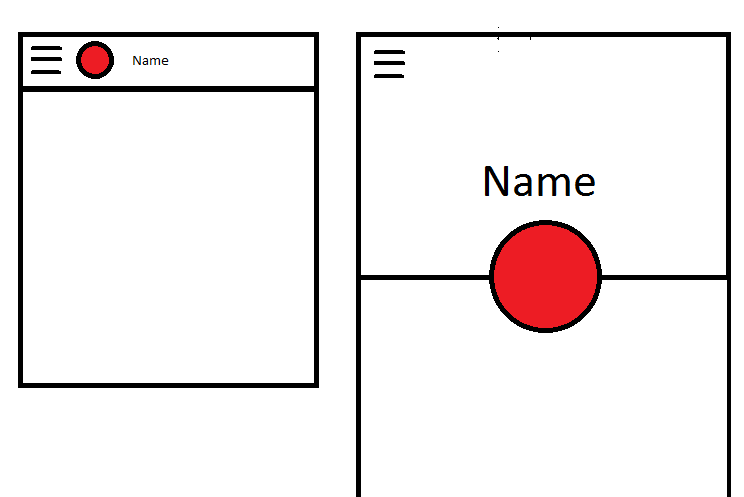
My behavior was implemented in much the same manner as Saul's. The biggest difference is that I like to put a non-visible view like a Space where I wanted the circle image to end up, then use that view's bounds to determine how to move & size the circle image.
public class CollapsingImageBehavior extends CoordinatorLayout.Behavior<View> {

    private final static int X = 0;
    private final static int Y = 1;
    private final static int WIDTH = 2;
    private final static int HEIGHT = 3;

    private int mTargetId;

    private int[] mView;

    private int[] mTarget;

    public CollapsingImageBehavior() {
    }

    public CollapsingImageBehavior(Context context, AttributeSet attrs) {

        if (attrs != null) {
            TypedArray a = context.obtainStyledAttributes(attrs, R.styleable.CollapsingImageBehavior);
            mTargetId = a.getResourceId(R.styleable.CollapsingImageBehavior_collapsedTarget, 0);
            a.recycle();
        }

        if (mTargetId == 0) {
            throw new IllegalStateException("collapsedTarget attribute not specified on view for behavior");
        }
    }

    @Override
    public boolean layoutDependsOn(CoordinatorLayout parent, View child, View dependency) {
        return dependency instanceof AppBarLayout;
    }

    @Override
    public boolean onDependentViewChanged(CoordinatorLayout parent, View child, View dependency) {

        setup(parent, child);

        AppBarLayout appBarLayout = (AppBarLayout) dependency;

        int range = appBarLayout.getTotalScrollRange();
        float factor = -appBarLayout.getY() / range;

        int left = mView[X] + (int) (factor * (mTarget[X] - mView[X]));
        int top = mView[Y] + (int) (factor * (mTarget[Y] - mView[Y]));
        int width = mView[WIDTH] + (int) (factor * (mTarget[WIDTH] - mView[WIDTH]));
        int height = mView[HEIGHT] + (int) (factor * (mTarget[HEIGHT] - mView[HEIGHT]));

        CoordinatorLayout.LayoutParams lp = (CoordinatorLayout.LayoutParams) child.getLayoutParams();
        lp.width = width;
        lp.height = height;
        child.setLayoutParams(lp);
        child.setX(left);
        child.setY(top);

        return true;
    }

    private void setup(CoordinatorLayout parent, View child) {

        if (mView != null) return;

        mView = new int[4];
        mTarget = new int[4];

        mView[X] = (int) child.getX();
        mView[Y] = (int) child.getY();
        mView[WIDTH] = child.getWidth();
        mView[HEIGHT] = child.getHeight();

        View target = parent.findViewById(mTargetId);
        if (target == null) {
            throw new IllegalStateException("target view not found");
        }

        mTarget[WIDTH] += target.getWidth();
        mTarget[HEIGHT] += target.getHeight();

        View view = target;
        while (view != parent) {
            mTarget[X] += (int) view.getX();
            mTarget[Y] += (int) view.getY();
            view = (View) view.getParent();
        }

    }
}
And here's the layout. One important thing I found out is that the circle image view needed to have an elevation set so that it would lay out atop the toolbar in collapsed mode, otherwise it would be behind the toolbar and not shown.
<?xml version="1.0" encoding="utf-8"?>
<android.support.design.widget.CoordinatorLayout
    xmlns:android="http://schemas.android.com/apk/res/android"
    xmlns:app="http://schemas.android.com/apk/res-auto"
    xmlns:tools="http://schemas.android.com/tools"
    android:id="@+id/coordinator_layout"
    android:layout_width="match_parent"
    android:layout_height="match_parent"
    android:fitsSystemWindows="true"
    tools:context="com.krislarson.customcoordinatorlayoutbehavior.ScrollingActivity">

    <android.support.design.widget.AppBarLayout
        android:id="@+id/app_bar"
        android:layout_width="match_parent"
        android:layout_height="wrap_content"
        android:fitsSystemWindows="true"
        android:theme="@style/AppTheme.AppBarOverlay">

        <android.support.design.widget.CollapsingToolbarLayout
            android:id="@+id/toolbar_layout"
            android:layout_width="match_parent"
            android:layout_height="280dp"
            android:minHeight="108dp"
            android:fitsSystemWindows="true"
            app:title="Abby"
            app:contentScrim="?attr/colorPrimary"
            app:expandedTitleGravity="center_horizontal"
            app:expandedTitleMarginTop="140dp"
            app:layout_scrollFlags="scroll|exitUntilCollapsed">

            <ImageView
                android:id="@+id/background"
                android:layout_width="match_parent"
                android:layout_height="match_parent"
                android:src="@drawable/sunset"
                app:layout_collapseMode="parallax"
                android:scaleType="centerCrop"/>

            <android.support.v7.widget.Toolbar
                android:id="@+id/toolbar"
                android:layout_width="match_parent"
                android:layout_height="?attr/actionBarSize"
                app:layout_collapseMode="pin"
                app:popupTheme="@style/AppTheme.PopupOverlay">

                <Space
                    android:id="@+id/circle_collapsed_target"
                    android:layout_width="40dp"
                    android:layout_height="40dp"/>

            </android.support.v7.widget.Toolbar>


        </android.support.design.widget.CollapsingToolbarLayout>

    </android.support.design.widget.AppBarLayout>

    <include layout="@layout/content_scrolling"/>

    <de.hdodenhof.circleimageview.CircleImageView
        android:id="@+id/circle_image_view"
        android:layout_width="120dp"
        android:layout_height="120dp"
        android:src="@drawable/abby"
        android:layout_marginTop="220dp"
        android:layout_gravity="top|center_horizontal"
        android:elevation="8dp"
        app:border_color="@android:color/black"
        app:border_width="2dp"
        app:collapsedTarget="@id/circle_collapsed_target"
        app:layout_behavior="com.krislarson.customcoordinatorlayoutbehavior.CollapsingImageBehavior"/>

</android.support.design.widget.CoordinatorLayout>
You can see the entire demo project at https://github.com/klarson2/CustomCoordinatorLayoutBehavior