I currently have elements within a container, each of which contains an image. I want to distribute these into the four corners or the container, using flexbox. The images are distributing correctly horizontally, but don't take up all the available space vertically.
Here's what it looks like at the moment: 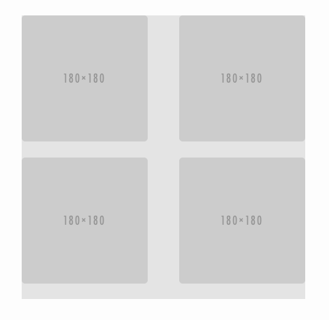
Here's my markup:
<div class="container">
    <div class="photo">
        <img src="https://placehold.it/180">
    </div>
    <div class="photo">
        <img src="https://placehold.it/180">
    </div>
    <div class="photo">
        <img src="https://placehold.it/180">
    </div>
    <div class="photo">
        <img src="https://placehold.it/180">
    </div>
</div>
And my (S)CSS:
div.container {
    width: 405px;
    height: 405px;
    background: rgba(0,0,0,0.1);
    display: flex;
    flex-wrap: wrap;
    justify-content: space-between;

    div.photo {
        width: 180px;
        height: 180px;
        overflow: hidden;
        border-radius: 5px;

        img {
            height: 100%;
        }
    }
}
div.container {
  width: 405px;
  height: 405px;
  background: rgba(0, 0, 0, 0.1);
  display: flex;
  flex-wrap: wrap;
  justify-content: space-between;
}

div.container div.photo {
  width: 180px;
  height: 180px;
  overflow: hidden;
  border-radius: 5px;
}

div.container div.photo img {
  height: 100%;
}
<div class="container">
<div class="photo">
<img src="https://placehold.it/180">
</div>
<div class="photo">
<img src="https://placehold.it/180">
</div>
<div class="photo">
<img src="https://placehold.it/180">
</div>
<div class="photo">
<img src="https://placehold.it/180">
</div>
</div>