Does anyone know what padding/margins are used to layout toolbar icons? Is this info available in any on-line docs? Thanks.
Asked
Active
Viewed 1,357 times
4 Answers
3
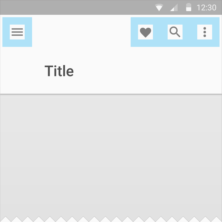
There isn't any margin between the icons in the Toolbar.
Each icon is 24dp wide and tall, with a padding on each side of 12dp
Read more in the Material Design Guidelines

Ognian Gloushkov
- 2,669
- 1
- 20
- 35
1
According to material guidelines:
App bar height: 56dp
App bar left and right padding: 16dp
App bar icon top, bottom, left padding: 16dp
App bar title left padding: 72dp
App bar title bottom padding: 20dp

Source: https://material.io/guidelines/layout/structure.html#structure-app-bar
bmelnychuk
- 1,100
- 8
- 14
0
The left inset is caused by Toolbar's contentInsetStart which by default is 16dp.
Change this to 72dp to align to the keyline.
Update for support library v24.0.0:
To match the Material Design spec there's an additional attribute contentInsetStartWithNavigation which by default is 16dp. Change this if you also have a navigation icon. For more information
-
3You just copy someones answer and post as yours ... I don't like it. – Selvin Dec 22 '16 at 14:44
-
Thanks for the quick response. However, I'm still not clear on what spacing between toolbar icons is. Any hints? – bdristan Dec 22 '16 at 14:50
-
@bdristan In my asnwer you can see that there is no margin between the icons – Ognian Gloushkov Dec 22 '16 at 14:56
0
According to material design documents the default height of toolbar in Android phone is 56 dp, and the icons should have 16 dp padding on all sides. So the height and width of toolbar icons are 24 dp. Reference: Material design docs
Shahbaz Ahmed
- 1,190
- 10
- 13