7

I'm sure this has been asked before but I can't find an answer to the exact question.

I want a very simple layout:

-------------------
      header
-------------------
         |
 content | graphic
         |
-------------------

where:

  • The header height is set by the font size;
  • The content has a fixed minimum width;
  • The graphic is as large as possible given those two constraints and preserving aspect ratio (i.e. it will be as tall as the screen minus the header unless that would make the content panel too narrow);
  • The content is as wide as possible given those three constraints.

[edited to add:]

  • Vertical: The image is vertically centered when the width+aspect ratio constraints result in it being shorter than the maximum height
  • Horizontal: The image is always hard against the right side of the screen (except for any manually added padding) and the content always goes right up to the left side of the image (also except for any manually added padding).

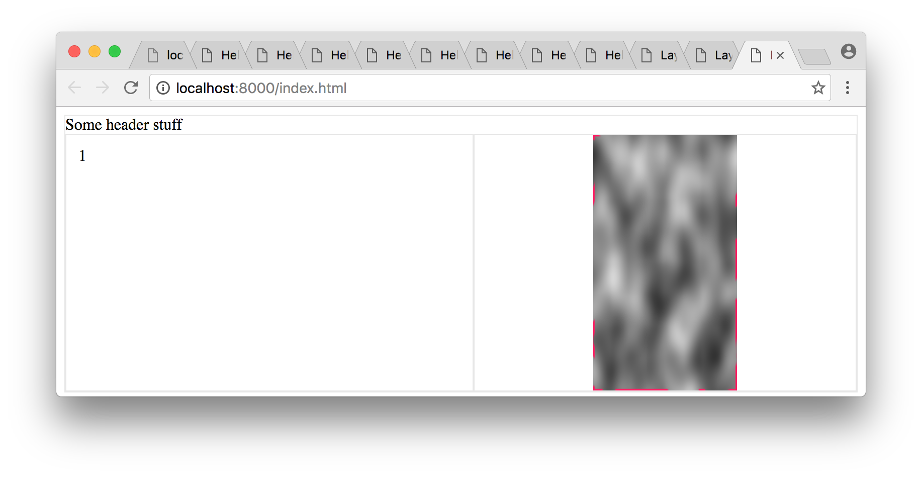
I've tried using flexboxes and have satisfied the first three constraints, but I can't get the content pane to grow horizontally to fill the space not used by the image. The best results I've got are using the HTML and CSS below but, as you can see in the screenshot below, this results in the content div and the image taking up the same size instead of the content div pushing the image to the right. (This is expected behavior from setting flex=1 on both, so I wasn't expecting it to work; but at least this gives me the image size behaving how I'd like).

Screenshot

What I'm using is at https://jsfiddle.net/uv566jc3/:

.grid {
  border: solid 1px #e7e7e7;
  height: 95vh;
  display: flex;
  flex-direction: column;
}
.header {
  flex: 0;
}
.grid__row {
  flex: 1;
  display: flex;
  flex-direction: row;
}
.grid__item {
  flex: 1;
  padding: 12px;
  border: solid 1px #e7e7e7;
}
img {
  flex: 1;
  object-fit: contain;
  overflow: hidden;
  border: solid 1px #e7e7e7;
}
<div class="grid">
  <div class="header">Some header stuff
  </div>
  <div class="grid__row">
    <div class="grid__item">1</div>
    <img id="pic" src="https://s27.postimg.org/oc7sozu7n/clouds.png">
  </div>
</div>
  • grid style is flexbox in column direction containing header and grid__row;
  • header has flex 0, i.e. height is set by contents;
  • grid__row has flex 1, i.e. fills the height left over after the header; is also a flex container in row direction containing grid__item and img.
  • grid__item has flex 1, i.e. fills the width available;
  • img has flex 1 and uses object-fit = 1 (which gets the image sizing properties I need) and overflow=hidden (which I don't really understand what it's doing, but if I leave it out the img container expands horizontally by a factor of 2).

I haven't set min-width explicitly on the grid__item item in the jsfiddle, but I don't anticipate that making any difference.

Is there an easy way to get what I want in CSS? Apologies if this is a duplicate.

William Whyte
  • 4,641
  • 2
  • 20
  • 17

9 Answers9

2

The flex: 1 factor

In your grid__row flex container, which is in row-direction, the two flex items – grid__item and img – each have flex: 1 applied.

This means that both items will divide the available space in the container evenly among themselves. In other words, 50/50, like in your illustration.

My suggestion: Remove flex: 1 from the img.


Whitespace resulting from object-fit: contain

With object-fit: contain the aspect ratio of the image is kept and it scales to fit within the box.

As a result, there may be whitespace on the left and/or right (portrait fit), or top and/or bottom (landscape fit).

That could be the reason you're seeing "padding" space on the left and right of the image.

If you try cover, all the space gets used, but there's cropping (demo).

Here's more about object-fit: https://stackoverflow.com/a/37127590/3597276


The overflow: hidden effect

With regard to your side comment:

...overflow=hidden (which I don't really understand what it's doing, but if I leave it out the img container expands horizontally by a factor of 2).

It's likely this is due to the minimum sizing algorithm of flex items.

By default, a flex item cannot be smaller than the size of its content.

However, this feature can be overridden with overflow: hidden.

More details here: Why doesn't flex item shrink past content size?

Community
  • 1
  • 1
Michael Benjamin
  • 346,931
  • 104
  • 581
  • 701
  • As with removing overflow=hidden, removing flex:1 made the image become about twice as wide. It's as if there's some padding automatically being added which the flex gives us the ability to reduce and the overflow tag gives us the ability to hide. – William Whyte Dec 29 '16 at 03:41
  • The image you're using is huge (900 x 1600). So it's going to consume all available space. Maybe start by adding the min-width to `.grid__item`. Try this instead of `flex: 1`: `flex: 1 0 200px`. – Michael Benjamin Dec 29 '16 at 03:46
  • It doesn't consume all available space, though. The problem isn't the image itself, which resizes as I would expect. The problem is that the browser adds a significant amount of blank space symmetrically on either side of the image -- see the screenshot in the question. – William Whyte Dec 29 '16 at 03:56
  • 1
    I've sometimes fixed image problems by wrapping them in a div. Maybe that will work. You'll find many questions on this site from people struggling with images in flex containers. – Michael Benjamin Dec 29 '16 at 04:19
  • Also, I've seen problems unique to placeholder images, so also test with an actual image. – Michael Benjamin Dec 29 '16 at 04:20
  • I have, thanks -- just didn't want to use the actual image in the question on SO. – William Whyte Dec 29 '16 at 05:16
  • Thanks for asking! No luck yet, unfortunately. I've been working on other parts of the project and haven't spent a lot of time on this but will probably circle back round in a week or so. The problem seems to be that even without the flex statement, the browser is deciding to add padding on either side of the image. Seems like it shouldn't be hard to solve, doesn't it? – William Whyte Dec 31 '16 at 16:12
  • You are using `object-fit: contain`.This means that the aspect ratio of the image is maintained and it scales to fit within the box. This may result in whitespace on the left and/or right (portrait fit), or top and/or bottom (landscape fit). If you try `cover`, all the space is used, but there's cropping: https://jsfiddle.net/uv566jc3/1/ – Michael Benjamin Dec 31 '16 at 18:37
2

I've edited the code your solution is this what you want ? I'm not sure..

https://jsfiddle.net/vjLps7qs/6/

It becomes :

  .container {
    width: calc(100vw);
    height: 100vh;
    overflow: hidden;
  }

  .top {
    height: 1.25em;
    padding: 3px;
    background: yellow;
    display: flex;
    flex-direction: row;
  }

  .innerCtr {
    height: 100%;
    overflow: hidden;
  }

  .left {
    height: 100%;
    background: red;
    overflow: hidden;
  }

  .right {
    max-height: 100%;
    max-width: 80%;
    calc(100% - 1.25rem);
    background: blue;
    float: right;
    object-fit: contain;
    overflow: hidden;
    position: relative;
    top: calc(50% - 1.25rem);
    transform: translateY(-52%) scale(0.95);
  }

added calc, which is supported by all major browsers

  .right {
    calc(100% - 1.25rem);
    top: calc(50% - 1.25rem);
  }

Again, I'm very sorry if that wasn't what you were looking for but this thread is hard to navigate.

Ced
  • 15,847
  • 14
  • 87
  • 146
1

This example uses float concept:

Portrait image:

* {
  box-sizing: border-box;
}
body {
  margin: 0px;
}
.header {
  width: 100%;
  height:8vh;
  border: 1px solid #aaa;
}
.main-content {
  width: 100%;
  border: 1px solid #aaa;
  padding: 0px;
}
.main-content > .left {
  float: left;
  width: 50%;
}
.main-content > .right {
  float: right;
  width: 50%;
}
.main-content > div {
  min-height: 50%;
  max-height: 90%;
}
.main-content > .right > img {
  max-width: 100%;
  max-height: 90vh;
}
.main-content:after,
.main-content:before {
  display: table;
  clear: both;
  content: "";
}
<div class="header">
  Some Header stuff..
  <br>
</div>
<div class="main-content">

  <div class="left">
    Somehitng on the left
  </div>
  <div class="right">
    <img src="https://s-media-cache-ak0.pinimg.com/236x/41/89/8c/41898cae6d9edd8737dfef07ab50ea57.jpg" />
  </div>
</div>

Landscape image:

* {
  box-sizing: border-box;
}
body {
  margin: 0px;
}
.header {
  width: 100%;
  height: 8vh;
  border: 1px solid #aaa;
}
.main-content {
  width: 100%;
  border: 1px solid #aaa;
  padding: 0px;
}
.main-content > .left {
  float: left;
  width: 50%;
}
.main-content > .right {
  float: right;
  width: 50%;
}
.main-content > div {
  min-height: 50%;
  max-height: 90%;
}
.main-content > .right > img {
  max-width: 100%;
  max-height: 90vh;
}
.main-content:after,
.main-content:before {
  display: table;
  clear: both;
  content: "";
}
<div class="header">
  Some Header stuff..
  <br>
</div>
<div class="main-content">

  <div class="left">
    Somehitng on the left
  </div>
  <div class="right">
    <img src="http://www.w3schools.com/css/img_fjords.jpg" />
  </div>
</div>
Jones Joseph
  • 4,703
  • 3
  • 22
  • 40
0

You should remove flex from your image and wrap it inside of a container to meet your requirements.

I have modified your code a little bit to achieve the same. Please check the changes.

UPDATE

I have updated my answer and used display: inline-flex now. Should meet all your requirements.

.grid {
  border: solid 1px #e7e7e7;
  height: 95vh;
  display: flex;
  flex-direction: column;
}

.header {
  flex: 0;
}

.grid__row {
  flex: 1;
  display: flex;
  flex-direction: row;
}

.grid__item {
  flex: 1;
  padding: 12px;
  border: solid 1px #e7e7e7;
}

.img_ctr {
  border: solid 1px #e7e7e7;
  display: inline-flex;
}

 img {
  height: 100%;
} 
<div class="grid">
  <div class="header">Some header stuff
  </div>
  <div class="grid__row">
    <div class="grid__item">1</div>
    <div class="img_ctr">
      <img id="pic" src="https://s-media-cache-ak0.pinimg.com/236x/41/89/8c/41898cae6d9edd8737dfef07ab50ea57.jpg">
    </div>
  </div>
</div>
nashcheez
  • 5,067
  • 1
  • 27
  • 53
  • Thanks for the answer, but it doesn't scale the image either up or down -- remember, the goal is to have the image be as large as possible subject to the constraints that (a) aspect ratio is preserved, (b) it's no taller than the distance from the bottom of the header to the bottom of the screen and (c) it leaves at least the minimum width on the left for the content. – William Whyte Jan 02 '17 at 10:02
  • Doesn't scale vertically :-) – William Whyte Jan 02 '17 at 11:05
0

Is this possibly a solution for your issue ? See fiddle here

#pic {
       background: url('http://lorempixel.com/400/200/sports/1/') no-repeat; 
       position: absolute; 
       left: 440px; 
       right: 0; 
       top: 0; 
       bottom: 0; 
     }

I've put the image as a background image with cover property. That way, the image takes full width and height of the container, no matter how you resize it.

Vincent G
  • 8,547
  • 1
  • 18
  • 36
  • Thanks for the answer, but when I clicked through to the jsfiddle the image didn't respond to changes in the container size. (I also saw that in the jsfiddle the image container had object-fit:contain rather than cover -- maybe you hadn't finished editing it yet?) – William Whyte Jan 02 '17 at 10:13
  • Thanks! But the image still doesn't respond to changes in the container size, and I want the left-hand content panel to expand to fill the available space subject to the constraints on the image. I've edited the question to try to make this clearer. – William Whyte Jan 02 '17 at 10:30
0

I have used max-width and max-height to apply limits to the image, but preserving the aspect ratio. I also included the image within an independent div to allow for shrinking and growing of the two separated sections.

Could it be what you're looking for? https://jsfiddle.net/johnnykb/pu1vpL3q/2/

Both extremely tall and extremely wide images scale perfectly to fit the image container, which in turn shrinks if the image is small enough while never growing more than allowed by the minimum width of the content section.

HTML:

<div class="grid">
  <div class="header">Some header stuff
  </div>
  <div class="grid__row">
    <div class="content">1</div>
    <div class="image">
      <img id="pic" src="http://placekitten.com/200/2000">
    </div>
  </div>
</div>

CSS:

.grid {
  border: solid 1px #e7e7e7;
  height:95vh;
  display: flex;
  flex-direction: column;
}

.header {
  flex: 0;
}

.grid__row {
  flex: 1;
  display: flex;
  flex-direction:row;
}

.content {
  flex-grow: 1;
  padding: 12px;
  border: solid 1px #e7e7e7;
  min-width: 400px;
}

.image {
  flex-shrink: 1;
  padding: 12px;
  border: solid 1px #e7e7e7;
  text-align: center;
}

img {
  overflow: hidden;
  border: solid 1px #e7e7e7;
  max-height: 100%;
  max-width: 100%;
}
Johnny Kutnowski
  • 2,340
  • 1
  • 13
  • 15
  • Not quite -- the image isn't as large as possible subject to the constraints I listed. Try it with http://placekitten.com/900/1600 and http://placekitten.com/1600/900, those are the ratios I'll be using. By the way, thanks for introducing me to placekitten! – William Whyte Jan 02 '17 at 11:30
  • @WilliamWhyte happy to be the one bringing the kitty joy :) I'm not sure I understand how is it not fulfilling the requirements. It uses the maximum possible size of the bigger of two values, height and width. Always depending on the viewport size and considering the `min-width` of the `.content`. If you could please explain in detail what's missing, I might be able to be of more help. – Johnny Kutnowski Jan 02 '17 at 11:39
  • Hi Johnny -- have a look at the answer I just added to see what I was looking for. In your fiddle you have flex on both the left and the right, and that means that the right isn't as big as possible: its size is a tradeoff with the size of the left. With the 2000-width image you selected the left should always be the minimum width when viewed in a jsfiddle window, because they're always less than 2000 pixels wide; instead the left grows with the window. Does that explain the issue? – William Whyte Jan 02 '17 at 12:04
0

NOTE: This is the best answer I've found to date, but the bounty is still open -- see below.

I found an answer using float. See https://jsfiddle.net/wwhyte/vjLps7qs/; replace the image with http://placekitten.com/1600/900 to see landscape behavior.

CSS:

  .container {
    width: calc(100vw);
    height: 100vh;
    overflow: hidden;
  }

  .top {
    height: 1.25em;
    background: yellow;
  }

  .innerCtr {
    height: 100%;
    overflow: hidden;
  }

  .left {
    height: 100%;
    background: red;
    overflow: hidden;
  }

  .right {
    max-height: 100%;
    max-width: 80%;
    background: blue;
    float: right;
    object-fit: contain;
    overflow: hidden;
    position: relative;
    top: 50%;
    transform: translateY(-52%) scale(0.95);
  }

HTML:

<div class="container">
  <div class="top">
  </div>
  <div class="innerCtr">
    <img class="right" src="http://placekitten.com/1600/900">
    <div class="left">Lorem ipsum dolor sit amet, consectetur adipiscing elit, sed do eiusmod tempor incididunt ut labore et dolore magna aliqua. Ut enim ad minim veniam, quis nostrud exercitation ullamco laboris nisi ut aliquip ex ea commodo consequat. Duis aute irure dolor in reprehenderit in voluptate velit esse cillum dolore eu fugiat nulla pariatur. Excepteur sint occaecat cupidatat non proident, sunt in culpa qui officia deserunt mollit anim id est laborum</div>
  </div>
</div>

What I think is happening is:

  • In the right class:
    • max-height, max-width, and object-fit give me the scaling I need.
    • float:right gives the position I need. (I got this from an article I found yesterday but have now lost, I'll edit this answer to provide attribution if I re-find it).
    • the transform is inspired by the article on vertical alignment at: http://zerosixthree.se/vertical-align-anything-with-just-3-lines-of-css/.
    • the 95% scale improves the visibility of the image.
  • In the left class, height:100% gives the panel size I want
  • The innerCtr class gives a parent for the image to calculate its height against
  • The container class fits the viewport to the browser window.

Even this isn't quite ideal. There's some weird interaction between the height of the top bar and the height of the image so that the bottom of the image is pushed out of the display. The amount pushed out is less than but related to the height of the top bar -- I haven't fully investigated. If you remove the top bar the CSS above behaves perfectly. I addressed this with the 95% scale and slight adjustment to the Y-transform, but this still doesn't behave exactly right at small window sizes -- the image isn't perfectly vertically centered. I had thought that setting height=calc(100vh-1.25em) on the container class might fix this, but in fact it breaks the vertical scaling of the image so it now only scales horizontally. This was completely unexpected behavior! The bounty is therefore still open if someone can get the vertical centering to work exactly right.

Thanks everyone for all the suggestions!

William Whyte
  • 4,641
  • 2
  • 20
  • 17
0

The answers about removing the flex from the image are on the right track, flex's are intended for containers not content. Here is a working example..

.grid {
  border: solid 1px #e7e7e7;
  height:95vh;
  display: flex;
  flex-direction: column;
}

.header {
  flex: 0;
}

.grid__row {
  flex: 1;
  display: flex;
  flex-direction:row;
}

.grid__item {
  white-space:nowrap;
  padding: 12px;
  border: solid 1px #e7e7e7;
}

img {
  object-fit:contain;
  border: solid 1px #e7e7e7;
  max-width:75%;
}

Fiddle

tnt-rox
  • 5,400
  • 2
  • 38
  • 52
  • This has the same issue as the CSS in my original question -- when the image is at its maximum height given the window dimensions, the left-hand panel should expand to be the maximum possible width and the image should be hard against the right-hand side. However, in your proposal and in my original question, we end up with padding on the left and right of the image. Sorry... – William Whyte Jan 04 '17 at 06:05
0

I have fixed some details in your answer, now I believe it's working ok.

There are 2 versions of the demo, one for the landscape image and another for the portrait.

I have set an animation on hover of the image to show it scales properly keeping it centered

body {
    margin: 0px;
  }

  .container {
    width: calc(100vw);
    height: 50vh;
  }

  .top {
    height: 1.25em;
    background: yellow;
  }

  .innerCtr {
    height: calc(100% - 1.25em);  /* important to have the heuight ok */
    position: relative;     /* make the dimension inheritable */
  }

  .left {
    height: 100%;
    background: red;
    overflow: hidden;
  }

  .right {
    max-height: 100%;
    max-width: 80%;
    background: blue;
    float: right;
    object-fit: contain;
    top: 50%;
    position: relative;
    transform: translateY(-50%) scale(0.95) ;
}

.right:hover {
    animation: zoom 4s infinite;  
}

@keyframes zoom {
    from {transform: translateY(-50%) scale(0.98) }
    to {transform: translateY(-50%) scale(0) }
}
<div class="container">
  <div class="top">
  </div>
  <div class="innerCtr">
    <img class="right" src="http://placekitten.com/1600/900">
    <div class="left">Lorem ipsum dolor sit amet, consectetur adipiscing elit, sed do eiusmod tempor incididunt ut labore et dolore magna aliqua. Ut enim ad minim veniam, quis nostrud exercitation ullamco laboris nisi ut aliquip ex ea commodo consequat. Duis aute irure dolor in reprehenderit in voluptate velit esse cillum dolore eu fugiat nulla pariatur. Excepteur sint occaecat cupidatat non proident, sunt in culpa qui officia deserunt mollit anim id est laborum</div>
  </div>
</div>
<div class="container">
  <div class="top">
  </div>
  <div class="innerCtr">
    <img class="right" src="http://placekitten.com/900/1600">
    <div class="left">Lorem ipsum dolor sit amet, consectetur adipiscing elit, sed do eiusmod tempor incididunt ut labore et dolore magna aliqua. Ut enim ad minim veniam, quis nostrud exercitation ullamco laboris nisi ut aliquip ex ea commodo consequat. Duis aute irure dolor in reprehenderit in voluptate velit esse cillum dolore eu fugiat nulla pariatur. Excepteur sint occaecat cupidatat non proident, sunt in culpa qui officia deserunt mollit anim id est laborum</div>
  </div>
</div>
vals
  • 61,425
  • 11
  • 89
  • 138