I'm working on an app and I have a custom UISlider.
However, I'm having some issues on how to make the default thumb to appear smaller like the ones in the iOS control center.
Note that I want the same iOS thumb, not a custom thumb image. So far, I've tried thumbRect(forBounds...) but no luck.
Any suggestions?
Asked
Active
Viewed 5.1k times
35
Axel Guilmin
- 11,454
- 9
- 54
- 64
UI Scuti
- 375
- 1
- 3
- 5
-
UISliders have an intrinsic height, making (I think) the need for a custom slider almost a given. – Feb 07 '17 at 16:01
8 Answers
60
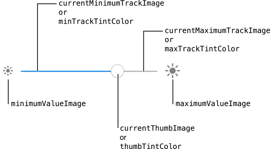
You can't change the size of the default thumb image, but UISlider has a method setThumbImage(_:for:) that will allow you to pass a similar, smaller image.
In your view controller viewDidLoad :
let image:UIImage? = // ...
yourSlider.setThumbImage(image, for: .normal)
yourSlider.setThumbImage(image, for: .highlighted) // Also change the image when dragging the slider
See Customizing the Slider’s Appearance of the API Reference.
On iOS10, the default thumb image appear to be no more than a bordered white circle with a thin shadow dropped under (if you don't set the thumbTintColor).
I use this snippet to generate a similar image that can be scaled down ;)
var canvas = document.getElementById("canvas");
var ctx = canvas.getContext("2d");
var data = " \
<svg xmlns='http://www.w3.org/2000/svg' width='86' height='86'> \
<foreignObject width='100%' height='100%'> \
 <div xmlns='http://www.w3.org/1999/xhtml'> \
  <style> \
  #ios-uislider-thumb { \
    -webkit-box-sizing: content-box; \
    -moz-box-sizing: content-box; \
    box-sizing: content-box; \
    width: 66px; \
    height: 66px; \
    overflow: hidden; \
    border: 1px solid #CCC; \
    -webkit-border-radius: 33px; \
    border-radius: 33px; \
    background: #FFFFFF; \
    -webkit-box-shadow: 0 6px 6px 0 rgba(0,0,0,0.2); \
    box-shadow: 0 6px 6px 0 rgba(0,0,0,0.2); \
    margin : 5px 10px 15px 10px; \
  } \
  </style> \
  <div id='ios-uislider-thumb'></div> \
 </div> \
</foreignObject> \
</svg> \
";
var DOMURL = self.URL || self.webkitURL || self;
var img = new Image();
var svg = new Blob([data], {
  type: "image/svg+xml;charset=utf-8"
});
var url = DOMURL.createObjectURL(svg);
img.onload = function() {
  ctx.drawImage(img, 0, 0);
  DOMURL.revokeObjectURL(url);
};
img.src = url;
<canvas id="canvas" style="border:2px dotted black;" width="86" height="86"></canvas>
Community
- 1
- 1
Axel Guilmin
- 11,454
- 9
- 54
- 64
-
2I made a small fiddle based on the image generator: https://jsfiddle.net/x0ry14oL/1/embedded/result/dark/ (I know it's pretty messy, but I just threw it together, and it works) – Fishy Jun 19 '19 at 16:33
-
If you use thumb image then you can't set tint color; My requirement is to change size and tint color; Tint color value will be update continuously while sliding. – msmq Jul 25 '19 at 14:32
-
the problem I faced is the custom slider image is not completely left-aligned to the slider progress bar and a portion of the progress bar is visible which is making the thumb image stretched to left from center but in actual it is progress bar – garg Jan 13 '22 at 06:20
60
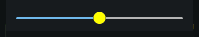
I created a UISlider subclass that allows to change the thumb size as well as track size, all without using images.
import UIKit

class CustomSlider: UISlider {

    @IBInspectable var trackHeight: CGFloat = 3

    @IBInspectable var thumbRadius: CGFloat = 20

    // Custom thumb view which will be converted to UIImage
    // and set as thumb. You can customize it's colors, border, etc.
    private lazy var thumbView: UIView = {
        let thumb = UIView()
        thumb.backgroundColor = .yellow//thumbTintColor
        thumb.layer.borderWidth = 0.4
        thumb.layer.borderColor = UIColor.darkGray.cgColor
        return thumb
    }()

    override func awakeFromNib() {
        super.awakeFromNib()
        let thumb = thumbImage(radius: thumbRadius)
        setThumbImage(thumb, for: .normal)
        setThumbImage(thumb, for: .highlighted)
    }

    private func thumbImage(radius: CGFloat) -> UIImage {
        // Set proper frame
        // y: radius / 2 will correctly offset the thumb

        thumbView.frame = CGRect(x: 0, y: radius / 2, width: radius, height: radius)
        thumbView.layer.cornerRadius = radius / 2

        // Convert thumbView to UIImage
        // See this: https://stackoverflow.com/a/41288197/7235585

        let renderer = UIGraphicsImageRenderer(bounds: thumbView.bounds)
        return renderer.image { rendererContext in
            thumbView.layer.render(in: rendererContext.cgContext)
        }
    }

    override func trackRect(forBounds bounds: CGRect) -> CGRect {
        // Set custom track height
        // As seen here: https://stackoverflow.com/a/49428606/7235585
        var newRect = super.trackRect(forBounds: bounds)
        newRect.size.height = trackHeight
        return newRect
    }

}
Result:
Shreeram Bhat
- 2,849
- 2
- 11
- 19
Adam
- 1,776
- 1
- 17
- 28
-
9Great answer, but I think "radius" should be "diameter" since it's the thumb's width & height. – Kacy Feb 17 '20 at 06:46
-
This code doesn't change the thumb size for me -- at least it cannot make it smaller. – Steve Macdonald Feb 24 '21 at 15:11
-
1It works for smaller, but need to add setThumbImage(thumb, for: .highlighted) for the selected thumb – Jszn Mar 12 '21 at 10:05
-
@Steve Macdonald Change the "thumbView.frame" radius in thumbImage func and you can change the thumb size. I changed it to "radius / 4" and it looks smaller. – oğuz May 10 '21 at 16:02
-
if you're not using xib file or storyboard create an initializer and move the code from "awakefromnib" to your initializer. it will work then. – Sasan Soroush Jul 28 '21 at 11:06
24
If you want to change Thumb Image as well as Tint Color then both can't be possible; There is one workaround of this issue. Create circular image programmatically and change the color of the image and assign that image to slider thumb; In this way, you can also resize the image as well as color.
Here is the fully working sample code:
fileprivate func makeCircleWith(size: CGSize, backgroundColor: UIColor) -> UIImage? {
    UIGraphicsBeginImageContextWithOptions(size, false, 0.0)
    let context = UIGraphicsGetCurrentContext()
    context?.setFillColor(backgroundColor.cgColor)
    context?.setStrokeColor(UIColor.clear.cgColor)
    let bounds = CGRect(origin: .zero, size: size)
    context?.addEllipse(in: bounds)
    context?.drawPath(using: .fill)
    let image = UIGraphicsGetImageFromCurrentImageContext()
    UIGraphicsEndImageContext()
    return image
}
You can call this function like this:
    func setSliderThumbTintColor(_ color: UIColor) {
    let circleImage = makeCircleWith(size: CGSize(width: 20, height: 20),
                   backgroundColor: color)
    slider.setThumbImage(circleImage, for: .normal)
    slider.setThumbImage(circleImage, for: .highlighted)
}
This method setSliderThumbTintColor will be called on valueChanged event of UISlider.
msmq
- 1,298
- 16
- 28
7
Download an image similar to the one you have in the iOS control centre.
Scale it to the size you want (20x20 or even smaller) and save it in your assets.
Paste the following code in viewDidLoad:
self.yourSlider.setThumbImage(UIImage(named: "SliderName")!, for: .normal)
5
Here's an option for you, use a CGAffineTransform.
Swift 4
mySlider.transform = CGAffineTransform(scaleX: 0.85, y: 0.85)
This will change the width and height of the slider, so you may need to realign it with your interface.
J. Martin
- 124
- 1
- 7
-
1You can also add constraints like these: `mySlider.centerXAnchor.constraint(equalTo: centerXAnchor)`, `mySlider.widthAnchor.constraint(equalTo: widthAnchor, multiplier: 1 / 0.85)` to make it refill the size like before. – George Jan 08 '19 at 20:51
-
22
3
Use customize image like below ..
for state: UIControl.State in [.normal, .selected, .application, .reserved] {
            editorSlider.setThumbImage(UIImage.init(named: "slider_thumb"), for: state)
        }
Zaporozhchenko Oleksandr
- 4,660
- 3
- 26
- 48
emraz
- 1,563
- 20
- 28
2
Swift (iOS 13+):
On iOS 13+ you can generate the thumb image using SF Symbols:
let configuration = UIImage.SymbolConfiguration(pointSize: 12)
let image = UIImage(systemName: "circle.fill", withConfiguration: configuration)
slider.setThumbImage(image, for: .normal)
You might also need to set the image for .highlighted state (when dragging):
slider.setThumbImage(image, for: .highlighted)
However, when there is no image set for the .highlighted state, the image for .normal state is used also in the .highlighted state.
Marián Černý
- 15,096
- 4
- 70
- 83
1
Just a quick and clean fix:
   [.normal, .highlighted].forEach { state in
        slider.setThumbImage(thumbImage, for: state)
    }
Zaporozhchenko Oleksandr
- 4,660
- 3
- 26
- 48