1

How can I arrange elements with different heights vertically? I mean using something like this:

div[class^="elm"]{
 width: 50%;
 display: inline-block;
 margin-bottom: 20px;
 background-color: gray;
}
 
.elm1{
 height: 100px;
}
 
.elm2{
 height: 200px;
}
 
.elm3{
 height: 160px;
}
 
.elm4{
 height: 110px;
}
 
.elm5{
 height: 60px;
}
 
.elm6{
 height: 220px;
}
 
.elm7{
 height: 90px;
}
<div class="elm1">Element 1</div><div class="elm2">Element 2</div><div class="elm3">Element 3</div><div class="elm4">Element 4</div><div class="elm5">Element 5</div><div class="elm6">Element 6</div><div class="elm7">Element 7</div>

and showing it like this (ordering is important):

vertically aligned elements

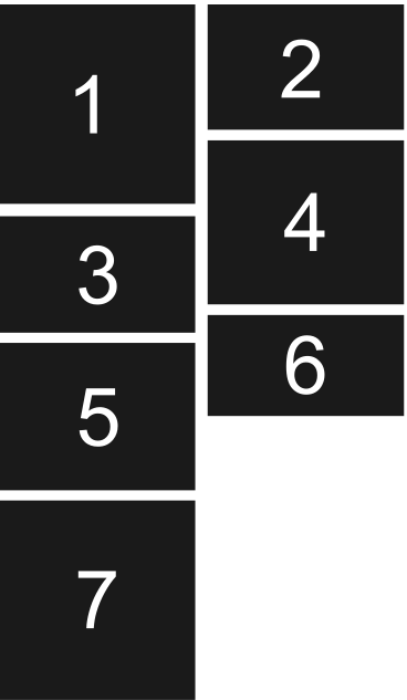
I know this type of thing can happening with two blocks. each for one column but it makes me to use javascript in responsive design (for making it more than two columns).

Example Google+ doing it with multi block that changes by javascript. How can I do it without using javascript and only CSS?

Sumit patel
  • 3,807
  • 9
  • 34
  • 61
ICE
  • 1,667
  • 2
  • 21
  • 43
  • 3
    You might want to check out `flexbox` – domsson Mar 07 '17 at 12:48
  • 1
    @domdom I tried something like this before: http://codepen.io/klamping/pen/bddxyr?editors=110 but it doesn't do what I need :( – ICE Mar 07 '17 at 12:55
  • 1
    Isn't this a masonry layout? Have you considered using the masonry plugin which allows you to order elements – Tom Michew Mar 07 '17 at 12:59
  • 1
    @TomMichew yes i want something like that. but I want to know how can I make it happen with CSS. – ICE Mar 07 '17 at 13:14

2 Answers2

2

You can do this by alternating between float: left and float: right:

.items {
  display: block;
  overflow: hidden;
  width: 400px;
}

.item {
  box-sizing: border-box;
  width: 190px;
  margin: 5px;
  padding: 5px;
  background: #000;
  color: #fff;
  text-align: center;
  font-family: 'Arial', 'Helvetica', sans-serif;
  font-size: 48pt;
  font-weight: bold;
}

.item:nth-child(odd) {
  float: left; 
}

.item:nth-child(even) {
  float: right;
}

.elm1 {
  height: 100px;
}
 
.elm2 {
  height: 200px;
}
 
.elm3 {
  height: 160px;
}
 
.elm4 {
  height: 110px;
}
 
.elm5 {
  height: 60px;
}
 
.elm6 {
  height: 220px;
}
 
.elm7 {
  height: 90px;
}
<div class="items">
  <div class="item elm1">1</div>
  <div class="item elm2">2</div>
  <div class="item elm3">3</div>
  <div class="item elm4">4</div>
  <div class="item elm5">5</div>
  <div class="item elm6">6</div>
  <div class="item elm7">7</div>
</div>

Hope this helps.

EDIT: This can still fail, depending on the heights of the tiles, as can be seen here: https://jsfiddle.net/f16apso8/ - better (actual) solutions are present here: How to Create Grid/Tile View with CSS?

Community
  • 1
  • 1
domsson
  • 4,553
  • 2
  • 22
  • 40
  • Thanks for mentioning nth-child. now I can use nth-child(3n+0) for three columns and nth-child(4n+0) for four columns. If you like add that to your answer. – ICE Mar 07 '17 at 13:25
  • Great! Note, however, that you might still get "aligning gaps" if you have a specific order and size of elements (try the exact size of the items that is shown in your example picture). I'm currently not sure how to solve that, to be honest. – domsson Mar 07 '17 at 13:29
  • 1
    As much as I'd like to take the praise, this is the remaining issue I was talking about: https://jsfiddle.net/f16apso8/ - I guess @TomMichew was right when he suggested the Masonry Layout, check http://stackoverflow.com/questions/8470070/how-to-create-grid-tile-view-with-css (JavaScript) and a pure CSS3 solution here http://stackoverflow.com/questions/8470070/how-to-create-grid-tile-view-with-css#answer-42614384 – domsson Mar 07 '17 at 13:46
0

Is this output are you expecting

this might help you

Check output in Codepen.io

div[class^="elm"] {
  width: 50%;
  display: block;
  background-color: gray;
}

.elm1 {
  height: 100px;
  margin: 2px;
}

.elm2 {
  height: 200px;
  position: relative;
  left: 10px;
  top: -105px;
  float: right;
}

.elm3 {
  height: 160px;
  margin: 2px;
}

.elm4 {
  height: 110px;
  margin: 2px;
  position: relative;
  left: 10px;
  top: -105px;
  float: right;
}

.elm5 {
  height: 60px;
}

.elm6 {
  height: 220px;
  margin: 2px;
  position: relative;
  left: 10px;
  top: -105px;
  float: right;
}

.elm7 {
  height: 90px;
  margin: 2px;
}
<div class="elm1">Element 1</div>
<div class="elm2">Element 2</div>
<div class="elm3">Element 3</div>
<div class="elm4">Element 4</div>
<div class="elm5">Element 5</div>
<div class="elm6">Element 6</div>
<div class="elm7">Element 7</div>
Mandarr Sant
  • 457
  • 9
  • 22
  • 1
    Thanks for your answer but what you're mentioning is good when I know how many elements I have and which one is going to the right and which one is going to the left. the whole idea is all about list. it can be even 1000 of them or more and it must be a good solution when shifting from two columns to three or more columns in responsive design. – ICE Mar 07 '17 at 13:12
  • 1
    Is my solution solving your problem? – Mandarr Sant Mar 07 '17 at 13:19