140

For example, I have some class .article, and I want to view this class as grid view. So I applied this style:

.article{
  width:100px;
  height:100px;
  background:#333;
  float:left;
  margin:5px;
}

That style will make the .article look tiled/grid. It's work fine with fixed height. But if I want to set the height to auto (automatically stretch according to the data within it), the grid look nasty.

enter image description here

And I want to make the view like this:

enter image description here

Paolo Forgia
  • 6,572
  • 8
  • 46
  • 58
Ariona Rian
  • 9,153
  • 3
  • 24
  • 36

8 Answers8

84

This type of layout is called Masonry layout. Masonry is another grid layout but it will fill out the whitespace caused by the difference height of elements.

jQuery Masonry is one of jQuery plugin to create masonry layout.

Alternatively, you can use CSS3 columns. But for now jQuery based plugin is the best choice since there is compatibility issue with CSS3 column.

altocumulus
  • 21,179
  • 13
  • 61
  • 84
bookcasey
  • 39,223
  • 13
  • 77
  • 94
29

You can use flexbox.

  1. Place your elements in a multiline column flex container

    #flex-container {
      display: flex;
      flex-flow: column wrap;
    }
    
  2. Reorder the elements, so that the DOM order is respected horizontally instead of vertically. For example, if you want 3 columns,

    #flex-container > :nth-child(3n + 1) { order: 1; } /* 1st column */
    #flex-container > :nth-child(3n + 2) { order: 2; } /* 2nd column */
    #flex-container > :nth-child(3n + 3) { order: 3; } /* 3rd column */
    
  3. Force a column break before the first item of each column:

    #flex-container > :nth-child(-n + 3) {
      page-break-before: always; /* CSS 2.1 syntax */
      break-before: always;  /* New syntax */
    }
    

    Sadly, not all browsers support line breaks in flexbox yet. It works on Firefox, though.

#flex-container {
  display: flex;
  flex-flow: column wrap;
}

#flex-container > :nth-child(3n + 1) { order: 1; } /* 1st column */
#flex-container > :nth-child(3n + 2) { order: 2; } /* 2nd column */
#flex-container > :nth-child(3n + 3) { order: 3; } /* 3rd column */

#flex-container > :nth-child(-n + 3) {
  page-break-before: always; /* CSS 2.1 syntax */
  break-before: always;  /* New syntax */
}

/* The following is optional */
#flex-container > div {
  background: #666;
  color: #fff;
  margin: 3px;
  display: flex;
  justify-content: center;
  align-items: center;
  font-size: 36px;
}
#flex-container > :nth-child(1) { height: 100px; }
#flex-container > :nth-child(2) { height: 50px; }
#flex-container > :nth-child(3) { height: 75px; }
#flex-container > :nth-child(4) { height: 50px; }
#flex-container > :nth-child(5) { height: 100px; }
#flex-container > :nth-child(6) { height: 50px; }
#flex-container > :nth-child(7) { height: 100px; }
#flex-container > :nth-child(8) { height: 75px; }
#flex-container > :nth-child(9) { height: 125px; }
<div id="flex-container">
  <div>1</div><div>2</div><div>3</div>
  <div>4</div><div>5</div><div>6</div>
  <div>7</div><div>8</div><div>9</div>
</div>
Oriol
  • 274,082
  • 63
  • 437
  • 513
  • This is amazing. One has only to add a width+inline-block on the childs and it’s okay. The new "column" syntax works great also, but it’s not possible in my case, since I can’t modify the container. – le hollandais volant Dec 09 '18 at 15:24
12

For creating a masonry layout, using CSS the column-count along with column-gap would suffice. But I've also used media queries to make it responsive.

Before diving into the implementation, please consider that it'd be much safer to add a jQuery Masonry library fallback to make your code compatible for legacy browser, specially IE8:

<!--[if lte IE 9]>
    <script src="/path/to/js/masonry.pkgd.min.js"></script>
<![endif]-->

Here we go:

.masonry-brick {
    color: #FFF;
    background-color: #FF00D8;
    display: inline-block;
    padding: 5px;
    width: 100%;
    margin: 2px 0; /* for separating masonry-bricks vertically*/
}

@media only screen and (min-width: 480px) {
    .masonry-container {
        -moz-column-count: 3;
        -webkit-column-count: 3;
        column-count: 3;
    }
}

@media only screen and (min-width: 768px) {
    .masonry-container {
        -moz-column-count: 4;
        -webkit-column-count: 4;
        column-count: 4;
    }
}

@media only screen and (min-width: 960px) {
    .masonry-container {
        -moz-column-count: 5;
        -webkit-column-count: 5;
        column-count: 5;
    }
}
<div class="masonry-container">
   <div class="masonry-brick">Masonry pure CSS3 Masonry pure CSS3 Masonry pure CSS3 Masonry pure CSS3 Masonry pure CSS3 </div>
   <div class="masonry-brick">Masonry pure CSS3 Masonry pure CSS3 Masonry pure CSS3 Masonry pure CSS3 Masonry pure CSS3 </div>
   <div class="masonry-brick">Masonry pure CSS3 Masonry pure CSS3 </div>
   <div class="masonry-brick">Masonry pure CSS3 Masonry pure CSS3 Masonry pure CSS3 Masonry pure CSS3 Masonry pure CSS3 </div>
   <div class="masonry-brick">Masonry pure CSS3 Masonry pure CSS3 Masonry pure CSS3 Masonry pure CSS3 Masonry pure CSS3 Masonry pure CSS3 Masonry pure CSS3 Masonry pure CSS3 Masonry pure CSS3 Masonry pure CSS3 </div>
   <div class="masonry-brick">Masonry pure CSS3 Masonry pure CSS3 Masonry pure CSS3 Masonry pure CSS3 Masonry pure CSS3 </div>
   <div class="masonry-brick">Masonry pure CSS3 Masonry pure CSS3 Masonry pure CSS3 Masonry pure CSS3 Masonry pure CSS3 </div>
</div>
TylerH
  • 20,799
  • 66
  • 75
  • 101
behkod
  • 2,647
  • 2
  • 18
  • 33
  • Do you know how to have equal space between items in the masonry and the container? – intcreator Jul 26 '17 at 19:15
  • 8
    It's good but for a lot of people, there's a necessity to ORDER the `masonry bricks`. The column orders things top to bottom, the question was asking for the order to stay the same horizontally, not to switch to vertically. For example, the shortest block found above SHOULD be in the third column but the top row. – jscul Feb 11 '18 at 03:21
5

The best option to solve that with only css is using css column-count property.

 .content-box {
   border: 10px solid #000000;
   column-count: 3;
 }

Check this for more info: https://developer.mozilla.org/en/docs/Web/CSS/column-count

3

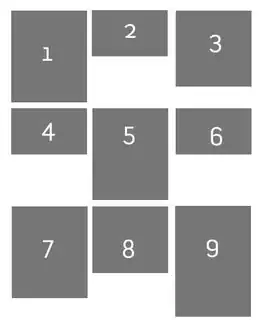
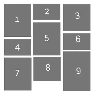
With the CSS Grid Module you can create a pretty similar layout.

CodePen demo

1) Set three fixed-width grid columns

ul {
  display: grid;
  grid-template-columns: 150px 150px 150px;
  ...
}

2) Make sure the items with large height span 2 rows

li:nth-child(1),
li:nth-child(3),
li:nth-child(5),
li:nth-child(8),
li:nth-child(9),
li:nth-child(10),
li:nth-child(12)
{
  grid-row: span 2;
}

body {
  margin: 0;
}
ul {
  display: grid;
  grid-template-columns: 150px 150px 150px;
  grid-gap: 1rem;
  justify-content: center;
  align-items: center;
  
  /* boring properties: */
  list-style: none;
  width: 90vw;
  height: 85vh;
  margin: 4vh auto;
  border: 5px solid green;
  padding: 1rem;
  overflow: auto;
  counter-reset: item;
}
li {
  position: relative;
}
li:after {
  content: counter(item);
  counter-increment: item;
  position: absolute;
  padding: 0.3rem;
  background: salmon;
  color: white;
  left:0;
  top:0;
}
img {
  outline: 5px solid salmon;
}
li:nth-child(1),
li:nth-child(3),
li:nth-child(5),
li:nth-child(8),
li:nth-child(9),
li:nth-child(10),
li:nth-child(12)
{
  grid-row: span 2;
}
<ul>
  <li><img src="http://lorempixel.com/150/150/animals" alt="" /></li>
  <li><img src="http://lorempixel.com/150/50/animals" alt="" /></li>
  <li><img src="http://lorempixel.com/150/140/animals" alt="" /></li>
  <li><img src="http://lorempixel.com/150/80/animals" alt="" /></li>
  <li><img src="http://lorempixel.com/150/220/animals" alt="" /></li>
  <li><img src="http://lorempixel.com/150/120/animals" alt="" /></li>
  <li><img src="http://lorempixel.com/150/70/animals" alt="" /></li>
  <li><img src="http://lorempixel.com/150/200/animals" alt="" /></li>
  <li><img src="http://lorempixel.com/150/230/animals" alt="" /></li>
  <li><img src="http://lorempixel.com/150/240/animals" alt="" /></li>
  <li><img src="http://lorempixel.com/150/130/animals" alt="" /></li>
  <li><img src="http://lorempixel.com/150/160/animals" alt="" /></li>
</ul>

Codepen demo

The problems:

  • The gaps between the items won't be uniform
  • You have to manually set the large/high items to span 2 or more rows
  • Limited browser support :)
TylerH
  • 20,799
  • 66
  • 75
  • 101
Danield
  • 121,619
  • 37
  • 226
  • 255
3

You can use display: grid. for example:

This is a grid with 7 columns and your rows has auto size.

.myGrid{
      display: grid;
      grid-template-columns: 1fr 1fr 1fr 1fr 1fr 1fr 1fr;
      grid-auto-rows: auto;
      grid-gap: 10px;
      justify-items: center;
}

For more details access the follow link: https://css-tricks.com/snippets/css/complete-guide-grid/

TylerH
  • 20,799
  • 66
  • 75
  • 101
vrbsm
  • 1,188
  • 15
  • 22
2

There is one grid-based example.

.grid-layout {
  display: grid;
  grid-template-columns: repeat(auto-fill, minmax(100px, 1fr));
  grid-gap: 10px;
  grid-auto-rows: minmax(100px, auto);
  grid-auto-flow: dense;
  padding: 10px;
}

.grid-layout .item {
  padding: 15px;
  color: #fff;
  background-color: #444;
}

.span-2 {
  grid-column-end: span 2;
  grid-row-end: span 2;
}

.span-3 {
  grid-column-end: span 3;
  grid-row-end: span 4;
}
<div class="grid-layout">
    <div class="item">content</div>
    <div class="item">content</div>
    <div class="item span-3">content</div>
    <div class="item">content</div>
    <div class="item">content</div>
    <div class="item span-2">content</div>
    <div class="item">content</div>
    <div class="item">content</div>
    <div class="item span-3">content</div>
    <div class="item">content</div>
    <div class="item">content</div>
    <div class="item span-2">content</div>
    <div class="item">content</div>
    <div class="item">content</div>
    <div class="item">content</div>
    <div class="item">content</div>
    <div class="item">content</div>
    <div class="item">content</div>
    <div class="item">content</div>
    <div class="item">content</div>
    <div class="item">content</div>
    <div class="item">content</div>
    <div class="item">content</div>
    <div class="item">content</div>
    <div class="item">content</div>
    <div class="item">content</div>
    <div class="item">content</div>
    <div class="item">content</div>
</div>

Based on this CodePen by Balazs Sziklai

TylerH
  • 20,799
  • 66
  • 75
  • 101
vovchisko
  • 2,049
  • 1
  • 22
  • 26
0

and if you want to go even further than masonry, use isotope http://isotope.metafizzy.co/ it is the advanced version of masonry (developed by the same author) it isn't pure CSS, it uses the help of Javascript but it is very popular, so you will find plenty of docs

if you find it very complicated then there are many premium plugins that based their development on isotope already, for example the Media Boxes http://codecanyon.net/item/media-boxes-responsive-jquery-grid/5683020