I'm providing this answer because even when there are good ones which do provide a solution(using Masonry) still isn't crystal clear why it isn't possible to achieve this by using floats.
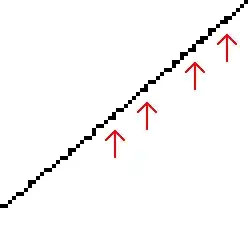
(this is important - #1).
A floated element will move as far to the left or right as it can in
the position where it was originally
So put it in this way:
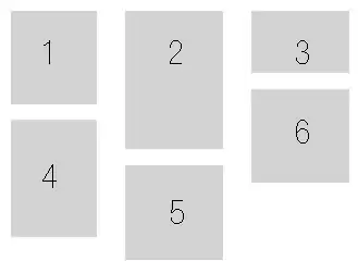
We have 2 div
<div class="div5">div5</div>
<div class="div6">div6</div>

.div-blue{
    width:100px;
    height:100px;
    background: blue;
}

.div-red{
    width:50px;
    height:50px;
    background: red;
}
without float they'll be one below the other
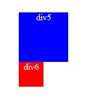
If we float: right the div5, the div6 is positioned on the line where the div5 was ,
/*the lines are just for illustrate*/
So if now we float: left the div6 it will move as far to the left as it can, "in this line" (see #1 above), so if div5 changes its line, div6 will follow it.
Now let's add other div into the equation
<div class="div4">div4</div>
<div class="div5">div5</div>
<div class="div6">div6</div>

.div-gree{
    width:150px;
    height:150px;
    background: green;

    float:right;
}
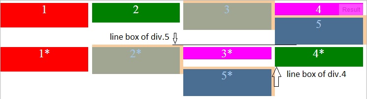
We have this

If we set clear: right to the div5, we are forcing it to take the line bellow div4
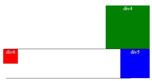
and div6 will float in this new line wether to the right or to the left.
Now lets use as example the question that brought me here due to a duplicate Forcing div stack from left to right
Here the snippet to test it:
div{
    width:24%;
    margin-right: 1%;
    float: left;
    margin-top:5px;
    color: #fff;
    font-size: 24px;
    text-align: center;
}

.one{
    background-color:red;
    height: 50px;
}

.two{
    background-color:green;
    height:40px;
}

.three{
    background-color:orange;
    height:55px;
}

.four{
    background-color:magenta;
    height:25px;
}

.five{
    background-color:black;
    height:55px;
}
<div class="one">1</div>
<div class="two">2</div>
<div class="three">3</div>
<div class="four">4</div>
<div class="five">5</div>

<div class="one">1*</div>
<div class="three">2*</div>
<div class="four">3*</div>
<div class="two">4*</div>
<div class="five">5*</div>
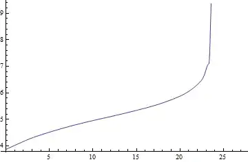
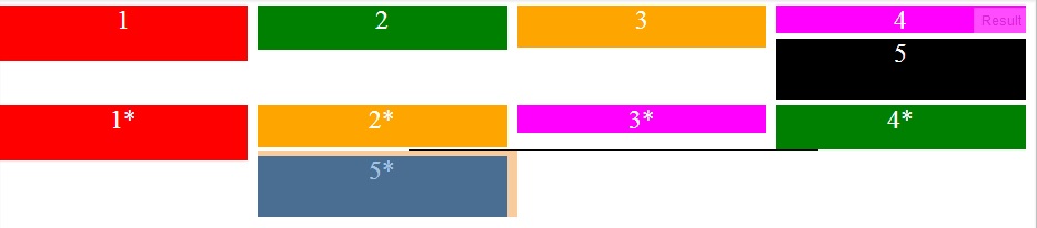
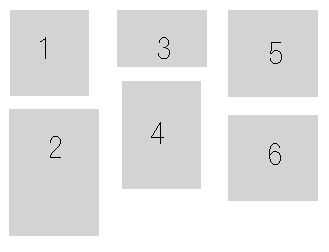
In the above image you can see how div.5 is stocked just next to div.3 that is because in its line (defined by the line box of div.4) that is as far it can go, div.1*, div.2*, etc, also float left of div.5 but as they don't fit in that line they go to the line bellow (defined by the line box of div.5)
Now notice that when we reduce the height of div.2* enough to be less than div.4* how it let pass to div.5*:
I hope this helps to clarify why this can not be achieved using floats. I only clarify using floats (not inline-block) because of the title "CSS Floating Divs At Variable Heights" and because right now the answer is quite long.