0

I'm having trouble getting a responsive grid to work well with row and column span. I've been trying to accomplish this with bootstrap, but also trying with native CSS as well.

Here is a good example of what I am trying to do with CSS:
https://codepen.io/adrianpuescu/pen/PwRVej

Here is an image of the grid that I am trying to achieve. enter image description here

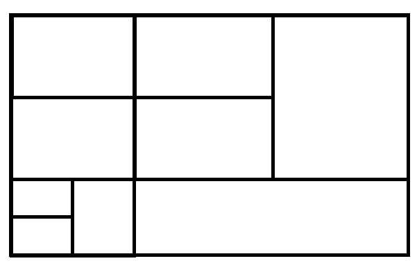
Any way to adjust to codepen to achieve the grid in the image? The problem I am having is getting the bottom grid to work.

/* Optional */
html,
body {
  height: 100%;
  padding: 0;
  margin: 0;
}
* {
  -webkit-box-sizing: border-box;
  -moz-box-sizing: border-box;
  box-sizing: border-box;
}
table {
  height: 100%;
}
.cell {
  background: #ddd;
  border: 5px solid #fff;
}
/* Optional */
[class*="col-"] {
  float: left;
}
.col-1 {
  width: 8.333333%;
}
.col-2 {
  width: 16.666666%;
}
.col-3 {
  width: 25%;
}
.col-4 {
  width: 33.333333%;
}
.col-5 {
  width: 41.666666%;
}
.col-6 {
  width: 50%;
}
.col-7 {
  width: 58.333333%;
}
.col-8 {
  width: 66.666666%;
}
.col-9 {
  width: 75%;
}
.col-10 {
  width: 83.333333%;
}
.col-11 {
  width: 91.666666%;
}
.col-12 {
  width: 100%;
}
.row-1 {
  height: 8.333333%;
}
.row-2 {
  height: 16.666666%;
}
.row-3 {
  height: 25%;
}
.row-4 {
  height: 33.333333%;
}
.row-5 {
  height: 41.666666%;
}
.row-6 {
  height: 50%;
}
.row-7 {
  height: 58.333333%;
}
.row-8 {
  height: 66.666666%;
}
.row-9 {
  height: 75%;
}
.row-10 {
  height: 83.333333%;
}
.row-11 {
  height: 91.666666%;
}
.row-12 {
  height: 100%;
}
<div class="row-12 col-6">      
  <div class="row-8 cell">row 1-2, cell 1</div>
  <div class="row-4 cell">row 1, cell 2</div>
</div>

<div class="row-12 col-6">
  
  <div class="row-12 col-6">
    <div class="row-4 cell">row 1, cell 1</div>
    <div class="row-8 cell">row 2-3, cell 2</div>
  </div>

  <div class="row-12 col-6">
    <div class="row-4 cell">row 1, cell 1</div>
    <div class="row-4 cell">row 2, cell 2</div>
    <div class="row-4 cell">row 3, cell 1</div>
  </div>

</div>
luskbo
  • 155
  • 3
  • 18
  • 1
    Your error is thinking this is 3 rows, it isn't...it's 2 rows which need inner divs as columns. – Paulie_D Jul 16 '18 at 15:59
  • Thanks for pointing out what I am doing wrong. Any idea on how to do it right? – luskbo Jul 16 '18 at 16:39
  • That is easy to accomplish with nested `div` elements, though more importantly, how should it look like on a device in portrait mode, e.g. a smart phone or on smaller screens ? ... so if you take the posted image, add numbers to each box, and then show how it should look on desktop and table/portrait mode. – Asons Jul 16 '18 at 17:23
  • This will never be in portrait mode. It will only ever be displayed in landscape. Thanks for the reply though. – luskbo Jul 16 '18 at 18:25

2 Answers2

3

You can accomplish this fairly easily with the new Grid Layout spec.

.container {
  display: grid;
  grid-template-columns: repeat(1fr, 6);
  grid-template-rows: repeat(1fr, 6);
  grid-column-gap: 5px;
  grid-row-gap: 5px;
  grid-template-areas:
    'col1 col1 col2 col2 col5 col5'
    'col1 col1 col2 col2 col5 col5'
    'col3 col3 col4 col4 col5 col5'
    'col3 col3 col4 col4 col5 col5'
    'col6 col8 col9 col9 col9 col9'
    'col7 col8 col9 col9 col9 col9';
}

[class^='col'] {
  background: pink;
  min-height: 40px;
  display: flex;
  align-items: center;
  justify-content: center;
}

.col1 { grid-area: col1; }
.col2 { grid-area: col2; }
.col3 { grid-area: col3; }
.col4 { grid-area: col4; }
.col5 { grid-area: col5; }
.col6 { grid-area: col6; }
.col7 { grid-area: col7; }
.col8 { grid-area: col8; }
.col9 { grid-area: col9; }
<div class="container">
  <div class="col1">1</div>
  <div class="col2">2</div>
  <div class="col3">3</div>
  <div class="col4">4</div>
  <div class="col5">5</div>
  <div class="col6">6</div>
  <div class="col7">7</div>
  <div class="col8">8</div>
  <div class="col9">9</div>
</div>

Here's some more information on Grid:

https://developer.mozilla.org/en-US/docs/Web/CSS/CSS_Grid_Layout

Daniel Bernardi
  • 487
  • 2
  • 7
  • The one thing I should add is to make sure the browsers you are targeting support Grid Layout. https://caniuse.com/#search=grid – Daniel Bernardi Jul 16 '18 at 20:53
1

You can just make it into a table. In my answer, I've divided up your sections into 4 rows and 4 columns. The column definitions are provided in the <colgroup> tag. You can push those styles into CSS if you wish.

/* Optional */
html,
body {
  height: 100%;
  padding: 0;
  margin: 0;
}

* {
  -webkit-box-sizing: border-box;
  -moz-box-sizing: border-box;
  box-sizing: border-box;
}

table {
  width: 100%;
  height: 100%;
}

table td {
  background: #ddd;
  border: 5px solid #fff;
}
<table>
  <colgroup>
    <col style="width:16.66%">
    <col style="width:16.66%">
    <col style="width:33.33%">
    <col style="width:33.33%">
  </colgroup>
  <tbody>
    <tr>
      <td colspan=2>row 1, cell 1-2</td>
      <td>row 1, cell 3</td>
      <td rowspan=2>row 1, cell 4</td>
    </tr>
    <tr>
      <td colspan=2>row 2, cell 1-2</td>
      <td>row 2, cell 3</td>
    </tr>
    <tr>
      <td>row 3, cell 1</td>
      <td rowspan=2>row 3-4, cell 2</td>
      <td rowspan=2 colspan=2>row 3-4, cell 3</td>
    </tr>
    <tr>
      <td>row 4, cell 1</td>
    </tr>
  </tbody>
</table>

There's another question: How to Create a Grid/Tile View which advocates the use of jQuery Masonry plugin (plugin overhead), Flexbox (can be complex and confusing), or Columns (also can be complex).

If these solutions are right for you, is up to you, but it is impossible using only CSS Floats as pointed out in many SO questions.

Sunny Patel
  • 7,830
  • 2
  • 31
  • 46
  • Don't recommend to use `` for layout. It is for _tabular data_, or only in extreme cases, which this one isn't.
    – Asons Jul 16 '18 at 17:14
  • What's funny, is that I totally believe in that too. I guess I was going for pure simplicity. This solution is not scalable. – Sunny Patel Jul 16 '18 at 18:03
  • Thank you Sunny for the response. You are correct, I was trying to avoid using a table however. I would like to point out for anyone that comes across this in the future, this will work, but is not recommended as LGSon and Sunny mention. – luskbo Jul 16 '18 at 18:23