8

I'm making a website with 3 drawers - elements that are absolutely positioned off screen, one on the left, one on the right and one on the bottom.

Have a look at the website here to see what I'm talking about https://sjbuysse.github.io/javascriting/index.html

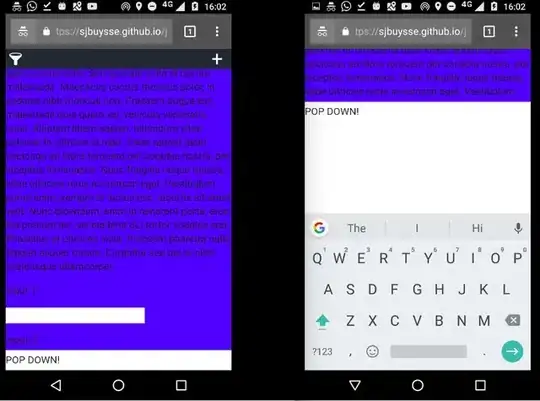
Click on the bottom Pop up! toggle, and you'll see a div with some inputs show up. As usual, when you click on one of these inputs in your mobile browser, a keyboard is displayed, which in result will resize the website. This is no problem on my website when the input high enough on the screen (above the keyboard). But if I didn't scroll down as much, and the keyboard pops up above the selected input element, my whole website is being pushed up, and some blank space is created under my <html> content. Even after I close the keyboard, that blank space stays there.

I will show you with screenshots what I mean:

Situation 1: When the input is high enough to be above the keyboard, no problem.

No Problem when input is above keyboard

Situation 2: When the input is not high enough on the screen, and the keyboard will pop over it, The websites content gets pushed up

The websites content is pushed up when input field is under keyboard

The blank space stays in the website even after I hide the keyboard

Blank space persists

After a whole lot of debugging I singled out the cause for this issue: The right-hand drawer on my website (the one you can toggle open with the + sign) somehow is causing this issue by being positioned absolutely. The css for this drawer looks like this:

.create-drawer {
  height: 100vh;
  text-align: left;
  color: #EEE;
  width: 200px;
  background-color: #1C262F;
  position: absolute;
  top: 0;
  transition: transform 0.3s ease-out;
  z-index: 2;
  box-sizing: border-box;
  right: 0;
  transform: translate(200px, 0); 
}

Simply by commenting out the position: absolute line, the problem is fixed. Can someone explain this to me?

Also, The left-hand drawer (with the filter symbol) has the exact same css (except that it's positioned left), and does not interfere with anything. I would also love to understand how that's possible.

sjbuysse
  • 3,872
  • 7
  • 25
  • 37

4 Answers4

11

For future readers who struggle with moving absolutely positioned elements:

I solved this problem by defining the position of the parent container (body) to relative.

For some reason I thought this was the default value, but it's not. So if you have weird stuff happening with absolute positioned elements, make sure the containers position is defined (to something else than static)

sjbuysse
  • 3,872
  • 7
  • 25
  • 37
4

For anyone still having issues with this: The size of any viewport based/percentage element will change when the virtual keyboard is invoked (Android). One fix is to get the size of the current inner window height (in px) and then use that as the height of the element that you want to remain constant on keyboard popup.

Using jQuery:

$(document).ready(function() {
    /* ... */
    var windowHeight = $(window).innerHeight();
    $('body').css({'height':windowHeight});
    /* ... */
});

Refer to this SO question Mobile keyboard changes html viewport size

danieln
  • 473
  • 1
  • 5
  • 20
2

If yours form with inputs is in modal, try to put .modal{overflow-y: visible;}

  • in a modal, I have only one input field, and it almost bottom of the modal. the modal is already scrollable and I have to scroll to show the input field. when I click on input keyboard appears and input goes behind the keyboard. I have to scroll again to show the input field. – Md Rashedul Islam Jun 15 '22 at 02:09
0

This is a simple fix I was able to impliment in my code using JavaScript for fixing the problem of elements adjusting to the screen size on a mobile device when the keyboard is open and when any variation of the height property of an elements style was set for responsiveness eg. vh or %.


const getPixels = (percent) => {
  const screenHeight = window.innerHeight;
  return (screenHeight / 100) * percentage;
};

elem.style.minHeight = `${getPixels(75)}px`;

This simple line of code is dynamically setting the height of your element in JavaScript. What makes this work is that now you are setting a height that is both dynamic and fixed. When you set the height of the element through the get pixels function you are passing in at what percentage you would like the div's height to be. In my case I want it to be 75% of the height of our window object but then transforms it to pixels which is a fixed height. The reason it is dynamic is because the function first grabs the height of your device, whatever that might be and then transforms your percentage into a fixed height in pixels based of your screen size. This hopefully is helpful for those who ran into issues still after exhausting all of the other solutions listed on here such as myself! Haha.

Ryan Large
  • 11
  • 2