I have a dataset with 1,000 rows, that is structured similar to this:
Thing    Category A    Category B
(char)   (factor)      (factor)
11       Green         Flower
12       Green         Flower
13       Blue          Flower
14       Blue          Sky
...      ...           ...
My real dataset has about 1,000 rows, and 30 non-overlapping categories for A and B. I'm interested in obtaining a graph that shows the overlap/interaction of the factors within category A and category B.
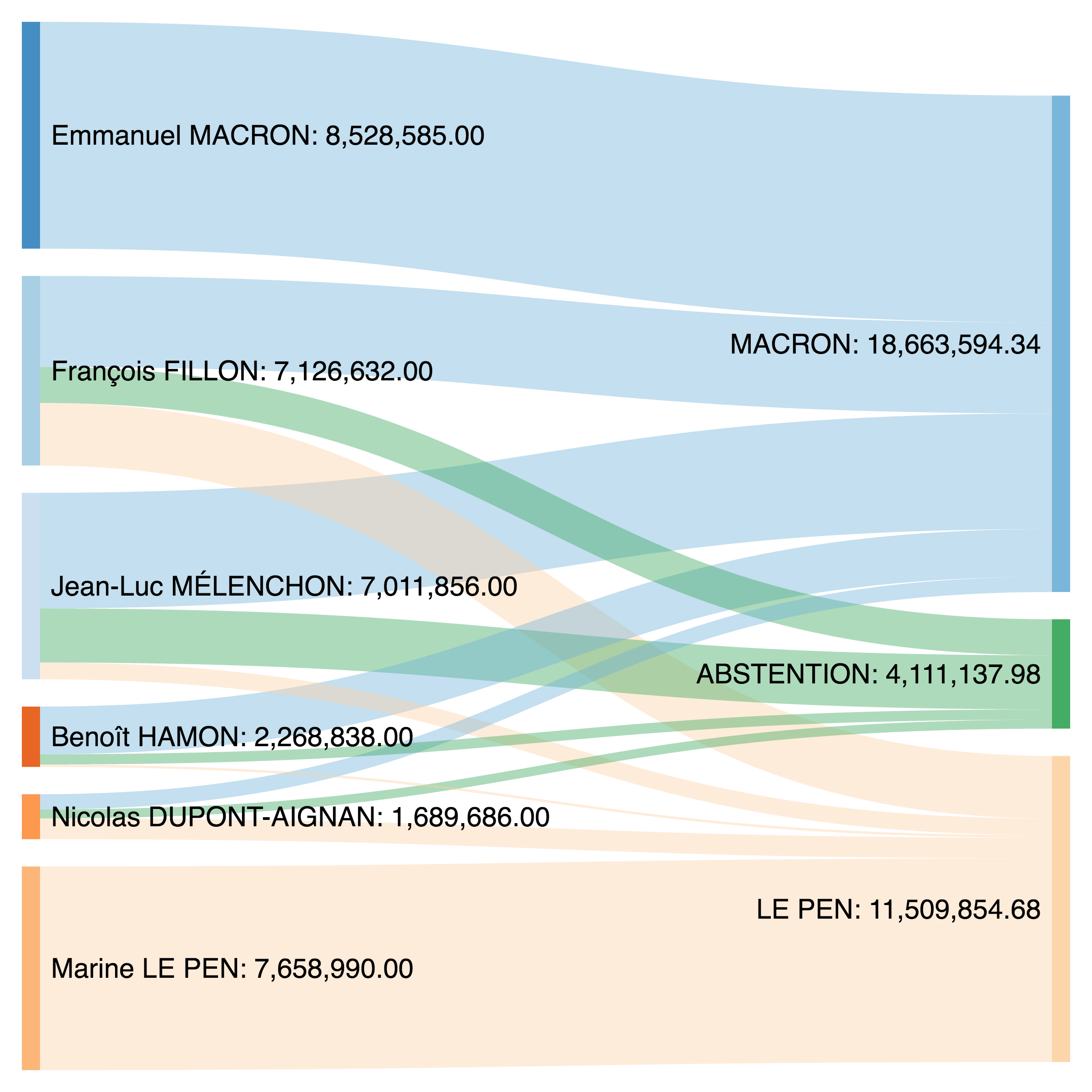
I have in mind a graph that resembles this one about potential vote transfers in the French presidential election. So I'd like to have "category A" on the left-hand side, "category B" on the right-hand side. And the size of the bars should be determined by the frequency of "Things" in the respective categories.
Does anybody happen to know the name of this sort of graph and any way that this can (hopefully easily) be implemented for R?
Thank you!