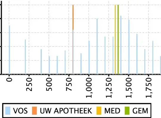
I have a dataset with user IDs and the number of objects they created. I drew the histogram using ggplot and now I'm trying to include the cumulative sum of the x-values as a line. The aim is to see much the bins contribute to the total number. I tried the following:
ggplot(data=userStats,aes(x=Num_Tours)) + geom_histogram(binwidth = 0.2)+
   scale_x_log10(name = 'Number of planned tours',breaks=c(1,5,10,50,100,200))+
   geom_line(aes(x=Num_Tours, y=cumsum(Num_Tours)/sum(Num_Tours)*3500),color="red")+
   scale_y_continuous(name = 'Number of users', sec.axis = sec_axis(~./3500, name = "Cummulative percentage of routes [%]"))
This does not work because I don't include any bins so the plot
and
ggplot(data=userStats,aes(x=Num_Tours)) + geom_histogram(binwidth = 0.2)+
   scale_x_log10(name = 'Number of planned tours',breaks=c(1,5,10,50,100,200))+
   stat_bin(aes(y=cumsum(..count..)),binwidth = 0.2, geom="line",color="red")+
   scale_y_continuous(name = 'Number of users', sec.axis = sec_axis(~./3500, name = "Cummulative percentage of routes [%]"))
Resulting in this:
 .
.
Here the cumsum of the count is considered. What I want is the cumsum of the count * value of the bin. Then it should be normalized, so that it can be displayed in one plot. What I am trying to to is something like that:

I would appreciate any input! Thanks
Edit: As test data, this should work:
userID <- c(1:100)
Num_Tours <- sample(1:100,100)
userStats <- data.frame(userID,Num_Tours)
userStats$cumulative <- cumsum(userStats$Num_Tours/sum(userStats$Num_Tours))
