3

I'm trying to add a point/triangle to my div with a background image but am struggling with how to create enough empty space.

Here's what I'm going for:

enter image description here

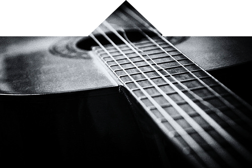
Here's what I have so far:

<div class="bg"></div>

.bg {
  position: relative;
  background: url('http://i.imgur.com/W27LCzB.jpg');
  background-size: cover;
  width: 100%;
  padding-top: 50px;
  height: 200px;
}

.bg:before {
  content:'';
  border-left: 50px solid #fff; 
  border-right: 50px solid #fff; 
  border-bottom: 50px solid transparent; 
  position:absolute; 
  top: 0;
  left: 0;
  right: 0;
  margin: 0 auto;
  width: 0;
}

I tried following this Stack Overflow question, but the approach in the top answer creates borders that come from the ends of the rectangular div.

user3325749
  • 171
  • 1
  • 11
  • want to try html,css style triangle? try this https://css-tricks.com/snippets/css/css-triangle/ – vijay Jun 24 '17 at 13:11

2 Answers2

4

Could achieve your design using another div. Hope you'll like it :)

.bg {
  position: relative;
  background: url('http://i.imgur.com/W27LCzB.jpg');
  background-size: cover;
  width: 100%;
  padding-top: 50px;
  height: 200px;
}

.bg:before {
  content:'';
  border-left: 50px solid #fff; 
  border-right: 50px solid #fff; 
  border-bottom: 50px solid transparent; 
  position:absolute; 
  top: 0;
  left: 0;
  right: 0;
  margin: 0 auto;
  width: 0;
}

.helper {
  position: absolute;
  height: 50px;
  top: 0;
  left: 0;
  right: 0;
}

.helper:before, .helper:after {
  content: "";
  background: white;
  position: absolute;
  top: 0;
  bottom: 0;
  width: calc(50% - 50px);
}

.helper:before {left: 0;}
.helper:after {right: 0;}
<div class="bg">
  <div class="helper"></div>
</div>
Itay Ganor
  • 3,965
  • 3
  • 25
  • 40
2

You can achieve what you want by using pseudo element and skew them to get the shape border

.bg {
  position: relative;
  background: url('http://i.imgur.com/W27LCzB.jpg');
  background-size: cover;
  width: 100%;
  padding-top: 50px;
  height: 200px;
  overflow: hidden;
}

.bg:before {
  content: '';
  background: #fff;
  position: absolute;
  top: 0;
  right: calc(50% + 20px);
  width: 150%;
  height: 50px;
  transform: skewX(-40deg);
}

.bg:after {
  content: '';
  background: #fff;
  position: absolute;
  top: 0%;
  left: calc(50% + 20px);
  width: 150%;
  height: 50px;
  transform: skewX(40deg);
}
<div class="bg"></div>
Chiller
  • 9,520
  • 2
  • 28
  • 38