3

Intro

this is similar to this question but unfortunately the answer only applies to greasmonkey (which only works on firefox). Further, this was asked on the stylish forum but the answer was ambiguous.

Question

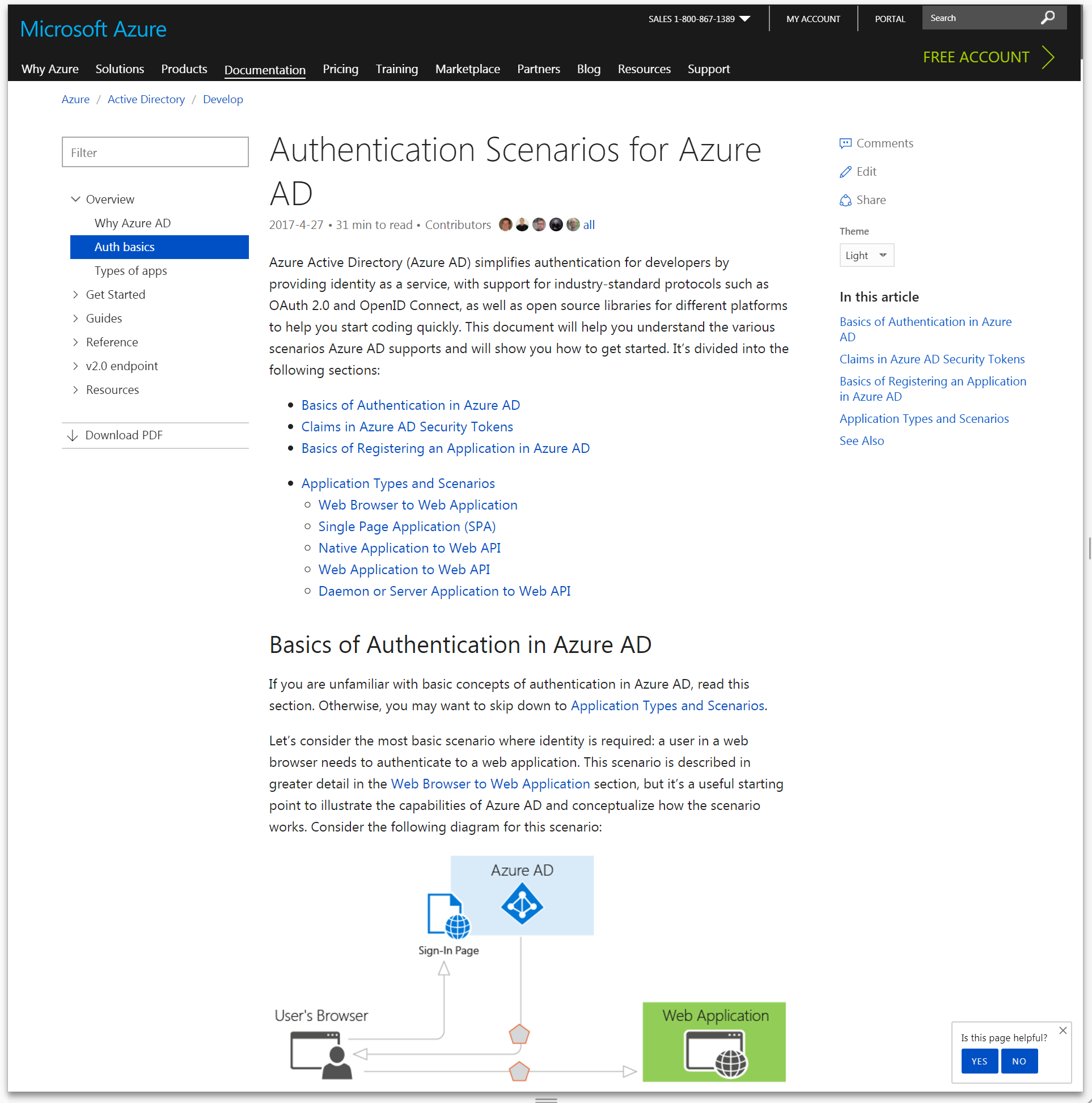
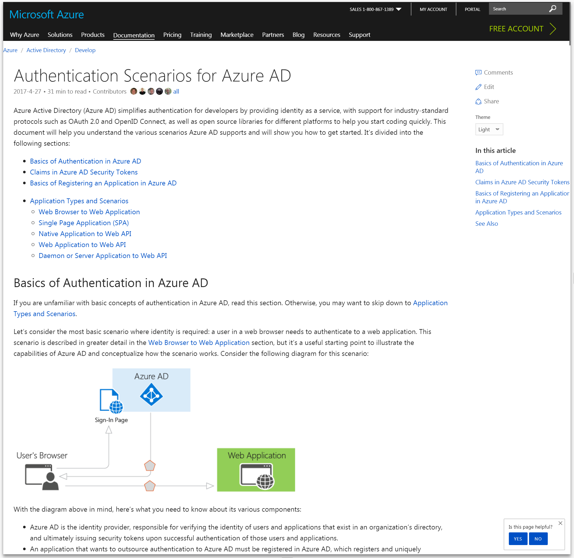
I want to remove the left column in the azure help page and expand the main body to make it cover the widht of the screen. The first part can easily be done by this

#sidebarContent {display:none}

How ever the second part must conver this

media (max-width: 1199.99999px)

to this

media (max-width: 100%)

But I have no idea how to do that using stylish.. ideas?

abbood
  • 23,101
  • 16
  • 132
  • 246

1 Answers1

1

To override a media query you just need to load another media query - that also applies to your device - after it.

Well...you want a blunt media query that applies to everything. The best way is to use @media (min-width: 1px) since that includes all devices.

Now, put it all together - along with some other CSS cleanups like padding and margin removal and setting a new width for .mainContainer and you get this

#sidebar {
    display: none;
}
@media (min-width: 1px) {
    .mainContainer {
        margin: 0 auto;
        width: 100vw;
        padding: 0;
    }
    body>.container {
    padding: 0;
}
}

New code: (with different selector for width)

#sidebar {
    display: none;
}
@media (min-width: 1px) {
    .mainContainer { /*example styles*/
        margin: 0 auto;
        width: 100vw;
    }
    body>.container {
    padding: 0;
}
    body>.mainContainer>main {
    max-width: 100vw!important;

}
}

You still have to adjust the padding to your preference as setting the padding to 0 breaks the design a little bit but this should be good starting point.

Before: enter image description here

After: enter image description here

I haz kode
  • 1,587
  • 3
  • 19
  • 39
  • there are still margins on the side.. i need it to cover 100% width of the screen.. – abbood Jul 19 '17 at 06:46
  • as i advertised for it here > https://userstyles.org/styles/145425/azure-help-expander – abbood Jul 19 '17 at 06:48
  • the above can be achieved if i manually override max-width to 100% but using chrome devtools.. rather than stylish itself – abbood Jul 19 '17 at 06:48
  • @abbood I edited the answer. You have to find the right selectors to override and then add them to the media query I put in the answer. My answer is not about finding the selectors, it's about **how to override the default media queries**. – I haz kode Jul 19 '17 at 06:58