When dealing with images of various sizes I always opt for setting the image URL in CSS rather than an IMG tag. The IMG tag is very limiting in terms of telling the browser how to render it in a container. In CSS you have far greater control.
So if you use background-image: url('{path/url}'); in your CSS then you can now use background-size: cover; or background-size: contain;
background-image: url('{path/url}')
background-size: cover;
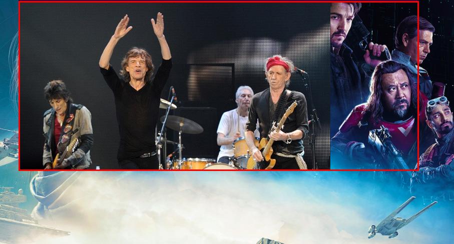
cover: Scale the background image to be as large as possible so that the background area is completely covered by the background
image. Some parts of the background image may not be in view within
the background positioning area
contain: Scale the image to the largest size such that both its width and its height can fit inside the content area
You can also control where the image is centered via
image-position: center; // or %50 %50 or 100px 10px, etc, etc
I find that cover really shines when responsiveness is a requirement of your site/app.
.image {
  background-image: url('http://coolwildlife.com/wp-content/uploads/galleries/post-3004/Fox%20Picture%20003.jpg');
  height: 340px;
  background-repeat: no-repeat;
  background-position: center;
}

.image.contain {
  background-size: contain;
}

.image.cover {
  background-size: cover;
}
<h3>Cover</h3>
<div class="container" style="width: 800px">
  <div class="row">
    <div style="
      height:340px;
      width: 100%;
      overflow: hidden;
      border: 3px solid red;
      ">
      <div class="image cover"></div>
    </div>
  </div>
</div>
<hr/>
<h3>Contain</h3>
<div class="container" style="width: 800px">
  <div class="row">
    <div style="
      height:340px;
      width: 100%;
      overflow: hidden;
      border: 3px solid red;
      ">
      <div class="image contain"></div>
    </div>
  </div>
</div>