While testing my website on an iOS device I realized that a particular transition, which I used to animate the changing of a div's background-color, looked very jittery on it. At first I thought it was the device's fault, but when I later tested on a few other, newer devices the result was the same.
I did some research and discovered that this is a well known problem, and that all I need to do to improve the animation quality is to coax iOS into enabling hardware acceleration. This answer showed me how:
-webkit-transform: translate3d(0, 0, 0);
Adding this style to the the div completely smoothed out the transition. However, it had the unintended side-effect making all elements that had position: fixed to stop working properly, and instead behave as if they had position: absolute instead.
Here is an screenshot of my page, slightly scrolled down, viewed on an iPad without the style:
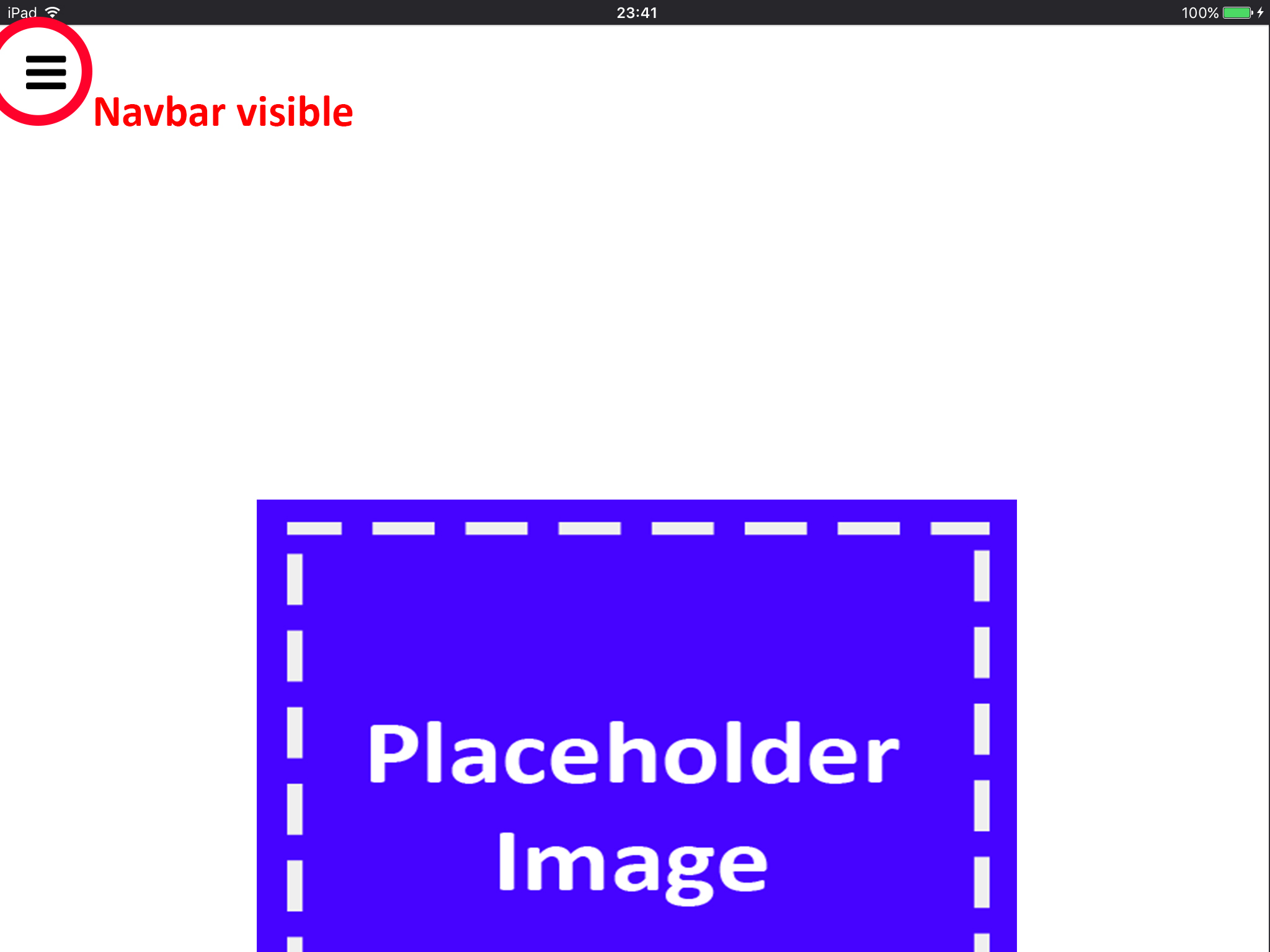
And here is a screenshot of the page scrolled down the same amount, but with the style:

The nav is, in fact, still there. You just have to scroll up to see it. It is no longer fixed to the viewport.
Here is a demo which demonstrates the bug in action:
html,
body {
    width:100%;
    height:100%;
    margin:0;
    padding:0;
    transform: translate3d(0, 0, 0);
}

#nav{
    width:100%;
    height:10%;
    position:fixed;
    top:0;
    left:0;
    background-color:red;
}

#content {
    width:100%;
    height:500%;
}
<!DOCTYPE html>
<html>
<body>
<nav id="nav">
</nav>
<main id="content">
</main>
</body>
</html>The red nav should be visible even after scrolling down. Depending on your browser, this may or may not work properly as is. Removing the problematic -webkit-transform: translate3d(0, 0, 0); style makes it work properly across all browsers.
This is one of several threads I found which confirm my suspicion of this not being case-specific. Any page with this style and position: fixed doesn't work properly.
So my question is, how can I enable hardware acceleration and at the same time have elements with position: fixed function properly?