0

So I have spent a lot of time trying to figure this out but nothing works. I have divs, and I want to have 3 in each row, but centered. I have tried selecting the 4th div and putting it onto a new line, but that doesn't work.

I tried to read the guide, but don't quite understand it. If someone can help me out and explain it, so I know what I did wrong, that would be much appreciated.

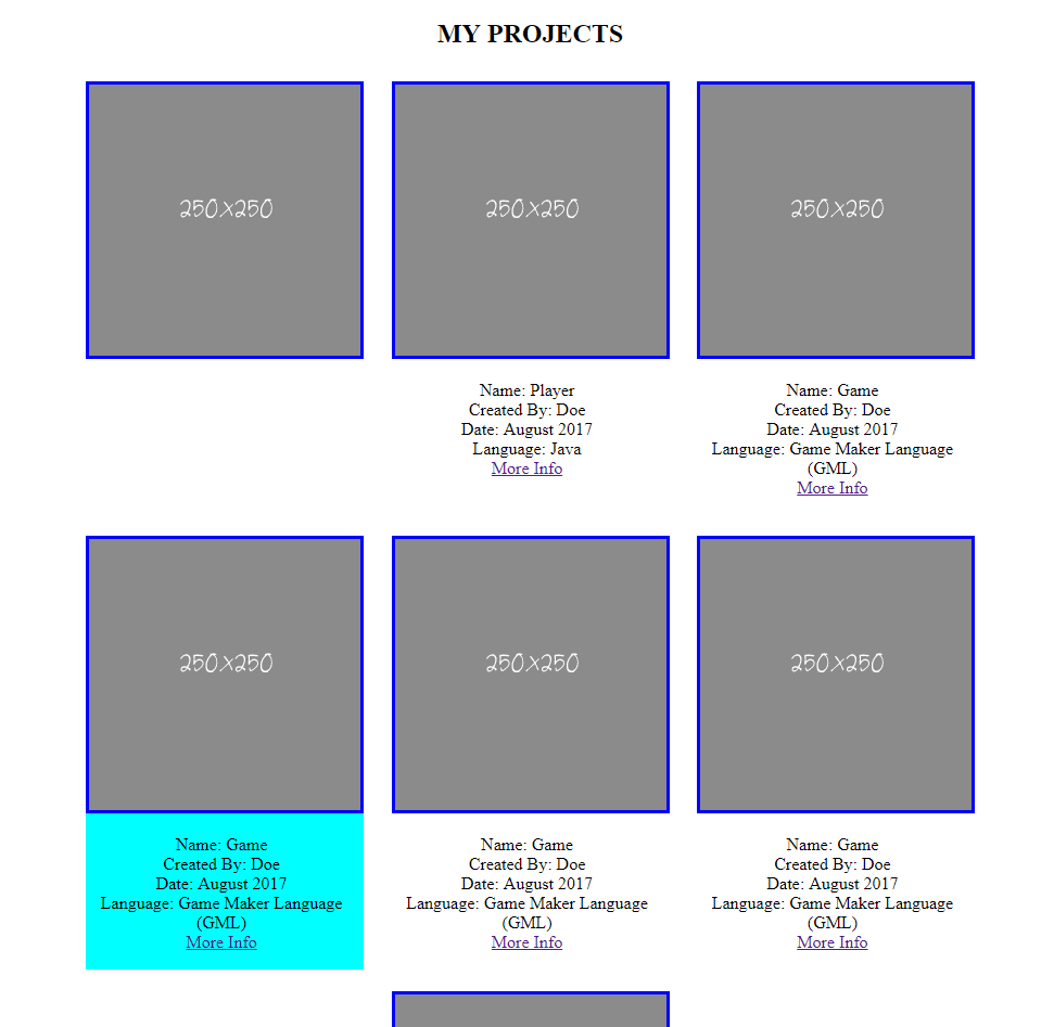
The image below is what I want on full screen devices; I want to always have 3 columns in each row.

What I want to have on full screen devices (desktops e.g)

/* general styles */

body {
  margin: 0;
}

h2 {
  text-align: center;
  text-decoration: overline underline;
  text-decoration-color: #fff;
}

.col li {
  list-style-type: none;
}

.group:before,
.group:after {
  content: "";
  display: table;
}

.group:after {
  clear: both;
  /* these styles are called a clearfix (look it up) */
}


/* grid layout with flexbox */

.portfolio-col {
  display: flex;
  justify-content: center;
  flex-wrap: wrap;
}

.col {
  margin: 1% 1.3%;
  /* equally space our boxes, instead of different left and right margins; specific numbers you can adjust */
  flex-shrink: 0;
  box-sizing: border-box;
  justify-content: center;
}

.col ul {
  padding-left: 0;
  text-align: center;
  width: 100%;
  max-width: 250px;
  /* same width and max-width as our images */
}

.col img {
  border-style: solid;
  border-color: blue;
  width: 100%;
  height: 100%;
  max-width: 250px;
  max-height: 250px;
}

.col:nth-child(4) {
  background-color: aqua;
  margin-left: 30%;
  flex-direction: column;
  flex-wrap: wrap;
  margin: auto;
  justify-content: center;
}
<section class="port-folio" id="portfolio">
  <div class="container">
    <h2>MY PROJECTS</h2>
    <div class="portfolio-col">
      <div class="col span_1_of_3">
        <img src="https://swords.cc/lotzine/250x250.gif" alt="Smiley face">
        <ul class="project-info">
        </ul>
      </div>
      <div class="col span_1_of_3">
        <img src="https://swords.cc/lotzine/250x250.gif" alt="Smiley face">
        <ul class="project-info">
          <li>Name: Player</li>
          <li>Created By: Doe</li>
          <li>Date: August 2017</li>
          <li>Language: Java</li>
          <li><a href="">More Info</a></li>
        </ul>
      </div>
      <div class="col span_1_of_3">
        <img src="https://swords.cc/lotzine/250x250.gif" alt="Smiley face">
        <ul class="project-info">
          <li>Name: Game</li>
          <li>Created By: Doe</li>
          <li>Date: August 2017</li>
          <li>Language: Game Maker Language (GML)</li>
          <li><a href="">More Info</a></li>
        </ul>
      </div>
      <br>
      <div class="col span_1_of_3">
        <img src="https://swords.cc/lotzine/250x250.gif" alt="Smiley face">
        <ul class="project-info">
          <li>Name: Game</li>
          <li>Created By: Doe</li>
          <li>Date: August 2017</li>
          <li>Language: Game Maker Language (GML)</li>
          <li><a href="">More Info</a></li>
        </ul>
      </div>
    </div>
  </div>
</section>
Michael Benjamin
  • 346,931
  • 104
  • 581
  • 701
Cmi
  • 479
  • 2
  • 5
  • 12

3 Answers3

1

You only need to change 2 properties and add 2 to make that work.

If you change to justify-content: space-around; in the .portfolio-col rule, and add margin: 0 auto; max-width: 850px;, you'll get 3 columns in a row, always centered on bigger screens.

.portfolio-col {
  display: flex;
  justify-content: space-around;        /* changed */
  flex-wrap: wrap;

  margin: 0 auto;                       /* added */
  max-width: 850px;                     /* added, 3 * 250px + margin/gutter */
}

Since it is not recommended to use percent for paddings/margins in combination with Flexbox (buggy behavior), I changed the top/bottom margin in .col from 1% to 1vh (Viewport-percentage units), and as we use space-around on the .portfolio-col, no need for a left/right margin, so I set it to 5px so they break to new line on narrower screens before their edges comes to close

.col {
  margin: 1vh 5px;                      /* changed */
  flex-shrink: 0;
  box-sizing: border-box;
}

Note, I also removed the <br> you had in your markup and some properties on amongst other the .col:nth-child(4) rule

Stack snippet

/* general styles */

body {
  margin: 0;
}

h2 {
  text-align: center;
  text-decoration: overline underline;
  text-decoration-color: #fff;
}

.col li {
  list-style-type: none;
}

.group:before,
.group:after {
  content: "";
  display: table;
}

.group:after {
  clear: both;
  /* these styles are called a clearfix (look it up) */
}


/* grid layout with flexbox */

.portfolio-col {
  display: flex;
  justify-content: space-around;
  flex-wrap: wrap;
  
  margin: 0 auto;
  max-width: 850px;
}

.col {
  margin: 1vh 5px;
  /* equally space our boxes, instead of different left and right margins; specific numbers you can adjust */
  flex-shrink: 0;
  box-sizing: border-box;
}

.col ul {
  padding-left: 0;
  text-align: center;
  width: 100%;
  max-width: 250px;
  /* same width and max-width as our images */
}

.col img {
  border-style: solid;
  border-color: blue;
  width: 100%;
  height: 100%;
  max-width: 250px;
  max-height: 250px;
}

.col:nth-child(4) {
  background-color: aqua;
}
<section class="port-folio" id="portfolio">
  <div class="container">
    <h2>MY PROJECTS</h2>
    <div class="portfolio-col">
      <div class="col span_1_of_3">
        <img src="http://swords.cc/lotzine/250x250.gif" alt="Smiley face">
        <ul class="project-info">
        </ul>
      </div>
      <div class="col span_1_of_3">
        <img src="http://swords.cc/lotzine/250x250.gif" alt="Smiley face">
        <ul class="project-info">
          <li>Name: Player</li>
          <li>Created By: Doe</li>
          <li>Date: August 2017</li>
          <li>Language: Java</li>
          <li><a href="">More Info</a></li>
        </ul>
      </div>
      <div class="col span_1_of_3">
        <img src="http://swords.cc/lotzine/250x250.gif" alt="Smiley face">
        <ul class="project-info">
          <li>Name: Game</li>
          <li>Created By: Doe</li>
          <li>Date: August 2017</li>
          <li>Language: Game Maker Language (GML)</li>
          <li><a href="">More Info</a></li>
        </ul>
      </div>
    </div>
  </div>
</section>
Asons
  • 84,923
  • 12
  • 110
  • 165
  • Okay just so I understand better, so you changed the justify-content to space-around because it gives you space on the left and right, correct? And the /* added, 3 * 750px + margin/gutter */ what is the margin/gutter? Are you doing 3(number of columns * by the width 250 which is 750) than adding 100 to it? I just want to know in case I ever want to say make a row with 2,4 or 8 columns or whatever. – Cmi Aug 23 '17 at 23:55
  • @Cmi Yes, that is correct. And I wrote 3 * 750px by mistake, should be 3 * 250px (updated my answer). And the extra 100 is to give space for the items, which also includes to make up for the 5px margin left/right set on `.col`. This means the extra 100 can't be less than (3 * 250px) + (3 * (5px + 5px)) or else there won't fit, in this case, 3 items in a row – Asons Aug 24 '17 at 05:22
0

Here's my working jsFiddle :)

*{ box-sizing: border-box; }

.port-folio h2{ text-align: center; }
.portfolio-col {
    text-align: center;
    overflow: hidden; 
    padding: 5px;
    clear: both;
}
.port-folio ul{ list-style: none; padding: 0; margin: 25px 0 0; }
.port-folio ul li{ display: block; }
.col{
   width: 31.33%;
   border: 1px solid black; 
   float: left;
   padding: 5px;
   margin: 15px 1%;
}
    <section class="port-folio" id="portfolio">
  <div class="container">
    <h2>MY PROJECTS</h2>
    <div class="portfolio-col">
      <div class="col span_1_of_3">
        <img src="https://swords.cc/lotzine/250x250.gif" alt="Smiley face">
        <ul class="project-info">
          <li>Name: Player</li>
          <li>Created By: Doe</li>
          <li>Date: August 2017</li>
          <li>Language: Java</li>
          <li><a href="">More Info</a></li>
        </ul>
      </div>
      <div class="col span_1_of_3">
        <img src="https://swords.cc/lotzine/250x250.gif" alt="Smiley face">
        <ul class="project-info">
          <li>Name: Game</li>
          <li>Created By: Doe</li>
          <li>Date: August 2017</li>
          <li>Language: Game Maker Language (GML)</li>
          <li><a href="">More Info</a></li>
        </ul>
      </div>
      <br>
      <div class="col span_1_of_3">
        <img src="https://swords.cc/lotzine/250x250.gif" alt="Smiley face">
        <ul class="project-info">
          <li>Name: Game</li>
          <li>Created By: Doe</li>
          <li>Date: August 2017</li>
          <li>Language: Game Maker Language (GML)</li>
          <li><a href="">More Info</a></li>
        </ul>
      </div>
      <div class="col span_1_of_3">
        <img src="https://swords.cc/lotzine/250x250.gif" alt="Smiley face">
        <ul class="project-info">
          <li>Name: Game</li>
          <li>Created By: Doe</li>
          <li>Date: August 2017</li>
          <li>Language: Game Maker Language (GML)</li>
          <li><a href="">More Info</a></li>
        </ul>
      </div>
    </div>
  </div>
</section>

Hope that helps. :)

bellabelle
  • 908
  • 7
  • 13
0
h2 {
      text-align: center;

    }

    .col li {
      list-style-type: none;
    }

    .portfolio-col {
      display: flex;
      flex-wrap: wrap;
    }

    .col {
        align-items: center;
         box-sizing: border-box;
        display: flex;
        flex: 1 0 28%;
        flex-direction: column;
        margin: 1% 1.3%;

    }

    .col ul {
      padding-left: 0;
      text-align: center;
      width: 100%;
      max-width: 250px;
      }
    .col img {
      border-style: solid;
      border-color: blue;
      width: 100%;
      height: 100%;
      max-width: 250px;
      max-height: 250px;
    }
Lekhraj
  • 455
  • 4
  • 9