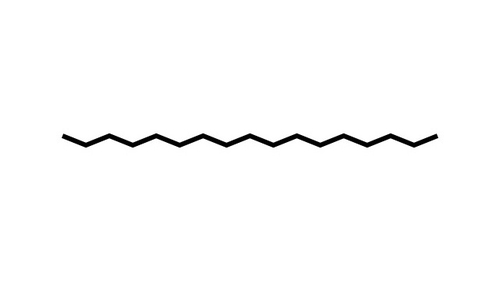
To implement a seek bar like that you can re-template a Slider control. You will also need to extend Border or similar control to use above image as Background or simply draw this line using Polyline as track-bar.
For example:
public class ZigZagBorder : Border
{
    protected override void OnRenderSizeChanged(SizeChangedInfo sizeInfo)
    {
        base.OnRenderSizeChanged(sizeInfo);

        var zigzag = new Polyline()
        {
            Stroke = Brushes.Black,
            StrokeThickness = 2
        };
        var points = new PointCollection();
        for (int i = 0; i < ActualWidth - 5; i = i + 5)
        {
            points.Add(
                new Point(
                    i,
                    (i % 2 == 0 ? 5 : 10)
                 ));
        }

        zigzag.Points = points;
        RenderOptions.SetEdgeMode(this, EdgeMode.Aliased);
        Child = zigzag;
    }
}
Sample usage would look like:
<Window.Resources>

    <Style x:Key="LeftRepeatButton" TargetType="RepeatButton">
        <Setter Property="SnapsToDevicePixels" Value="true" />
        <Setter Property="OverridesDefaultStyle" Value="true" />
        <Setter Property="IsTabStop" Value="false" />
        <Setter Property="Focusable" Value="false" />
        <Setter Property="Template">
            <Setter.Value>
                <ControlTemplate TargetType="RepeatButton">
                    <Border Background="Transparent" />
                </ControlTemplate>
            </Setter.Value>
        </Setter>
    </Style>

    <Style x:Key="RightRepeatButton" TargetType="RepeatButton">
        <Setter Property="SnapsToDevicePixels" Value="true" />
        <Setter Property="OverridesDefaultStyle" Value="true" />
        <Setter Property="Template">
            <Setter.Value>
                <ControlTemplate TargetType="RepeatButton">
                    <Border  Background="White" Opacity="0.75" />
                </ControlTemplate>
            </Setter.Value>
        </Setter>
    </Style>

    <Style x:Key="SliderThumb" TargetType="Thumb">
        <Setter Property="SnapsToDevicePixels" Value="true" />
        <Setter Property="OverridesDefaultStyle" Value="true" />
        <Setter Property="Template">
            <Setter.Value>
                <ControlTemplate TargetType="Thumb">
                    <StackPanel Orientation="Vertical">
                        <Path Data="M 0 0 L 8 0 L 4 6 Z"  Stroke="Black" Margin="-2,0,0,0" StrokeThickness="2" Fill="Black"></Path>
                        <Line X1="0" Y1="0" X2="0" Y2="3" Stroke="Black" StrokeThickness="1" Margin="2,0,0,0" StrokeDashArray="1.5,1.5"></Line>
                    </StackPanel>
                </ControlTemplate>
            </Setter.Value>
        </Setter>
    </Style>

    <ControlTemplate x:Key="Slider"  TargetType="Slider">
        <Grid>
            <Grid.RowDefinitions>
                <RowDefinition Height="Auto" />
                <RowDefinition Height="Auto" MinHeight="{TemplateBinding MinHeight}" />
                <RowDefinition Height="Auto" />
            </Grid.RowDefinitions>
            <TickBar x:Name="TopTick" SnapsToDevicePixels="True" Grid.Row="0" Placement="Top" Visibility="Collapsed"/>
            <local:ZigZagBorder x:Name="TrackBackground" VerticalAlignment="Center" Margin="0" Height="20" Grid.Row="1" />
            <Track Grid.Row="1" x:Name="PART_Track" Margin="0,-2,0,0"  >
                <Track.DecreaseRepeatButton>
                    <RepeatButton Style="{StaticResource LeftRepeatButton}"  Command="Slider.DecreaseLarge" />
                </Track.DecreaseRepeatButton>
                <Track.Thumb>
                    <Thumb Style="{StaticResource SliderThumb}" Margin="0,-5,0,0" />
                </Track.Thumb>
                <Track.IncreaseRepeatButton>
                    <RepeatButton Style="{StaticResource RightRepeatButton}" Command="Slider.IncreaseLarge" />
                </Track.IncreaseRepeatButton>
            </Track>
            <TickBar x:Name="BottomTick" SnapsToDevicePixels="True" Grid.Row="2" Placement="Bottom" Visibility="Collapsed" />
        </Grid>
        <ControlTemplate.Triggers>
            <Trigger Property="TickPlacement"  Value="TopLeft">
                <Setter TargetName="TopTick" Property="Visibility"  Value="Visible" />
            </Trigger>
            <Trigger Property="TickPlacement" Value="BottomRight">
                <Setter TargetName="BottomTick"  Property="Visibility"  Value="Visible" />
            </Trigger>
            <Trigger Property="TickPlacement" Value="Both">
                <Setter TargetName="TopTick" Property="Visibility" Value="Visible" />
                <Setter TargetName="BottomTick" Property="Visibility" Value="Visible" />
            </Trigger>
        </ControlTemplate.Triggers>
    </ControlTemplate>

    <Style x:Key="Horizontal_Slider" TargetType="Slider">
        <Setter Property="Focusable" Value="False"/>
        <Setter Property="SnapsToDevicePixels" Value="true" />
        <Setter Property="OverridesDefaultStyle" Value="true" />
        <Style.Triggers>
            <Trigger Property="Orientation" Value="Horizontal">
                <Setter Property="MinHeight" Value="30" />
                <Setter Property="MinWidth" Value="200" />
                <Setter Property="Template" Value="{StaticResource Slider}" />
            </Trigger>
        </Style.Triggers>
    </Style>
</Window.Resources>
<Grid x:Name="Panel1" Margin="20">
    <Slider Style="{StaticResource Horizontal_Slider}" VerticalAlignment="Center" TickFrequency="1" Minimum="0" Maximum="100"></Slider>
</Grid>
This sample controls the opacity on progress/seek bar by modifying these values in RepeatButton(s) templates - i.e. LeftRepeatButton, and RightRepeatButton
References:
- Draw zig-zag line using poly
- Custom track/slider template
