Try the following code:
OPTION 1: PURE CSS
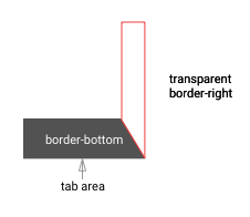
The logic of this approach is to add a thick border-bottom and a thick transparent border-right to achieve a tab effect;
- PROS: very minimal styling and very easy to understand.
- CONS: very limited in terms of customisation (i.e. can't add border to the tab)
.tabs {
  display: flex;
  flex-direction: row;
}

.tab {
    height: 0;
    width: 120px;
    border-bottom: 50px solid #CCCCCC;
    border-right: 20px solid transparent;
    border-top-left-radius: 5px;
    box-sizing: border-box;
    display: block;
}

.tab:not(:first-child) {
    margin-left: -10px;
    z-index: 0;
}

.tab .label{
  padding: 15px;
  text-align: center;
  color: #444444;
}

.active {
  border-bottom: 50px solid #444444;
  z-index: 10;
}
.active .label{
  color: #ffffff;
}
<div class="tabs">
<div class="tab active"><div class="label">TAB 1</div></div>
<div class="tab"><div class="label">TAB 2</div></div>
<div class="tab"><div class="label">TAB 3</div></div>
</div>
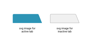
OPTION 2: USE SVG AS TAB BACKGROUND
The logic of this approach is to use two separate vector images (svg) as inline background image:
- PROS: very customisable; can add border to tab, can add gradient
background to tab.
- CONS: requires basic knowledge on svg.
.tabs {
  display: flex;
  flex-direction: row;
  overflow: visible;
  padding-left: 15px;
}

.tab {
    height: 0;
    width: 130px;
    height: 38px;
    margin-left: -15px;
    z-index: -1;
    cursor: pointer;
    background-size: contain;
    background: transparent url("data:image/svg+xml;utf8,<svg   xmlns='http://www.w3.org/2000/svg' width=\"121px\" height=\"38px\" viewBox=\"0 0 121 38\"><path d=\"M0.786477689,37.3880765 L0.786477689,5 L0.786477689,5 C0.786477689,2.790861 2.57733869,1 4.78647769,1 L102.838012,1 L102.838012,1 C104.471746,1 105.941285,1.99354246 106.549997,3.50964209 L120.152151,37.3880765 L0.786477689,37.3880765 Z\" stroke=\"#979797\" fill=\"#F0F0F0\"></path></svg>") no-repeat;
}

.tab .label{
  box-sizing: border-box;
  padding: 12px;
  text-align: center;
  color: #444444;
  font: 13px arial, sans-serif;
  width: 90%;
}

.active {
  background: transparent url("data:image/svg+xml;utf8,<svg   xmlns='http://www.w3.org/2000/svg' width=\"121px\" height=\"38px\" viewBox=\"0 0 121 38\"><path d=\"M0.786477689,37.3880765 L0.786477689,5 L0.786477689,5 C0.786477689,2.790861 2.57733869,1 4.78647769,1 L102.838012,1 L102.838012,1 C104.471746,1 105.941285,1.99354246 106.549997,3.50964209 L120.152151,37.3880765 L0.786477689,37.3880765 Z\" stroke=\"#2D94B5\" fill=\"#2D94B5\"></path></svg>") no-repeat;
  z-index: 10;
}
.active .label{
  color: #ffffff;
}
<div class="tabs">
<div class="tab"><div class="label">TAB 1</div></div>
<div class="tab"><div class="label">TAB 2</div></div>
<div class="tab active"><div class="label">TAB 3</div></div>
<div class="tab"><div class="label">TAB 4</div></div>
</div>
If you want to change the colours of background (fill) and border (stroke), just analyse the .tab and .active class, look for background property and search/edit the following on the inline svg:
- for normal tab:
stroke=\"#979797\" fill=\"#F0F0F0\"
- for active tab:
stroke=\"#2D94B5\" fill=\"#2D94B5\"
Hope it helps you
