5

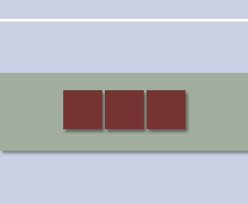
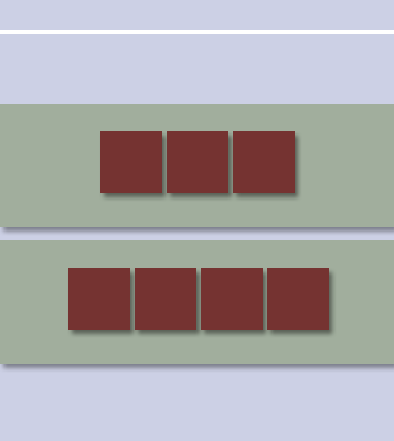
I have a simple webpage with a .topnav bar and a .container with a few elements in it. I am trying to center just the .container, not .topnav, within the body of the page so that it will be vertically centered. However, when I've tried styling body with:

display:flex;
align-items:center;
justify-content:center;

Both the .topbar and .container are centered. How do I go about centering just the .container vertically?

body,
html {
  height: 100%;
}

.contact_box {
  text-align: center;
  background-color: red;
  border: 1px solid #c0c0c0;
  border-radius: 5px;
  height: 20em;
  width: 25em;
  box-shadow: 1px 1px 6px #757677;
  float: left;
}

.contact_box img {
  margin-top: 3.3em;
  margin-bottom: 1.2em;
  height: 3em;
  width: 3em;
}

.contact_box h3 {
  color: #6d6d6d;
}

#contact .container {
  display: flex;
  align-items: center;
  justify-content: center;
}
<body id="contact">
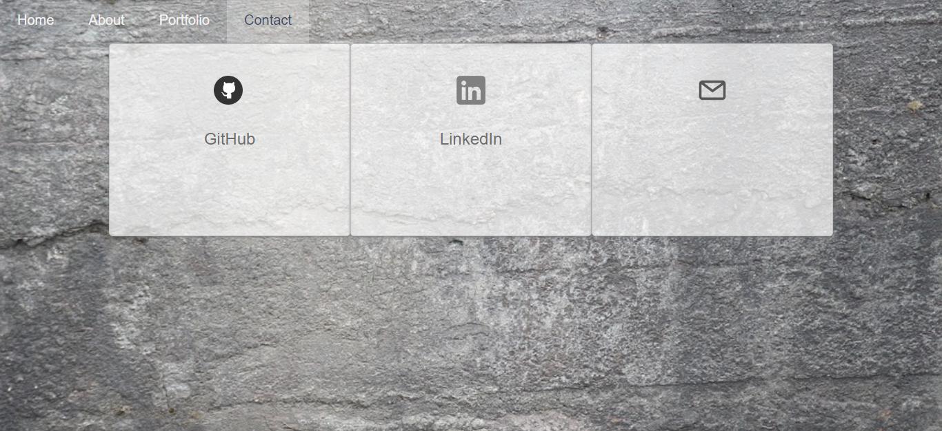
  <div class="topnav" id="myTopnav">
    <a href="index.html">Home</a>
    <a href="about.html">About</a>
    <a href="#" class="selected">Contact</a>
    <a class="icon" onclick="myFunction()">&#9776;</a>
  </div>

  <div class="container">
    <div class="row" id="contact_section">
      <div class="contact_box" class="col-md-4">
        <a href="https://github.com/" target="_blank"><img src="resources/github_logo.png" alt="Github"></a>
        <br>
        <h3>GitHub</h3>
      </div>

      <div class="contact_box" class="col-md-4">
        <a href="https://www.linkedin.com" target="_blank"><img src="resources/linkedin_logo.png" alt="LinkedIn"></a>
        <h3>LinkedIn</h3>
      </div>

      <div class="contact_box" class="col-md-4">
        <img src="resources/email_icon.png" alt="EMAIL">
        <h3>Email</h3>
      </div>
    </div>
  </div>
</body>

Here's how it looks now:

enter image description here

Michael Benjamin
  • 346,931
  • 104
  • 581
  • 701
nezdiro
  • 51
  • 3
  • Since you don't want flexbox behavior on your navbar, the simplest solution is probably to not put the navbar in the flexbox. – Daniel Beck Oct 20 '17 at 19:55
  • It doesn't look like the navbar is in the flexbox. Only the `.container` is set to `display:flex`. I'm confused. – showdev Oct 20 '17 at 19:57
  • 1
    Ah, you're right @showdev. I'm confused as well -- Nezdiro can you please clarify what you're asking? The code snippet you've posted here doesn't match your description of what's going wrong... – Daniel Beck Oct 20 '17 at 19:59
  • @DanielBeck it doesn't seem to be demonstrated in the code snippet result because the page is not larger than the elements, but on my web page the `contact_section` is being displayed directly under the navbar, not centered vertically on the page. I'll post a screenshot that may help clarify. – nezdiro Oct 20 '17 at 20:04

2 Answers2

3

Hi to align it vertically in the middle of the page, set the height of the container to be 100% of the viewport:

#contact .container {
    height:100vh;
    display:flex;
    align-items:center;
    justify-content:center;
}
Federico
  • 1,231
  • 9
  • 13
  • I like this answer! The only issue is that now the entire body is greater than the height of viewport, so the boxes only look centered when I scroll down below the navbar. The height of the navbar is 68px and I've tried setting the top of `.container` to `-68px`, but this doesn't seem to effect anything. – nezdiro Oct 20 '17 at 20:36
1

I think I see what you're looking for:
header at the top of the page and body below, with body contents centered vertically.

There are three flex systems in my example below:

The first sets up <body> as a vertical flex container with two items: .topnav and .container. The items are justified to the start of the flex container with justify-content: flex-start (this is the default anyway) and .container is allowed to grow to fill the flex container with flex-grow:1.

The second sets up .container as a vertical flex container with each .row as an item. Items are centered vertically and horizontally with justify-content: center and align-items: center, respectively.

The third sets up .row elements as horizontal flex containers (flex-direction: row is the default), with each .contact_box as an item. Items are centered horizontally with justify-content: center.

html {
  height: 100%;
}

body {
  margin: 0;
  min-height: 100%;
  display: flex;
  flex-direction: column;
  justify-content: flex-start;
}

.container {
  flex-grow: 1;
  display: flex;
  flex-direction: column;
  justify-content: center;
  align-items: center;
}

.row {
  display: flex;
  flex-direction: row;
  justify-content: center;
}

.contact_box {
  background-color: red;
  border: 1px solid #c0c0c0;
  border-radius: .5em;
  box-shadow: 1px 1px 6px #757677;
  padding: 1em 2em;
  text-align: center;
}

.contact_box h3 {
  margin: .25em 0 0;
}
<div class="topnav">
  <a href="#">Home</a>
  <a href="#">About</a>
  <a href="#" class="selected">Contact</a>
  <a class="icon">&#9776;</a>
</div>

<div class="container">

  <div class="row">

    <div class="contact_box">
      <a href="https://github.com/" target="_blank"><img src="resources/github_logo.png" alt="Github"></a>
      <br>
      <h3>GitHub</h3>
    </div>

    <div class="contact_box">
      <a href="https://www.linkedin.com" target="_blank"><img src="resources/linkedin_logo.png" alt="LinkedIn"></a>
      <h3>LinkedIn</h3>
    </div>

    <div class="contact_box">
      <img src="resources/email_icon.png" alt="EMAIL">
      <h3>Email</h3>
    </div>

  </div>

</div>

Like this, with each flex system a different color:

enter image description here

And if you added another .row, it might look like this:

enter image description here

showdev
  • 28,454
  • 37
  • 55
  • 73