1

I deeply appreciate the previous question and answers regarding 3D bar plot in R.

ggplot2 3D Bar Plot

However, the previous question and answers are not discussing how to plot "error bars" in the 3D plot.

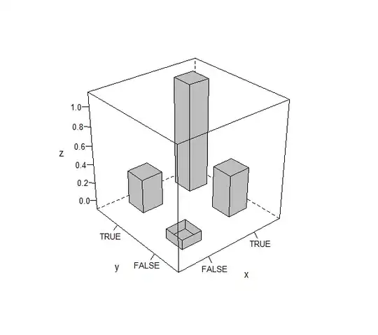
I am interested in ploting following type of data.

data = structure(list(x = structure(c(1L, 2L, 1L, 2L), .Label = c("FALSE", 
"TRUE"), class = "factor"), y = structure(c(1L, 1L, 2L, 2L), .Label = c("FALSE", 
"TRUE"), class = "factor"), z = c(-0.1, 0.44, 0.35, 1.14), asymp.LCL = c(-0.11, 
0.35, 0.28, 0.94), asymp.UCL = c(-0.09, 0.54, 0.42, 1.34)), .Names = c("x", 
"y", "z", "asymp.LCL", "asymp.UCL"), row.names = c(NA, 4L), class = "data.frame")


data
      x     y     z asymp.LCL asymp.UCL
1 FALSE FALSE -0.10     -0.11     -0.09
2  TRUE FALSE  0.44      0.35      0.54
3 FALSE  TRUE  0.35      0.28      0.42
4  TRUE  TRUE  1.14      0.94      1.34

The answer from the previous question will produce a 3D bar plot "without error bars."

library(latticeExtra)
cloud(z~x+y, data = data, panel.3d.cloud=panel.3dbars, col.facet='grey', 
      xbase=0.4, ybase=0.4, scales=list(arrows=FALSE, col=1), 
      par.settings = list(axis.line = list(col = "transparent")))

image generated with library latticeExtra

I would also appreciate if there is any other solution without using the library latticeExtra.

Please let me know any advice.

Thanks.

neilfws
  • 32,751
  • 5
  • 50
  • 63
mkim
  • 11
  • 3
  • 4
    Just my opinion, but if you add also errorbars to that plot it will highly probaly become quite hard to digest for your readers. Maybe consider a faceted or a dodgled bar-plot. – Jaap Oct 25 '17 at 06:37
  • 1
    I strongly recommend a simple 2D plot like: `library(ggplot2); ggplot(d, aes(x, z, ymin = asymp.LCL, ymax = asymp.UCL, fill = y)) + geom_col(position = position_dodge(0.75), width = 0.75) + geom_errorbar(position = position_dodge(0.75), width = 0.5)` – Axeman Oct 25 '17 at 07:03
  • 1
    Or `ggplot(d, aes('a', z, ymin = asymp.LCL, ymax = asymp.UCL)) + geom_col() + geom_errorbar(width = 0.5) + facet_grid(x~y, labeller = label_both)` – Axeman Oct 25 '17 at 07:06
  • @ Jaap @ Axeman: Thanks for your advice. I agree that usually 2D plots can be better representations. Faceted plot could be a very good alternative. However, my models have naturally perpendicular axes, and my boss wants to check them with 3D plots. – mkim Oct 25 '17 at 19:29
  • Please let me know if anyone has any other suggestion. Thanks a lot. – mkim Oct 25 '17 at 19:29

1 Answers1

0

I've learned to how to add layers in the library latticeExtra.

data = structure(list(x = structure(c(1L, 2L, 1L, 2L), .Label = c("FALSE", 
"TRUE"), class = "factor"), y = structure(c(1L, 1L, 2L, 2L), .Label = c("FALSE", 
"TRUE"), class = "factor"), z = c(-0.1, 0.44, 0.35, 1.14), asymp.LCL = c(-0.11, 
0.35, 0.28, 0.94), asymp.UCL = c(-0.09, 0.54, 0.42, 1.34), asymp.interval = c(0.024, 
0.191, 0.144, 0.402), SE = c(0.006, 0.049, 0.037, 0.103), z_SE = c(-0.094, 
0.489, 0.387, 1.243)), .Names = c("x", "y", "z", "asymp.LCL", 
"asymp.UCL", "asymp.interval", "SE", "z_SE"), row.names = c(NA, 
-4L), class = "data.frame")
zlim = c(-1, 2)

cloud(z~x+y, data = data, panel.3d.cloud=panel.3dbars, col.facet ='grey',
      xbase=0.4, ybase=0.4, scales=list(arrows=FALSE, col="black"),
      par.settings = list(axis.line = list(col = "transparent"))
      , zlim = zlim) +
    as.layer(cloud(
        z_SE~x+y, data = data, col ='black',
        par.settings = list(axis.line = list(col = "transparent"))
        , zlim = zlim, xlab = NULL, ylab = NULL, zlab = NULL
    )) +
    as.layer(cloud(
        value~x+y, data = bind_rows(select(data, x, y), gather((data %>% select(x, y, z, z_SE))[1,], z, z_SE, key = "key", value = "value"))
        , col ='black', panel.3d.cloud = panel.3dscatter, type = "l"
        , par.settings = list(axis.line = list(col = "transparent"))
        , zlim = zlim, xlab = NULL, ylab = NULL, zlab = NULL
    )) +
    as.layer(cloud(
        value~x+y, data = bind_rows(select(data, x, y), gather((data %>% select(x, y, z, z_SE))[2,], z, z_SE, key = "key", value = "value"))
        , col ='black', panel.3d.cloud = panel.3dscatter, type = "l"
        , par.settings = list(axis.line = list(col = "transparent"))
        , zlim = zlim, xlab = NULL, ylab = NULL, zlab = NULL
    )) +
    as.layer(cloud(
        value~x+y, data = bind_rows(select(data, x, y), gather((data %>% select(x, y, z, z_SE))[3,], z, z_SE, key = "key", value = "value"))
        , col ='black', panel.3d.cloud = panel.3dscatter, type = "l"
        , par.settings = list(axis.line = list(col = "transparent"))
        , zlim = zlim, xlab = NULL, ylab = NULL, zlab = NULL
    )) +
    as.layer(cloud(
        value~x+y, data = bind_rows(select(data, x, y), gather((data %>% select(x, y, z, z_SE))[4,], z, z_SE, key = "key", value = "value"))
        , col ='black', panel.3d.cloud = panel.3dscatter, type = "l"
        , par.settings = list(axis.line = list(col = "transparent"))
        , zlim = zlim, xlab = NULL, ylab = NULL, zlab = NULL
    ))

enter image description here

Please let me know if you know any other solution.

Thanks.

mkim
  • 11
  • 3