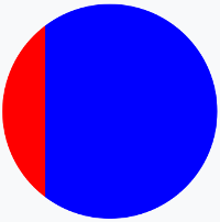
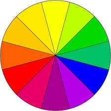
CSS Tricks has a post about conic gradients that describes the "colorful umbrella" as an intermediate step, which looks perfect for your use. I've put it together into a Code Pen for convenience.
HTML:
<div class="wheel">
  <ul class="umbrella">
    <li class="color"></li>
    <li class="color"></li>
    <li class="color"></li>
    <li class="color"></li>
    <li class="color"></li>
    <li class="color"></li>
    <li class="color"></li>
    <li class="color"></li>
    <li class="color"></li>
    <li class="color"></li>
    <li class="color"></li>
    <li class="color"></li>
  </ul>
</div>
SCSS:
@mixin circle($size) {
  content: "";
  position: absolute;
  border-radius: 50%;
  width: $size;
  height: $size;
  left: calc(50% - #{$size/2});
  top: calc(50% - #{$size/2});
}

$wheel: 15em;
.color {
  @include circle($wheel);
  clip: rect(0, $wheel, $wheel, #{$wheel/2});
  &:after {
    @include circle($wheel);
    background: blue;
    clip: rect(0, #{$wheel/2}, $wheel, 0);
    transform: rotate(45deg);
  }
}

.color, .color:nth-child(n+7):after {
  clip: rect(0, $wheel, $wheel, #{$wheel/2});
}
.color:after, .color:nth-child(n+7) {
  @include circle($wheel);
  clip: rect(0, #{$wheel/2}, $wheel, 0);
}

$colors: (#9ED110, #50B517, #179067, #476EAF, #9f49ac, #CC42A2, #FF3BA7, #FF5800, #FF8100, #FEAC00, #FFCC00, #EDE604);
@for $i from 0 to length($colors) {
  .color:nth-child(#{1+$i}):after {
    background-color: nth($colors, $i+1);
    @if $i < 6 {
      transform: rotate(#{30*(1+$i)}deg);
      z-index: #{length($colors)-$i};
    } @else {
      transform: rotate(#{-30+(30*(1+$i))}deg);
    }
  }
}
As a side note, if your only issue with background images is the scaling issue, keep in mind that SVG images scale smoothly, since they're basically vector graphics. (You'd have to draw that manually, but the image would scale.)