1

I think this question might be considered rather "noobish", but I'd like to know why my flexboxes look completely different in firefox. What did I forget Any help is greatly appreciated. I'm afraid it's something really simple what I missed

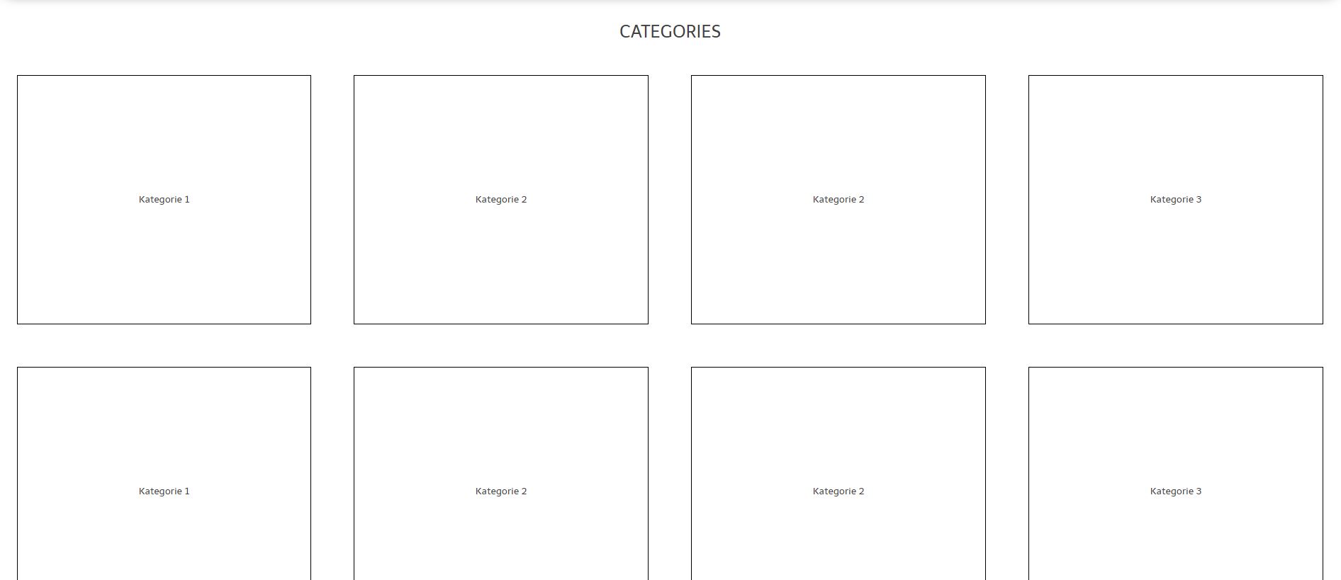
That's how it looks:

Chrome: Chrome

Firefox: enter image description here
My Code:

CSS:

.flex-container {
  padding: 0;
  margin: 0;
  width: 100%;
  height: 100%;
  list-style: none;
  display: -webkit-box;
  display: -moz-box;
  display: -ms-flexbox;
  display: -webkit-flex;
  display: flex;
 -webkit-flex-flow: row;
  justify-content: space-around;
  line-height: 30px;
}
.flex-item {
    border: 1px solid black;
    margin: 30px;
    /* max-width: 350px; */
    max-height: 350px;
    min-height: 72px;
    text-align: center;
    flex: 1 0 auto;
    display: flex;
    align-items: center;
    justify-content: center;
}

HTML:

<div class="flex-container">
    <div class="flex-item">
        <div id="catBox">
            Kategorie 1
        </div>
    </div>

    <div class="flex-item">
        <div id="catBox">
            Kategorie 2
        </div>
    </div>

    <div class="flex-item">
        <div id="catBox">
            Kategorie 2
        </div>
    <div class="flex-item">
        <div id="catBox">
            Kategorie 3
        </div>
</div>
floreich
  • 187
  • 2
  • 16
  • Actually, it's rendering exactly like it should. Since, the min-height of the given flex-item is 72px and the text is small enough that it doesn't need to expand. If you want it to have a higher height, change the min-height or rather set a height instead. –  Dec 16 '17 at 18:11
  • It's rendering exactly the same on chrome and firefox taking the min-height value. –  Dec 16 '17 at 18:17
  • But how to keep it responsive then ? – floreich Dec 16 '17 at 18:18
  • What are you expecting exactly? The 1st output or the 2nd? And both are responsive from what it seems, its just that your min-height value is taken into account. Just increase it. –  Dec 16 '17 at 18:20
  • I'm expecting the Chrome output – floreich Dec 16 '17 at 18:35
  • If I set a min height it's not going to be responsive – floreich Dec 16 '17 at 18:35
  • Using flexbox you can either make it responsive row-wise or column-wise. Since they are already responsive in a row fashion. You can make use of height in vh units to make them responsive in height. –  Dec 16 '17 at 18:36
  • vh units are what ? and How would i go about that ? – floreich Dec 16 '17 at 18:41
  • I posted a demonstration but using vw and vh is risky as it could mess up the alignment of flexbox to not wrap. –  Dec 16 '17 at 18:44
  • Current Chrome and FF render the same. But try this: Instead of `height: 100%` use `height: 100vh`. Here's the explanation: https://stackoverflow.com/questions/31728022/why-is-percentage-height-not-working-on-my-div/31728799#31728799 – Michael Benjamin Dec 16 '17 at 18:45
  • 1
    I'd suggest you fix a min-height to an absolute value and make the width responsive, using flexbox to make the height responsive isn't really what its intended for specially when you're aligning in a row wise manner. –  Dec 16 '17 at 18:46

2 Answers2

1

Here's a demonstration.

.flex-container {
  padding: 0;
  margin: 0;
  width: 100%;
  height: 100%;
  list-style: none;
  display: -webkit-box;
  display: -moz-box;
  display: -ms-flexbox;
  display: -webkit-flex;
  display: flex;
  -webkit-flex-flow: row;
  justify-content: space-around;
  line-height: 30px;
}

.flex-item {
  border: 1px solid black;
  margin: 20px;
  height:35vh;
  text-align: center;
  flex: 1;
}
<div class="flex-container">
  <div class="flex-item">
    <div id="catBox">
      Kategorie 1
    </div>
  </div>

  <div class="flex-item">
    <div id="catBox">
      Kategorie 2
    </div>
  </div>

  <div class="flex-item">
    <div id="catBox">
      Kategorie 3
    </div>
  </div>
  <div class="flex-item">
    <div id="catBox">
      Kategorie 4
    </div>
  </div>
</div>

<div class="flex-container">
  <div class="flex-item">
    <div id="catBox">
      Kategorie 1
    </div>
  </div>

  <div class="flex-item">
    <div id="catBox">
      Kategorie 2
    </div>
  </div>
  <div class="flex-item">
    <div id="catBox">
      Kategorie 3
    </div>
  </div>
  <div class="flex-item">
    <div id="catBox">
      Kategorie 4
    </div>
  </div>
</div>
0

Probably the reason is Firefox version you checked.

On 57.0.1 I see the same result.

Hello Folks
  • 149
  • 10