10

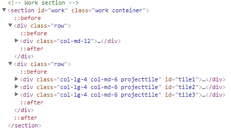
At the "My Work" section of this website: Website

something is causing it to be too wide.

When you hover over a project (or trigger the :hover state on the <div class="projectbox"> and look at the project icons (eye, github and images) the last project's "images" is what causing it I think.

However, I do not know why this is. Should I just remove the padding from these buttons? I feel like that's kind of not what you're supposed to be doing. (If the padding is even what's causing it to happen).

Relevant code:

Relevant code

Dylan
  • 323
  • 2
  • 5
  • 17

6 Answers6

26

Horizontal scrollbars are usually caused by using the Bootstrap grid incorrectly.

The solution proposed by Ben Goossens is a hack and should be avoided because it makes the use of Bootstrap pointless. Use Bootstrap as intended and you won't need any hacks or custom css gymnastics.

Here's what you need:

1) .container div

2) .row div

3) .col div

That's the "holy trinity" you need in order for the Bootstrap grid to work properly.

Always put all of your normal content into Bootstrap columns (which in turn go into a row, which goes into a container) and you won't have any horizontal scrollbar issues.

The Bootstrap rows are designed to work with columns together. If you leave one of those 2 out, you're gonna run into issues.

WebDevBooster
  • 14,674
  • 9
  • 66
  • 70
  • Yes that's what I thought. However adding the container that I removed earlier on, did not fix it. – Dylan Jan 11 '18 at 09:00
  • It's not just the container. A row is a container for columns. So, at least one column must go into a Bootstrap row. – WebDevBooster Jan 11 '18 at 09:01
  • 1
    Also, do NOT nest containers. Bootstrap containers aren't designed to be nested. You can nest rows and columns but not containers. – WebDevBooster Jan 11 '18 at 09:03
  • Right now I have this: (3x) – Dylan Jan 11 '18 at 09:04
  • It seems that you are missing a dash there... There's no space between `col` and `md`. – WebDevBooster Jan 11 '18 at 09:06
  • Yes it was just conceptual to show what I have, the columns are fine. Now when I inspect my website nothing seems to exceed the normal webpage width. The scrollbar is still there though. I will push to the live website so you can see. Also, could it be because I have 3 of divs inside a single row? So if it will be md it will not add up to 12 but start on a new row. I couldn't think of a better way to do that. – Dylan Jan 11 '18 at 09:10
  • You can have as many columns in a row as you want. If some of them don't fit, they'll be pushed down. At least, this is how it works in Bootstrap 4. But I'm pretty sure the basics of the Bootstrap grid are the same in BS 3. – WebDevBooster Jan 11 '18 at 09:15
  • I updated my original post with a picture that shows the current structure of the code. It looks like correct bootstrap usage right? – Dylan Jan 11 '18 at 09:20
  • No. You have "my work" and a paragraph that aren't inside a column. That's what's causing the horizontal scrollbar. Bootstrap rows and columns are designed to work together. So, ALL of your normal content needs to go inside a column. At least one column. So, you create one column, put your H1 and paragraph inside AND THEN you add a row into that same column and add your 3 columns inside that row. That's the concept of nesting. – WebDevBooster Jan 11 '18 at 09:25
  • Okay so I added a row with col-md-12 and put the H1 and paragraph inside that one and created a new row for the project tiles. Now everything is inside rows and colums but it still didn't fix it. – Dylan Jan 11 '18 at 09:29
  • And by the way, you can add the container class directly to the section tag. There's no need for an extra div tag. Bootstrap classes can be added to all kinds of suitable HTML tags, divs, section, article etc. – WebDevBooster Jan 11 '18 at 09:29
  • Actually I wasn't using a container in the section below the one we were talking about. Adding that fixed it. Thanks alot for helping me understand this. It feels better fixing it the right way than hacking it with css. – Dylan Jan 11 '18 at 09:33
  • Yep, almost every kind of layout and design can be done using native Bootstrap classes alone. People are much too quick adding custom css hacks where none are needed. This is especially true for Bootstrap 4. – WebDevBooster Jan 11 '18 at 09:35
3

A dirty little trick worked for me. You could add another 12 column grid before .row :

<div class="col-md-12">
    <div class="row">
        <div class="col-md-12">
    </div> 
</div>
StanLe3
  • 360
  • 1
  • 3
  • 11
  • It's a lot better than overriding Bootstrap's native gutter system which more than half the answers are trying to do, using `!important`, but which, unfortunately, break the gutters on mobile. – tao Jan 19 '20 at 20:36
3

If you do not want to use container because of margin which it creates, then you can use container-fluid.

<div class="container-fluid">
   <div class="row">
      <div class="col-md-12">...</div>
   </div> 
</div>
0

change this:

.row {
    margin-right: -15px;
    margin-left: -15px;
}

to:

.row {
    margin-right: 0px;
    margin-left: 0px;
}
Ben Goossens
  • 187
  • 7
  • Huh.. That fixed it. Why was it getting that from bootstrap itself? – Dylan Jan 11 '18 at 08:46
  • 2
    It's not the best solution. Rows must be placed within a container or container-fluid. Take a look at this: https://stackoverflow.com/questions/27758457/how-to-remove-this-horizontal-scrollbar-in-bootstrap-3 – Ben Goossens Jan 11 '18 at 08:58
  • Probably you have a row that is not in a container or container-fluid. – Ben Goossens Jan 11 '18 at 08:59
-1

You can fix this by applying these. It would work

.col-12{
    padding-right: 0!important;
    padding-left: 0!important;
}
.row{
    margin-right: 0px;
    margin-left: 0px; 
}
-1

Apply m-auto (margin auto) to the row.

Without m-auto auto:

.row {
  overflow-x: auto;
}
<link rel="stylesheet" href="https://stackpath.bootstrapcdn.com/bootstrap/4.4.1/css/bootstrap.min.css" integrity="sha384-Vkoo8x4CGsO3+Hhxv8T/Q5PaXtkKtu6ug5TOeNV6gBiFeWPGFN9MuhOf23Q9Ifjh" crossorigin="anonymous"> Without margin auto:
<div class="row">
  <div class="col-md">
    Column 1
  </div>
  <div class="col-md">
    Column 2
  </div>
</div>

With m-auto auto:

.row {
  overflow-x: auto;
}
<link rel="stylesheet" href="https://stackpath.bootstrapcdn.com/bootstrap/4.4.1/css/bootstrap.min.css" integrity="sha384-Vkoo8x4CGsO3+Hhxv8T/Q5PaXtkKtu6ug5TOeNV6gBiFeWPGFN9MuhOf23Q9Ifjh" crossorigin="anonymous"> Without margin auto:
<div class="row m-auto">
  <div class="col-md">
    Column 1
  </div>
  <div class="col-md">
    Column 2
  </div>
</div>
Spectric
  • 30,714
  • 6
  • 20
  • 43