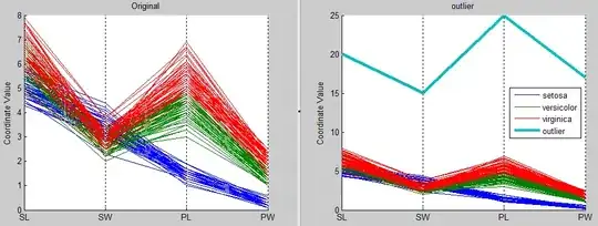
I'm using raphaelJS to draw a "radar chart" to display statistical data. For each axis it should accept values between 0 and 10.
For example, the vales of a polygon with its center point right in the center of the chart [10,10,10,10,10]. Simple...
However, it might happen that data looks like this:
[26, 14, 48, 18, 1],
[ 3, 14,  8,  9, 5],
[10,  6,  4, 16, 3]
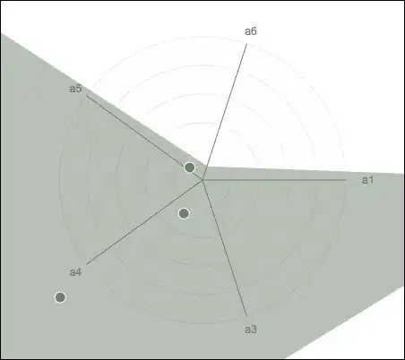
which leads to this (displaying the polygon with its center point in the bottom left off the chart):
If I would normalize data based on its biggest value (in this case 48), all of the other center points would be too near to the center the chart, and and its informative value would be around 0.
same data normalized based on its biggest value:
[5.42, 2.92, 10,   3.75, 0.21],
[0.63, 2.92, 1.67, 1.88, 1.04],
[2.08, 1.25, 0.83, 3.34, 0.63]

So now all of the other center points are clustered in the center of the chart, and have lost all of their explanatory power... If there was more than 3 center points, they would most likely overlap each other.

I was thinking about a relative way to display each polygon, without losing too much relation between each polygon, if it's possible...
Any ideas how to do this, or maybe another approach how to normalize?