0

I've spent hours going through the multitude of posts on this subject but still have not been able to resolve why I am getting two lines when I make the screen smaller, when the expected result is to get the toggle button.

I've tried changing the max-width as covered here by adding the additional css data.

I've also tried what is suggested here.

This is at full large desktop screen size:

enter image description here

This is at 3/4 of a large desktop screen size:

enter image description here

This is at 1/2 of a large desktop screen size:
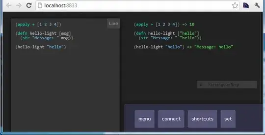
enter image description here

Here is the code

jroyce
  • 2,029
  • 2
  • 22
  • 45
  • So essentially, you want to keep everything on one line and just change the breakpoint at which the toggle button appears? – Obsidian Age Feb 20 '18 at 20:11
  • I want to keep everything on the same line and change the breakpoint so it doesn't go on two lines, but changes to toggle button instead. Ideally the spacing between the nav-items would reduce when shrinking screen before toggle appears, but not sure if this is possible. – jroyce Feb 20 '18 at 20:12
  • @jroyce Can you make a fiddle to better demonstrate the issue? – maxshuty Feb 20 '18 at 20:17
  • @maxhuty I added a codeply example... – jroyce Feb 20 '18 at 21:34

2 Answers2

1

Thats not an issue with bootstrap, thats how bootstrap work. When you make the screen medium smaller, the items aligned to right will go to a new line. Only in small screens, you will see the hamburger menu.

Buzzzzzzz
  • 1,074
  • 13
  • 17
  • Oh wow so there is no preventing the double line effect? It’s not very appealing. – jroyce Feb 20 '18 at 20:41
  • 1
    If you really think about it, theres nothing much to do about it. You have to show the nav tabs somewhere and if you make hamburger menu show up with a larger size window itll look worse. Even if you change the font size, you can only push that so far. I suggest an auto hiding nav from the left should do the trick. – Buzzzzzzz Feb 20 '18 at 20:46
  • Ooooh I like the sound of that. Can you post an example of how that would work at certain screen size? – jroyce Feb 20 '18 at 20:48
  • This answe from stack has the trigger points https://stackoverflow.com/questions/19827605/change-bootstrap-navbar-collapse-breakpoint-without-using-less Heres a side navbar from w3schools https://www.w3schools.com/howto/tryit.asp?filename=tryhow_js_sidenav – Buzzzzzzz Feb 20 '18 at 20:59
1

Easy to fix.

It's because you have two navbar-brand a links.

    <a class="navbar-brand" href="#"><img src="" alt="Text">
    </a></div><a class="navbar-brand" href="#">
    </a>

Get rid of the second one and the end div, it should be just this:

    <a class="navbar-brand" href="#"><img src="" alt="Text">
    </a>
Dan
  • 240
  • 5
  • 16