2

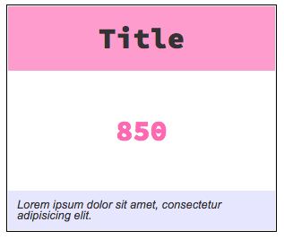
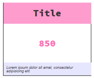
I have an element with a 1px border and a child element that has a background color causing the parent element's border to disappear when I zoom out my browser's zoom to 70-80%.

I've noticed it happens in Chrome and IE11 on a PC but not in Chrome on my MacBook Pro.

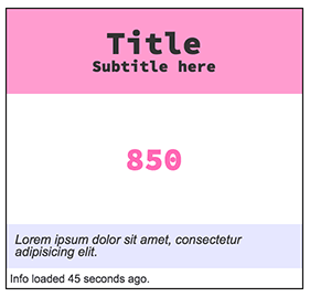
Here's a screenshot of the problem:

enter image description here

Below is the sample code: https://codepen.io/richfinelli/full/yvpRxW/

<section class="card__container">
  <header class="card__header">
    <h1>Title</h1>
  </header>
  <div class="card__value">850</div>
  <footer class="card__footer">Lorem ipsum dolor sit amet.</footer>
</section>

css/scss:

.card__container {
  border: 1px solid black;
  display: flex;
  flex-direction: column;
  width: 300px;
  margin: 10px auto;
  align-items: stretch;
  font-family: "source code pro";
  color: darken(#cccccc, 60%);
}
.card__header {
  background-color: lighten(hotpink, 10%);
  padding: 20px;
  display: flex;
  flex-direction: column;
  align-items: center;
  h1 {
    font-size: 2rem;
  }
}
.card__value {
  align-self: center;
  padding: 50px 0;
  color: hotpink;
  font-size: 2rem;
}
.card__footer {
  padding: 10px;
  font-family: Arial;
  font-style: italic;
  font-size: .8rem;
  background-color: lighten(blue, 45%);
}

Trying to figure out why my border is disappearing?

Rich Finelli
  • 882
  • 7
  • 18

2 Answers2

3

It sounds like number rounding issues due to the browser's subpixel calculus to me, too. However, I do see the issue on Chrome/Mac if you adjust different zoom levels and viewport widths you can see the issue manifest in different ways:

Chrome/Mac 125% Zoom / 1196px viewport Gap between header and footer backgrounds and left border:

125% Zoom / 1196px viewport

Chrome/Mac 90% Zoom / 1181px viewport Header and footer backgrounds overlap right border:

90% Zoom / 1181px viewport

A non-design impacting fix is to create the border using positioning in a pseudo-element:

.card__container {
    position: relative; // ADDED 
    // border: 1px solid black; // REMOVED
    display: flex;
    flex-direction: column;
    width: 300px;
    margin: 10px auto;
    align-items: stretch;
    font-family: "source code pro";
    color: darken(#cccccc, 60%);

    // ADDED
    &::after {
         content: '';
         position: absolute;
         top: 0;
         right: 0;
         bottom: 0;
         left: 0;
         border: 1px solid #000;
    }
}

90% Zoom / 1181px viewport

Codepen: https://codepen.io/danbrady/pen/QQYyzM (Tested in IE11, Chrome (Mac & Win7), Firefox, and Safari.

Although this is more code and, admittedly, a little quirky, it doesn't change the original design intent. Also, you might consider abstracting it into a mixin or separate utility class.

(P.S. Came here from your blog post. You've inspired me to not lurk (at least for today). :^)

Dan Brady
  • 126
  • 1
  • 2
1

I gathered that this might be happening: "You are forcing Chrome to do subpixel calculus, and this usually has strange behaviours." from a similar but slightly different question here: Borders disappear in Chrome when I zoom in

After much trial, error, and research my fix was to add a 1px margin (or buffer if you will) to the child elements with the background color. This was a slight tradeoff as there was a 1px gap between the border and the background, but it was a tradeoff I was comfortable with.

enter image description here

Codepen with the fix: https://codepen.io/richfinelli/pen/PQxbed?editors=1100

.card__container {
  border: 1px solid black;
  display: flex;
  flex-direction: column;
  width: 300px;
  margin: 10px auto;
  align-items: stretch;
  font-family: "source code pro";
  color: darken(#cccccc, 60%);
}
.card__header {
  background-color: lighten(hotpink, 10%);
  padding: 20px;
  display: flex;
  flex-direction: column;
  align-items: center;
  margin: 1px; //added this
  h1 {
    font-size: 2rem;
  }
}
.card__value {
  align-self: center;
  padding: 50px 0;
  color: hotpink;
  font-size: 2rem;
}
.card__footer {
  padding: 10px;
  font-family: Arial;
  font-style: italic;
  font-size: .8rem;
  background-color: lighten(blue, 45%);
  margin: 1px; //and added this
}

The 1px margin or buffer was enough I believe to not force the browsers to do the "subpixel calculus" and thus not remove the border on some sides when the browser is zoomed out.

Rich Finelli
  • 882
  • 7
  • 18