48

I have this really simple form: http://jsfiddle.net/TKb6M/91/. Sometimes, when I zoom in or out using Chrome, the input borders disappear. For example, when I zoom to 90% I get:

enter image description here

Naturally, your mileage may vary.

In case you're wondering about those <span> tags, I added them following the recommendation at How do I make an input element occupy all remaining horizontal space?.

Is there a problem with my CSS or is this a Chrome bug? It seems to work fine on Firefox. What can I do to avoid this behavior?

Thanks.

Community
  • 1
  • 1
Luís Pureza
  • 841
  • 1
  • 7
  • 13
  • I've also seen 1px of padding being removed on zoom level 90%. It was a padding rule on a `` element.
    – BairDev May 10 '19 at 08:03
  • I've also noticed that if your border is style "double" then one of the "double" lines may disappear. – posfan12 Jan 24 '21 at 14:17

8 Answers8

63

I'm pretty sure that Luís Pureza has solved his issue, but I found a really easy way to solve it changing only this:

If you have a table border like this one:

INPUT,TEXTAREA {
border-top: 1px solid #aaa
}

Change it to this one:

INPUT,TEXTAREA {
border-top: thin solid #aaa
}

I found this solution across this link: https://productforums.google.com/forum/#!topic/chrome/r1neUxqo5Gc

I hope it helps

34

You are forcing Chrome to do subpixel calculation, and this usually has strange behaviours.

If you change the height of the input to 30px, then a 90% zoom works ok (because this is 27px), but a zoom of 75% not (because this is 22.50 px).

You can also avoid this by giving the border a width of 3px. In this case, you will see that the borders width is different in different places .

Anyway, the very best solution is to give more space around the inputs so that the border can be drawn cleanly even if it is in a subpixel position.

ey dee ey em
  • 7,991
  • 14
  • 65
  • 121
vals
  • 61,425
  • 11
  • 89
  • 138
  • 3
    I had a similar problem, the border on the right side of the button was gone when zooming in/out. Adding the padding around the button fixed the border for me. Thanks – GraafM Oct 26 '15 at 09:30
  • Why doesn't it just round up to the nearest pixel? – ESR Jun 05 '19 at 13:02
  • Hi @ESR, I want to implement this, but in my case I have dropdown which has 10 vals and after 5 I am using overflow: auto. In this case I am not sure how can I give more padding at bottom. Only bottom border is disappearing in my case. – pramodpxi Feb 06 '20 at 07:20
9

I know I'm late in the game, but fudging it a bit and set the border width to 1.5px seems to do the trick every time.

David Morton
  • 16,338
  • 3
  • 63
  • 73
  • My problem was the opposite. Borders disappeared on bootstrap boxes when I zoomed OUT. This solution fixed it. – dapperdan1985 Jan 09 '19 at 23:52
  • In my case, 1px doesn't disappear on Firefox, bit does it in Chrome. With 1.5px the behavior is right in Chrome, but Firefox shows 2px width... – iFederx Nov 20 '20 at 09:36
  • In my case borders on Chrome disappeared on 100% zoom and appeared while zooming out or zooming in – traxium Jan 06 '22 at 13:43
  • Whatever you do with `border-width` just shifts the problem to other lines in your table. Any value that you give it may fix it on that one line, but creates the issue on other lines. I showed this in my thread: https://stackoverflow.com/questions/71789886/chome-border-thickness-issue-on-zoomed-resolutions-border-width-px-does-not And no, there's nothing "magic" about 1.5, it doesn't fully work either. – gene b. Apr 07 '22 at 23:21
7

I had the same problem with a bordered div wrapping borderless input , and all the great answers here does not helped me.

Finally, adding:

overflow: auto; 

to the div element (the one with the problematic border) did the trick.

Elad
  • 2,087
  • 1
  • 16
  • 30
3

It's because your setting a fixed height, and when zooming the input is growing larger than that height, making the border disappear. Use line-height and padding to get the desired height instead - see updated Fiddle

Update: Ignore what I said, it's because you're setting overflow:hidden on your span, removing that should do the trick. Might result in a need to change width of input though.

On a side note; you're making your span a block element which is fine and works, but it looks a bit bad. Try using block elements, like a instead of changing an inline element to a block, if possible.

Henrik Janbell
  • 1,784
  • 3
  • 21
  • 30
1

I had a similar issue with chrome in 2018 - the top border was missing on inputs and textareas. The fix was to specify the top border in css simply as

INPUT,TEXTAREA {
border-top: 1px solid #aaa
}

I can't explain why that was needed, and it was only losing the borders in certain places, but at least that was a quick workaround.

user2728841
  • 1,333
  • 17
  • 32
0

In case overflow: hidden is neccessary , mention overflow: hidden only for the browser you are facing the width issue . In other browser, metion display: flex so that the width is automatically taken correct and also, so that on zooming in/out the borders do not disappear.

For example : Width was not correct in my case only for IE, so I mentioned :

@media screen and (-ms-high-contrast: active), (-ms-high-contrast: none) {
.spanStyles {
display: block;
overflow: hidden;
}
}

And the zooming in/out issue was occuring in firefox and chrome, so I mentioned

.spanStyles {
 display : flex;
}

this resolved my issue in all browsers.

0

thanks for all your answers above, I got the border issue such as thisclick to look at the image
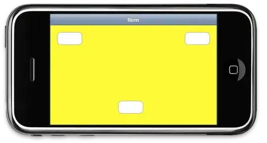
, the border display is a mess when zoomed down. finally found overflow: hidden worked for me.

export const InputWrapper = styled.div`
  display: flex;
  align-items: center;
  justify-content: space-around;
  width: 100%;
  height: 56px;
  border-radius: 4px;
  border: 1px solid #707070;
  padding: 16px 0 16px 16px;
  overflow: hidden;
Willie Cheng
  • 7,679
  • 13
  • 55
  • 68
Sijun
  • 1
  • 1