7

I have this html structure:

<div class="container">
   <div class="row">
      <div class="col-lg-9 description"></div>
      <div class="col-lg-3 sidebar"></div>
      <div class="col-lg-9 comments"></div>
   </div>
</div>

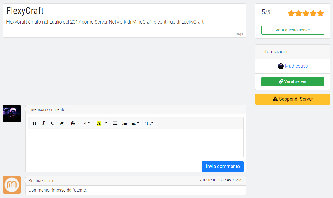
The final effect is this: enter image description here I need this HTML structure because when I have a smaller viewports and Bootstrap switches to the 1-column mode, I need that sidebar column goes between description and comments columns (where actually there is the empty space).

The problem is that I want to avoid to have that empty space when the template isn't in "mobile mode".

I tried many ways but I can't achieve this, someone could help me?

EDIT

I tried this way:

<div class="container">
   <div class="row">
      <div class="col-lg-9">
         <div class="description"></div>
         <div class="comments"></div>
      </div>
      <div class="col-lg-3 sidebar"></div>
   </div>
</div>

And tried to reorder by using the css "order", but doesn't worked (the only thing it allows me to do is to put sidebar at the start of the page, but isn't what I want).

2 Answers2

9

It's happening because Bootstrap 4 is flexbox, and all of the columns become the same height as the tallest column...

Instead of this:

 ------------------  ---------
|                  ||         |
|                  ||         |
 ------------------ |         |
 ------------------ |         |
|                  ||         |
 ------------------  ---------

You get this:

 ------------------  ---------
|                  ||         |
|                  ||         |
 ------------------ |         |
                    |         |
                    |         |
 ------------------  ---------
|                  |
 ------------------

Usually, you can workaround this (as you tried) by nesting the columns, but then you won't get the desired column order....

Nesting:

<div class="container">
    <div class="row">
        <div class="col-lg-9">
            <div class="row">
                <div class="col-lg-12 description"></div>
                <div class="col-lg-12 commments"></div>
            </div>
        </div>
        <div class="col-lg-3 sidebar"></div>
    </div>
</div>

However, to get the desired column order, the columns must be contained in a single .row.

Floats:

So, the workaround in BS4 is to use floats (like BS3 did) as explained here: Bootstrap 4 - I don't want columns to have the same height. Like this:

https://www.codeply.com/go/wnRnLl3Jmo

<div class="container">
   <div class="row d-lg-block">
      <div class="col-lg-9 float-left description">Desc</div>
      <div class="col-lg-3 float-right sidebar">Sidebar</div>
      <div class="col-lg-9 float-left comments">Comments</div>
   </div>
</div>

The d-lg-block sets display:block on the row instead of display:flex which allows the columns to float in lg screen widths.

Related:
Bootstrap with different order on mobile version

Carol Skelly
  • 351,302
  • 90
  • 710
  • 624
  • 1
    Thank you so much, the second workaround is what I needed and worked like a charm. Probably, it's a bit a "messy" solution, but seems it is the only way to get the column order I needed. – Mattia Del Franco Mar 08 '18 at 13:08
0

.description {
  background-color: red
}

.sidebar {
  background-color: blue
}

.comments {
  background-color: green
}
<link rel="stylesheet" href="https://maxcdn.bootstrapcdn.com/bootstrap/4.0.0/css/bootstrap.min.css" integrity="sha384-Gn5384xqQ1aoWXA+058RXPxPg6fy4IWvTNh0E263XmFcJlSAwiGgFAW/dAiS6JXm" crossorigin="anonymous">
<div class="container">
  <div class="row">
    <div class="col-12 description">description</div>
  </div>
  <div class="row justify-content-end">
    <div class="col-12 col-lg-3 sidebar">sidebar</div>
  </div>
  <div class="row">
    <div class="col-12 col-lg-9 comments">comments</div>
  </div>
</div>
</div>

I think this is what you're going for

MrKale
  • 43
  • 1
  • 11
  • 1
    Isn't what I need: in the snippet the description column takes the 100% width and the sidebar column already generate empty space. – Mattia Del Franco Mar 08 '18 at 13:10
  • try running the snippet again, then press the full page, the snippet is showing how it will look on a mobile device – MrKale Mar 08 '18 at 13:34