168

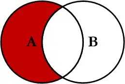
I know this is a rather simple question, but I can't figure it out for the life of me. I have two links which I've applied a background image to. Here's what it currently looks like (apologies for the shadow, just a rough sketch of a button):
enter image description here

However, I want those two buttons to be side by side. I can't really figure out what needs to be done with the alignment.

Here's the HTML

<div id="dB"}>
    <a href="http://notareallink.com" title="Download" id="buyButton">Download</a> 
</div>
<div id="gB">
    <a href="#" title="Gallery" onclick="$j('#galleryDiv').toggle('slow');return false;" id="galleryButton">Gallery</a>     
</div>

Here's the CSS

#buyButton {
    background: url("assets/buy.png") 0 0 no-repeat;
    display:block;
    height:80px;
    width:232px;
     text-indent:-9999px;
}
#buyButton:hover{
width: 232px;
height: 80px;
background-position: -232px 0;
}
#buyButton:active {
width: 232px;
height: 80px;
background-position: -464px 0;
}

#galleryButton {
    background: url("images/galleryButton.png") 0 0 no-repeat;
    display:block;
    height:80px;
    width:230px;
     text-indent:-9999px;
}
#galleryButton:hover{
width: 230px;
height: 80px;
background-position: -230px 0;
}
#galleryButton:active {
width: 230px;
height: 80px;
background-position: -460px 0;
}
Beau Smith
  • 33,433
  • 13
  • 94
  • 101
sudo rm -rf
  • 29,408
  • 19
  • 102
  • 161
  • 7
    The first that comes to mind by just reading the title is `float:left;` – JCOC611 Feb 08 '11 at 21:33
  • 3
    @JCOC611: Applying `float:left;` to both `div`s did it perfectly. Can you post your comment as an answer? Thanks! – sudo rm -rf Feb 08 '11 at 21:37
  • 2
    And the second is `display: inline-block;` but it's less well supported... – J V Feb 08 '11 at 21:37
  • 1
    float:left inside a container would work, but I would try using two tags instead of
    s for the buttons.
    – shiftycow Feb 08 '11 at 21:38
  • As already mentioned, adding float: left; to #buyButton and #galleryButton, then add another element with clear: both; to clear the floating. Why using divs (block elements) to wrap ? – ludesign Feb 08 '11 at 21:40
  • @ludeesign: I don't know why I wrapped them. I originally wasn't, but with this problem I wrapped them for no reason I guess. Removing the divs made no difference with `float:left;` so thanks for the suggestion. – sudo rm -rf Feb 08 '11 at 21:47

4 Answers4

218

Beware float: left

…there are many ways to align elements side-by-side.

Below are the most common ways to achieve two elements side-by-side…

Demo: View/edit all the below examples on Codepen


Basic styles for all examples below…

Some basic css styles for parent and child elements in these examples:

.parent {
  background: mediumpurple;
  padding: 1rem;
}
.child {
  border: 1px solid indigo;
  padding: 1rem;
}

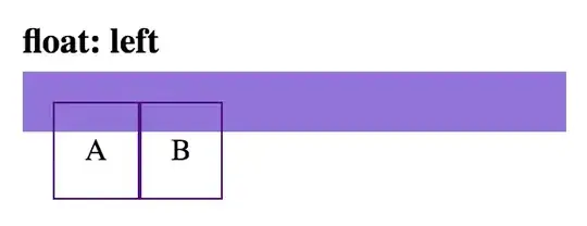
float:left

Using the float solution my have unintended affect on other elements. (Hint: You may need to use a clearfix.)

html

<div class='parent'>
  <div class='child float-left-child'>A</div>
  <div class='child float-left-child'>B</div>
</div>

css

.float-left-child {
  float: left;
}

display:inline-block

html

<div class='parent'>
  <div class='child inline-block-child'>A</div>
  <div class='child inline-block-child'>B</div>
</div>

css

.inline-block-child {
  display: inline-block;
}

Note: the space between these two child elements can be removed, by removing the space between the div tags:

display:inline-block (no space)

html

<div class='parent'>
  <div class='child inline-block-child'>A</div><div class='child inline-block-child'>B</div>
</div>

css

.inline-block-child {
  display: inline-block;
}

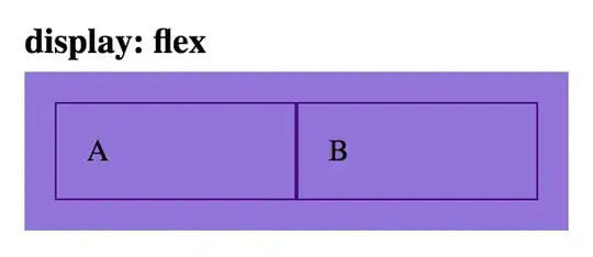
display:flex

html

<div class='parent flex-parent'>
  <div class='child flex-child'>A</div>
  <div class='child flex-child'>B</div>
</div>

css

.flex-parent {
  display: flex;
}
.flex-child {
  flex: 1;
}

display:inline-flex

html

<div class='parent inline-flex-parent'>
  <div class='child'>A</div>
  <div class='child'>B</div>
</div>

css

.inline-flex-parent {
  display: inline-flex;
}

display:grid

html

<div class='parent grid-parent'>
  <div class='child'>A</div>
  <div class='child'>B</div>
</div>

css

.grid-parent {
  display: grid;
  grid-template-columns: 1fr 1fr
}

Beau Smith
  • 33,433
  • 13
  • 94
  • 101
  • 2
    Yeah, but I heard that using `inline-block` has some compatibility issues. Also, any advantage to using that over `float`? – sudo rm -rf Feb 09 '11 at 02:30
  • 1
    Yes, `inline-block` is newer, thus your targe browsers may not yet support it (though there are many browser-specific properties and also workarounds for this). The advantage is that the containing element will wrap the elements; with `float` you'll have to add css to parent element. – Beau Smith Feb 24 '11 at 04:17
  • Note: using `inline-block` may cause some elements to be misaligned. *I* fixed this by making sure each element had the same amount of lines of text. – FBI Surveillance Van Feb 10 '21 at 00:01
  • 1
    I like the way you gave examples. – user1448914 Jan 12 '22 at 10:35
174

Apply float:left; to both of your divs should make them stand side by side.

JCOC611
  • 19,111
  • 14
  • 69
  • 90
  • Am I mistaken, or does a `clear:both;` need to go in there somewhere? I've never been the CSS savant but seems typical when I see floats to see clears as well. – Brad Christie Feb 09 '11 at 02:39
  • 4
    `clear:both` will do exactly the opposite. "Elements after the floating element will flow around it. To avoid this, use the clear property." – JCOC611 Feb 09 '11 at 02:43
  • @JCOC611: Ah, so clear usually follows when you want a momentary float ability? Makes sense. Thanks for the lesson. ;-) – Brad Christie Feb 09 '11 at 02:47
  • 9
    Just to be "clear," (horrible, I know), you would need to use `
    ` if you had a third div which you wanted beneath the two which were aligned.
    – Tass Mar 21 '13 at 19:16
  • 3
    @Tass you need only have your third div like this: `
    ...
    ` (no br required)
    – intrepidis Apr 16 '13 at 16:06
21

keep it simple

<div align="center">
<div style="display: inline-block"> <img src="img1.png"> </div>
<div style="display: inline-block"> <img src="img2.png"> </div>
</div>
0

.section {
  display: flex;
}

.element-left {
  width: 94%;
}

.element-right {
  flex-grow: 1;
}
<div class="section">
  <div id="dB" class="element-left" }>
    <a href="http://notareallink.com" title="Download" id="buyButton">Download</a>
  </div>
  <div id="gB" class="element-right">
    <a href="#" title="Gallery" onclick="$j('#galleryDiv').toggle('slow');return false;" id="galleryButton">Gallery</a>
  </div>
</div>

or

.section {
  display: flex;
  flex-wrap: wrap;
}

.element-left {
  flex: 2;
}

.element-right {
  width: 100px;
}
<div class="section">
  <div id="dB" class="element-left" }>
    <a href="http://notareallink.com" title="Download" id="buyButton">Download</a>
  </div>
  <div id="gB" class="element-right">
    <a href="#" title="Gallery" onclick="$j('#galleryDiv').toggle('slow');return false;" id="galleryButton">Gallery</a>
  </div>
</div>