2

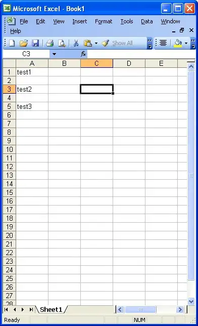
Sorry if image 1 is a little basic - layout sent by my project supervisor! I have created a scatterplot of total grey seal abundance (Total) over observation time (Obsv_time), and fitted a gam over the top, as seen in image 2:

plot(Total ~ Obsv_time,
     data = R_Count,
     ylab = "Total",
     xlab = "Observation Time (Days)",
     pch = 20, cex = 1, bty = "l",col="dark grey")
lines(R_Count$Obsv_time, fitted(gam.tot2))

I would like to somehow show on the graph the corresponding Season (Image 1) - from a categorical factor variable (4 levels: Pre-breeding,Breeding,Post-breeding,Moulting), which corresponds to Obsv_time.

I am unsure if I need to plot a secondary axis or just add labels to the graph...and how to do each! Thanks!

Wanted graph layout - indicate season from factor variable Scatterplot with GAM curve
missuse
  • 19,056
  • 3
  • 25
  • 47
Natalie Ward
  • 23
  • 1
  • 5
  • Hi Natalie Ward, please provide some data with `dput` that would go along with the code, so the example is [reproducible](https://stackoverflow.com/questions/5963269/how-to-make-a-great-r-reproducible-example) – missuse Mar 25 '18 at 11:01
  • Related: [shading area between two lines in r](https://stackoverflow.com/questions/23351752/shading-area-between-two-lines-in-r), [Highlight (shade) plot background in specific time range](https://stackoverflow.com/questions/1915001/highlight-shade-plot-background-in-specific-time-range) – Henrik Mar 25 '18 at 12:43

2 Answers2

1

You can do this with base R graphics. Leave off the x-axis in the original plot, and add an axis with the season labels separately. You can get indicate the season by overlaying polygons.

## Some bogus data
x = sort(runif(50,0,250))
y = 800*(sin(x/40) + x/100 + rnorm(50,0, 0.2)) + 500
FittedY = 800*(sin(x/40) + x/100)+500

plot(x,y, pch= 20, col='lightgray', ylim=c(300,2700), xaxt='n',
    xlab="", ylab='Total')
lines(x, FittedY)
axis(1, at=c(25,95,155,215), tick=FALSE,
    labels=c('PreBreed', 'Repro', 'PostBreed', 'Moulting'))
rect(c(-10,65,125,185), 0, c(65,125,185,260), 3000, 
    col=rainbow(4, alpha=0.05), border=NA)

Seasonal Picture

G5W
  • 36,531
  • 10
  • 47
  • 80
0

If you are able to use ggplot2, you could add (or compute from time) another factor variable to your data-frame which would be your season. Then it is just a matter of using color (or any other) aesthetic which would use this season variable.

require(ggplot2)
df <- data.frame(total = c(26, 41, 31, 75, 64, 32, 7, 89),
                 time = c(1, 2, 3, 4, 5, 6, 7, 8))
df$season <- cut(df$time, breaks=c(0, 2, 4, 6, 8),
                 labels=c("winter", "spring", "summer", "autumn"))
ggplot(df, aes(x=time, y=total)) +
  geom_smooth(color="black") +
  geom_point(aes(color=season))
JonnyRobbie
  • 526
  • 5
  • 16