I've got a div element that maintains an aspect ratio: it calculates its height based on its width (using the padding trick). What I'd like to do is to put this div into another one by fitting the maximum space available, vertically and horizontally, no crop. I think the closest thing to what I want is the object-fit: contain - which is img only.
I want the div to cover the max height and width possible while maintaining the aspect ratio. No vertical or horizontal crop.
Is it even possible with CSS only? If so, how?
Update: A good article where things are at the moment.
code (Can be any other solution, doesn't have to be built on this snippet):
html,
body {
  display: flex;
  justify-content: center;
  align-items: center;
  width: 100%;
  height: 100%;
}

.container {
  position: relative;
  width: 100%;
}

.container:before {
  content: "";
  display: block;
  width: 50%;
  padding-top: 50%;
}

.embed {
  position: absolute;
  top: 0;
  left: 0;
  width: 100%;
  height: 100%;
  background-color: red;
}
<div class="container">
<div class="embed">
this should accommodate all the available space and maintain aspect ratio, no crop when width is too wide
</div>
</div>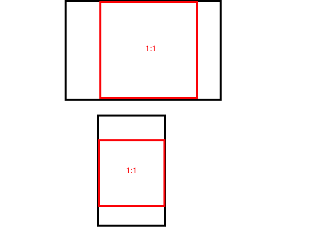
