Old question. A lot of answers. I went thru all of them and looked for the answer that provides code for a reusable button that accepts width and height as parameters. As OP specifically noted that it is tedious to wrap every button in a SizedBox.
Not found. So, here is one more answer. Below is a code for the reusable button component with a default size, which also accepts width and height.
class MenuButton extends StatelessWidget {
  final String text;
  final void Function()? onPressed;
  final double width;
  final double height;
  const MenuButton({required this.text, this.onPressed, this.width =
    200, this.height = 60, super.key}) ;
  @override
  Widget build(BuildContext context) {
    return SizedBox(
      width: width,
      height: height,
      child: OutlinedButton(
        onPressed: onPressed,
        child: Text(text),
      ),
    );
  }
}
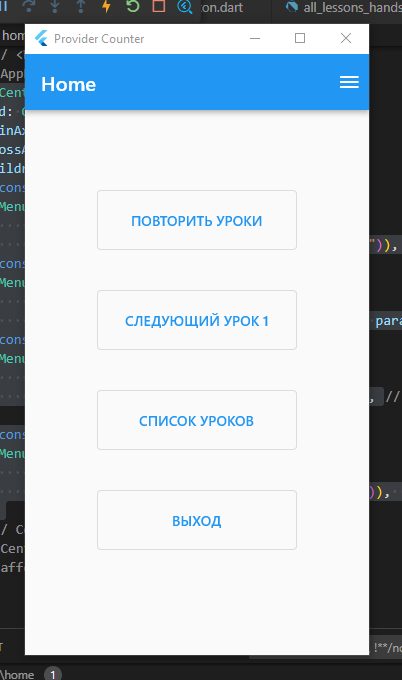
And use it like this:
body: Center(
    child: Column(
      mainAxisAlignment: MainAxisAlignment.start,
      crossAxisAlignment: CrossAxisAlignment.center,
      children: [
        const SizedBox(height: 80),
        MenuButton(
            text: 'ПОВТОРИТЬ УРОКИ',
            onPressed: () => context.go("/repeat_lessons")),
        const SizedBox(height: 40),
        MenuButton(
            text: 'СЛЕДУЮЩИЙ УРОК 1',
            onPressed: () => context.pushNamed("lesson", params: {'number': "1"})),
        const SizedBox(height: 40),
        MenuButton(
            text: 'СПИСОК УРОКОВ',
            onPressed: () => context.go("/lesson_list")),

        const SizedBox(height: 40),
        MenuButton(
            text: 'ВЫХОД',
            onPressed: () => print('exit button pressed')),
      ],
    ),
  ),


