I don't quite understand the Material UI grid system. If I want to use a form component for login, what is the easiest way to center it on the screen on all devices (mobile and desktop)?
Asked
Active
Viewed 4.4e+01k times
13 Answers
415
Since you are going to use this on a login page. Here is a code I used in a Login page using Material UI
Material UI v5
<Grid
  container
  spacing={0}
  direction="column"
  alignItems="center"
  justifyContent="center"
  sx={{ minHeight: '100vh' }}
>
  <Grid item xs={3}>
    <LoginForm />
  </Grid>
</Grid>
Material UI v4 and below
<Grid
  container
  spacing={0}
  direction="column"
  alignItems="center"
  justify="center"
  style={{ minHeight: '100vh' }}
>
  <Grid item xs={3}>
    <LoginForm />
  </Grid>
</Grid>
this will make this login form at the center of the screen.
But still, IE doesn't support the Material-UI Grid and you will see some misplaced content in IE.
As pointed by @max, another option is,
<Grid container justifyContent="center">
  <Your centered component/>
</Grid>
Please note that versions Material UI v4 and below should use justify="center" instead.
However, using a Grid container without a Grid item is an undocumented behavior.
Update on 2022-06-06
In addition to that, another new and better approach will be using the Box component.
<Box
  display="flex"
  justifyContent="center"
  alignItems="center"
  minHeight="100vh"
>
  <YourComponent/>
</Box>
This was originally posted by Killian Huyghe as another answer.
Hope this will help you.
Olivier Tassinari
- 8,238
- 4
- 23
- 23
Nadun
- 7,463
- 1
- 21
- 27
-
2A little correction, for the Op's use case, the flex direction should be row>>> direction="row" – Peter Moses May 20 '19 at 00:14
-
Normally, alignItems=center and justify=center puts the component in the center of the page but it's not the case. Adding the style={{ minHeight: '100vh' }} does the job but it adds a scrolling bar in the page. How it will be fixed? – Slim Feb 29 '20 at 17:32
-
Thanks. After hours or searching, finally this is the one that helped me to achieve FormLabel and TextField side by side in the same row. – Rajkumar M Jun 05 '21 at 21:11
-
1@Slim set CSS body margin:0 – willnode Jul 20 '21 at 08:38
-
4It's **justifyContent="center"** instead of **justify="center"** as of MUI v5 – asologor Oct 05 '21 at 16:02
-
Gracias campeon...! – Brayan Loayza Jan 20 '22 at 19:27
-
Grid is a bit overkill for centering items, I prefer the Box answers below – ViktorMS Jun 04 '22 at 08:45
-
2@ViktorMS sorry for the confusion. But Box wasn't even an option back in 2018, however, I admit that this should have been updated, so I updated the answer. Thanks for pointing this out. – Nadun Jun 05 '22 at 20:44
77
You can do this with the Box component:
import Box from "@mui/material/Box";

...

<Box
  display="flex"
  justifyContent="center"
  alignItems="center"
  minHeight="100vh"
>
  <YourComponent/>
</Box>
Killian Huyghe
- 1,422
- 9
- 13
-
2
-
-
Should be the accepted answer, Grid is a bit overkill for OP's question – ViktorMS Jun 04 '22 at 08:46
-
-
1@Julkar9 Box is just a wrapper over css, you need these 4 to: 1. use flex box, 2. center horizontally, 3. center vertically, 4. specify height so that vertical center works as expected – Killian Huyghe Sep 05 '22 at 10:35
64
Another option is:
<Grid container justify = "center">
  <Your centered component/>
</Grid>
Max
- 962
- 5
- 9
-
2Although this works, using a Grid container without a Grid item is an undocumented behaviour and may break anytime (though it probably won't). – Killian Huyghe Jun 08 '21 at 12:57
-
2
20
Here is another option without a grid:
<div
    style={{
        position: 'absolute',
        left: '50%',
        top: '50%',
        transform: 'translate(-50%, -50%)'
    }}
>
    <YourComponent/>
</div>
Jöcker
- 5,281
- 2
- 38
- 44
-
This worked very well for me for centering a Material-UI
component. As an add-on, in the translate method, the first parameter is the horizontal translation and the second is the vertical translation. – Michael Jay Sep 18 '20 at 01:15 -
This solution has a problem, it will shorten the size of the component by 50% in width and height – Nicolás Apolonia Nov 30 '20 at 14:56
14
The @Nadun's version did not work for me, sizing wasn't working well. Removed the direction="column" or changing it to row, helps with building vertical login forms with responsive sizing.
<Grid
  container
  spacing={0}
  alignItems="center"
  justify="center"
  style={{ minHeight: "100vh" }}
>
  <Grid item xs={6}></Grid>
</Grid>;
Domagoj Vuković
- 178
- 1
- 8
Onur Yıldırım
- 341
- 3
- 13
12
If you just need to center a couple of items in a row or column in Material UI v5, you can use Stack instead of Grid:
<Stack alignItems="center">
  <Item>Item 1</Item>
  <Item>Item 2</Item>
  <Item>Item 3</Item>
</Stack>
Another example with row direction:
<Stack direction="row" justifyContent="center">
  <Item>Item 1</Item>
  <Item>Item 2</Item>
  <Item>Item 3</Item>
</Stack>
Live Demo

Olivier Tassinari
- 8,238
- 4
- 23
- 23
NearHuscarl
- 66,950
- 18
- 261
- 230
-
Why use gap for the parent stack and spacing for the child stack. – Embedded_Mugs Jan 29 '23 at 09:38
6
With other answers used, xs='auto' did a trick for me.
<Grid container
    alignItems='center'
    justify='center'
    style={{ minHeight: "100vh" }}>

    <Grid item xs='auto'>
        <GoogleLogin
            clientId={process.env.REACT_APP_GOOGLE_CLIENT_ID}
            buttonText="Log in with Google"
            onSuccess={this.handleLogin}
            onFailure={this.handleLogin}
             cookiePolicy={'single_host_origin'}
         />
    </Grid>
</Grid>
bikram
- 7,127
- 2
- 51
- 63
5
All you have to do is wrap your content inside a Grid Container tag, specify the spacing, then wrap the actual content inside a Grid Item tag.
 <Grid container spacing={24}>
    <Grid item xs={8}>
      <leftHeaderContent/>
    </Grid>

    <Grid item xs={3}>
      <rightHeaderContent/>
    </Grid>
  </Grid>
Also, I've struggled with material grid a lot, I suggest you checkout flexbox which is built into CSS automatically and you don't need any addition packages to use. Its very easy to learn.
Gavin Thomas
- 1,827
- 2
- 11
- 17
-
Thanks, so I have use 3 Grid items and put the component in the middle to center it? – zorro Jun 08 '18 at 19:47
1
You can make this component and use it everywhere you want. also you can add your props:
import Box from '@mui/material/Box';

export default function Center(props: any) {

    const { children } = props

    return (
        <Box
            sx={{
                display: 'flex',
                justifyContent: 'center',
                alignItems: 'center',
                flexDirection: 'column'
            }}
            {...props}
        >
            {children}
        </Box>
    );
}
Radmehr
- 299
- 2
- 12
0
Little update 07-09-2021 'justify' is now 'justifyContent="center"'
Steffano Festa
- 56
- 1
- 9
-
1Please add further details to expand on your answer, such as working code or documentation citations. – Community Sep 07 '21 at 13:36
-
0
The most versatile solution for me is using container and item props in combination.
The container and item props are two independent booleans; they can be combined to allow a Grid component to be both a flex container and child.
Grid MUI documentation - https://mui.com/material-ui/react-grid/#responsive-values
<Grid container alignContent={'center'} xs={12}>
  <Grid container item xs={6} justifyContent={'start'}>
    <span> content one </span>
  </Grid>
  <Grid container item xs={6} justifyContent={'center'}>
    <span> content two </span>
  </Grid>
</Grid>
teranshil
- 109
- 1
- 6
0
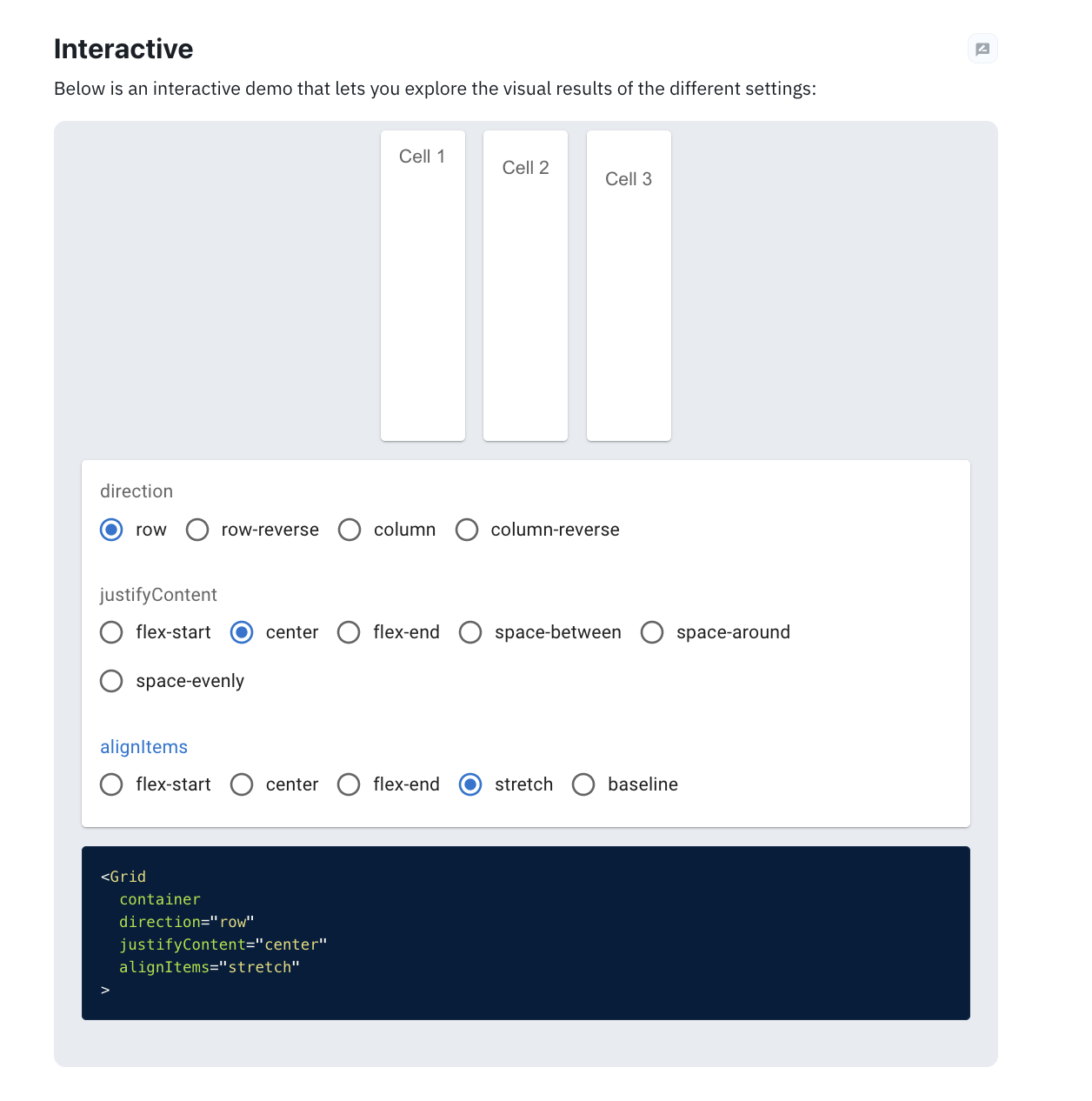
Image: MUI Grid interactive demo
The interactive grid demo on the grid component page on MUI website (https://mui.com/material-ui/react-grid/) is really easy to use for any configuration that one needs as it shows visually what it will do with what setting, basically a bunch of radio buttons to get what you want.
hasharnashar
- 113
- 1
- 8