6

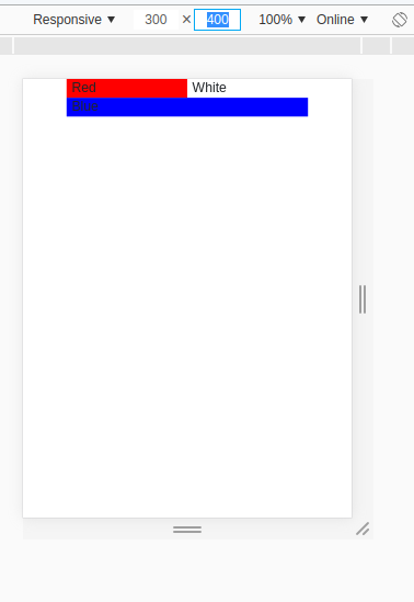
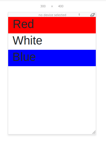
When using the Bootstrap grid and resizing the page below the minimum column size my columns aren't automatically stacking. The smallest size columns isn't even being recognized, only the second largest column size and up are working. I would have assumed I was using the grid incorrectly if it didn't work as expected in Firefox and the Atom HTML Preview.

Here is my code...

<html lang="en" dir="ltr">
  <head>
    <meta charset="utf-8">
    <title>bootstrap interface</title>
    <link rel="stylesheet" href="css/bootstrap.css">
  </head>
  <body>

    <div class="container">
      <div class="row">
        <div class="col-sm-4 col-md-6 col-lg-12" style="background-color: red">
          <h1>Red</h1>
        </div>
        <div class="col-sm-4 col-md-6 col-lg-6" style="background-color: white">
          <h1>White</h1>
        </div>
        <div class="col-sm-4 col-md-12 col-lg-6" style="background-color: blue">
          <h1>Blue</h1>
        </div>
      </div>
    </div>

    <script src="https://code.jquery.com/jquery-3.2.1.slim.min.js" integrity="sha384-KJ3o2DKtIkvYIK3UENzmM7KCkRr/rE9/Qpg6aAZGJwFDMVNA/GpGFF93hXpG5KkN" crossorigin="anonymous"></script>
    <script src="https://cdnjs.cloudflare.com/ajax/libs/popper.js/1.12.9/umd/popper.min.js" integrity="sha384-ApNbgh9B+Y1QKtv3Rn7W3mgPxhU9K/ScQsAP7hUibX39j7fakFPskvXusvfa0b4Q" crossorigin="anonymous"></script>
    <script src="js/bootstrap.bundle.min.js"></script>

  </body>
</html>

Pictures

In chrome: bootstrap-failing-chrome

In firefox: bootstrap-working-firefox

I thought it was a problem with using the cdn bootstrap but running it locally didn't fix the problem either.

I tested it with multiple versions of Chrome and removed all of my css to see if it was something I was overriding in bootstrap.

Chris Lyons
  • 61
  • 1
  • 3
  • Can you share the link where you facing the issue? – Anil K. Aug 08 '18 at 15:57
  • @AnilK. I posted photos – Chris Lyons Aug 08 '18 at 16:56
  • This is the first question I hit when searching for a solution. If you're having issues particularly with tables, perhaps view the following question: https://stackoverflow.com/questions/15115052/how-to-set-up-fixed-width-for-td – DubDub Feb 19 '19 at 09:42

3 Answers3

16

You are missing this in head tag.

<meta name="viewport" content="width=device-width, initial-scale=1, shrink-to-fit=no">
Anil K.
  • 251
  • 1
  • 7
2

Your code is right. The bootstrap is linked properly. Just a slight misconception you're facing here. When Google Chrome resizes down to 576px wide, Bootstrap considers the parameters of col-xs-* and since you've not provided the parameters it is considering it as default col-xs-1.

source: https://getbootstrap.com/docs/4.0/layout/grid/

<html lang="en" dir="ltr">
  <head>
    <meta charset="utf-8">
    <title>bootstrap interface</title>
    <link rel="stylesheet" href="https://maxcdn.bootstrapcdn.com/bootstrap/3.3.7/css/bootstrap.min.css" integrity="sha384-BVYiiSIFeK1dGmJRAkycuHAHRg32OmUcww7on3RYdg4Va+PmSTsz/K68vbdEjh4u" crossorigin="anonymous">
  </head>
  <body>

    <div class="container">
      <div class="row">
        <div class="col-xs-4 col-sm-4 col-md-6 col-lg-12" style="background-color: red">
          <h1>Red</h1>
        </div>
        <div class="col-xs-4 col-sm-4 col-md-6 col-lg-6" style="background-color: white">
          <h1>White</h1>
        </div>
        <div class="col-xs-4 col-sm-4 col-md-12 col-lg-6" style="background-color: blue">
          <h1>Blue</h1>
        </div>
      </div>
    </div>

    <script src="https://code.jquery.com/jquery-3.2.1.slim.min.js" integrity="sha384-KJ3o2DKtIkvYIK3UENzmM7KCkRr/rE9/Qpg6aAZGJwFDMVNA/GpGFF93hXpG5KkN" crossorigin="anonymous"></script>
    <script src="https://cdnjs.cloudflare.com/ajax/libs/popper.js/1.12.9/umd/popper.min.js" integrity="sha384-ApNbgh9B+Y1QKtv3Rn7W3mgPxhU9K/ScQsAP7hUibX39j7fakFPskvXusvfa0b4Q" crossorigin="anonymous"></script>
    <script src="js/bootstrap.bundle.min.js"></script>

  </body>
</html>

I think this must work for you now.

Pang
  • 9,564
  • 146
  • 81
  • 122
Ajay Kudva
  • 179
  • 6
  • You are right, I realized that my problem isn't with the col-sm-* but instead that the columns aren't automatically wrapping when resizing! I am updating the post – Chris Lyons Aug 08 '18 at 16:25
  • So is it still failing or working fine? Upvoting will help. :) – Ajay Kudva Aug 08 '18 at 16:27
  • it is still failing :( It isn't recognizing the xs columns but now it is recognizing the sm columns. I need them to wrap when scaling down but instead they are shrinking. – Chris Lyons Aug 08 '18 at 16:30
0

Try using this

<html lang="en" dir="ltr">
  <head>
    <meta charset="utf-8">
    <title>bootstrap interface</title>
    <link href="https://stackpath.bootstrapcdn.com/bootstrap/4.1.3/css/bootstrap.min.css" rel="stylesheet"/>
  </head>
  <body>

    <div class="container">
      <div class="row">
        <div class="col-12 col-sm-4 col-md-6 col-lg-12" style="background-color: red">
          <h1>Red</h1>
        </div>
        <div class="col-12 col-sm-4 col-md-6 col-lg-6" style="background-color: white">
          <h1>White</h1>
        </div>
        <div class="col-12 col-sm-4 col-md-12 col-lg-6" style="background-color: blue">
          <h1>Blue</h1>
        </div>
      </div>
    </div>

    <script src="https://code.jquery.com/jquery-3.2.1.slim.min.js" integrity="sha384-KJ3o2DKtIkvYIK3UENzmM7KCkRr/rE9/Qpg6aAZGJwFDMVNA/GpGFF93hXpG5KkN" crossorigin="anonymous"></script>
    <script src="https://cdnjs.cloudflare.com/ajax/libs/popper.js/1.12.9/umd/popper.min.js" integrity="sha384-ApNbgh9B+Y1QKtv3Rn7W3mgPxhU9K/ScQsAP7hUibX39j7fakFPskvXusvfa0b4Q" crossorigin="anonymous"></script>
    <script src="js/bootstrap.bundle.min.js"></script>

  </body>
</html>

Please note that the xs is not needed with Bootstrap 4.

Michał Drabik
  • 425
  • 4
  • 8