61

i cant figure out how do i remove border or outline ( not sure which one it is ) from react select, when its focused.

Uploaded image for reference. I have no border by default.
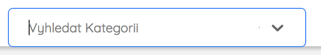
enter image description here

customStyle = {      
        control: provided => ({
            ...provided,           
            height: 10,
            width: 300,
            padding: 10,
            margin: 0,
            marginLeft: 0,
            border: "0px solid black",
            fontSize: 13,
            backgroundColor: 'white',
            outline: 'none'            
        })
    }  

Thanks

CosmicSeizure
  • 1,375
  • 5
  • 17
  • 35
  • Please add a relevant code snippet. There are already tons of examples of how to hide a border or outline https://stackoverflow.com/questions/1457849/how-to-remove-the-border-highlight-on-an-input-text-element – SuperDJ Oct 02 '18 at 18:49
  • @SuperDJ There is realy no relevant code snippet for this i think. I need help removing border / outline specificaly from focused state of React-Select component. I have no idea what to select or how to adjust style options. I have went over all documenation and all topics i could find on this. But this is definitely not question about removing simple outline/border from normal component. – CosmicSeizure Oct 02 '18 at 18:53
  • 1
    People, don't do this please—you'll end up excluding people relying on visual focus cues when using your interfaces (e.g. using keyboard nav). The only time you should do this is when you want to _replace_ the focus styles with your own – Robin Métral Dec 02 '21 at 15:58

7 Answers7

125

React-select v3

const style = {
  control: base => ({
    ...base,
    border: 0,
    // This line disable the blue border
    boxShadow: 'none'
  })
};

Here a live example

React-select v2

To reset border when Select is focused you have two solutions:

  1. Use the state

    control: (base, state) => ({
        ...base,
        border: state.isFocused ? 0 : 0,
        // This line disable the blue border
        boxShadow: state.isFocused ? 0 : 0,
        '&:hover': {
           border: state.isFocused ? 0 : 0
        }
    })
    
  2. Use !important (this one works but I recommend to use the first solution, !important is never a good thing to employ)

    control: base => ({
       ...base,
       border: '0 !important',
       // This line disable the blue border
       boxShadow: '0 !important',
       '&:hover': {
           border: '0 !important'
        }
    })
    

Don't forgot to reset the boxShadow (blue border) that you get.

Here a live example.

yaya
  • 7,675
  • 1
  • 39
  • 38
Laura
  • 8,100
  • 4
  • 40
  • 50
  • 2
    This solution is a bit excessive (although working), it is sufficient to use `boxShadow: 'none'` – Alex Dobrushskiy Dec 17 '19 at 08:33
  • @AlexDobrushskiy depending your version of react-select, removing just the box-shadow with none is not working (specially in early v2) – Laura Dec 17 '19 at 13:33
  • 1
    @AlexDobrushskiy I have edited my answer for newer version of `react-select` – Laura Dec 17 '19 at 16:19
  • Would it make sense to add a disclaimer at the beginning of this answer to tell developers they shouldn't do this, unless they're replacing the focus styles by their own? This is an accessibility issue – Robin Métral Dec 02 '21 at 16:00
31

This worked for me:

control: (base, state) => ({
    ...base,
    border: '1px solid black',
    boxShadow: 'none',
    '&:hover': {
        border: '1px solid black',
    }
})

This will ensure the border remains when inactive, hovered or active but there is no blue box shadow.

Jeff S.
  • 1,201
  • 1
  • 14
  • 17
6

This one is definitely working:

const style = {
    control: (base) => ({
      ...base,
      boxShadow: "none"
    })
}
matrixb0ss
  • 785
  • 8
  • 10
6

For anyone using react-select with @tailwindcss/forms, the dreaded blue line aka box-shadow on the input is introduced by the forms plugin. You need to pass strategy: class to the forms plugin in tailwind.config.js file.

plugins: [
  ...
  require('@tailwindcss/forms')({
    strategy: 'class',
  }),
]

More on this here: https://github.com/tailwindlabs/tailwindcss-forms#using-only-global-styles-or-only-classes

Similar question: https://stackoverflow.com/a/75541836/5712125

Akshay Kumar
  • 875
  • 13
  • 29
  • 1
    Thank you so much. I had a line inside the select, on the input field that makes the search. I tried a lot of different things but this solution solved my problem. Thanks for sharing! – tibasce Apr 28 '23 at 02:46
  • ftwwwwwwwwwwwww – Adamokkha Jul 01 '23 at 01:42
2

I have tried a lot! and finally This one worked for me.

control: (provided) => ({
...provided,
border: 0,
outline: '1px solid white',

}),

1

This removes the thickness of the box-shadow, and removes the blue from the border.

const controlStyle = base => ({
    ...base, 
    boxShadow: "none", 
    borderColor: "#cccccc",
    "&:hover": {
        borderColor: "#cccccc"
    }
})
0

Another approach of Akshay Kumar's awnser that worked for me:

input[id^="react-select-"] {
  @apply focus:outline-none focus:border-transparent focus:ring-0;
}
victommasi
  • 339
  • 3
  • 10