95

Recently I switched from support library to com.google.android.material:material:1.0.0

But now I have a problem, in this pages there's a note https://github.com/material-components/material-components-android/blob/master/docs/getting-started.md

Note: Using a Material Components theme enables a custom view inflater which replaces default components with their Material counterparts. Currently, this only replaces Button XML components with MaterialButton.

And the theme I am using

Theme.MaterialComponents.Light.NoActionBar

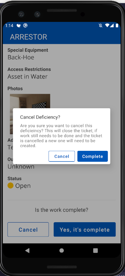
does exactly what it says in that note, it replaces AlertDialog Buttons to MaterialButtons but the problem is that by default MaterialButtons are colored background and now the buttons looks like this: enter image description here

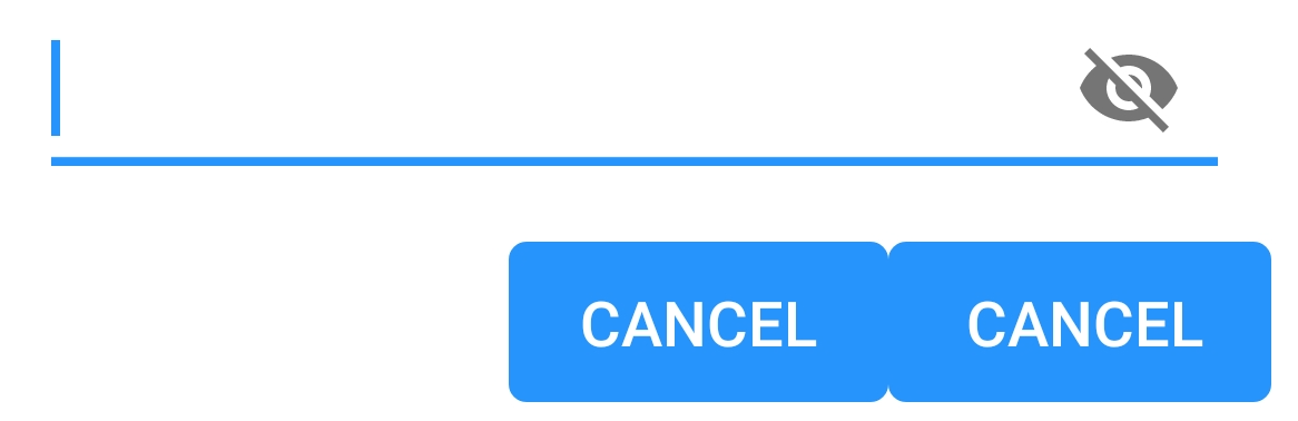
How can I make them borderless and backgroundless again?

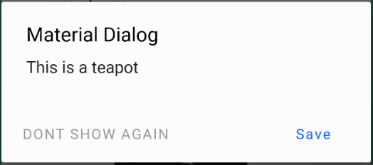
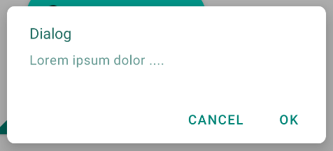
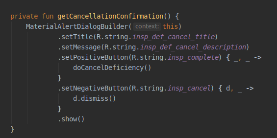
PS I am using alert builder to create alert dialogs:

android.app.AlertDialog.Builder
Gabriele Mariotti
  • 320,139
  • 94
  • 887
  • 841
antanas_sepikas
  • 5,644
  • 4
  • 36
  • 67
  • You can use Bridge theme if you want AppCompat theme contents with some new Material UI styles, it can solve your problem, refer my this answer : https://stackoverflow.com/a/52401497/10271334 – Jeel Vankhede Oct 16 '18 at 07:37

8 Answers8

125

I figured out what was causing this problem. I need to use different AlertDialog class:

androidx.appcompat.app.AlertDialog

When I switched to this everything started working as expected. Here's where I found the solution:

https://github.com/material-components/material-components-android/issues/162

antanas_sepikas
  • 5,644
  • 4
  • 36
  • 67
  • 2
    I migrated my code to androidx using the Android Studio's 'Migrate to AndroidX' option/feature but this library was not updated to AndroidX automatically. This issue for me was resolved when I updated the import manually as the answer suggests – sushrut619 Feb 26 '19 at 19:36
91

When using com.google.android.material:material:1.0.0 and androidx.appcompat.app.AlertDialog you can customize each button in the buttonBar by using Widget.MaterialComponents.Button.TextButton as parent.

val builder: AlertDialog.Builder = AlertDialog.Builder(ContextThemeWrapper(context, R.style.AlertDialogTheme))

Use the default layout or add a custom by builder.setView(R.layout.my_dialog)

In your styles:

<style name="AlertDialogTheme" parent="Theme.MaterialComponents.Light.Dialog.Alert">
    <item name="buttonBarPositiveButtonStyle">@style/Alert.Button.Positive</item>
    <item name="buttonBarNegativeButtonStyle">@style/Alert.Button.Neutral</item>
    <item name="buttonBarNeutralButtonStyle">@style/Alert.Button.Neutral</item>
</style>

<style name="Alert.Button.Positive" parent="Widget.MaterialComponents.Button.TextButton">
    <item name="backgroundTint">@color/transparent</item>
    <item name="rippleColor">@color/colorAccent</item>
    <item name="android:textColor">@color/colorPrimary</item>
    <item name="android:textSize">14sp</item>
    <item name="android:textAllCaps">false</item>
</style>

<style name="Alert.Button.Neutral" parent="Widget.MaterialComponents.Button.TextButton">
    <item name="backgroundTint">@color/transparent</item>
    <item name="rippleColor">@color/colorAccent</item>
    <item name="android:textColor">@color/gray_dark</item>
    <item name="android:textSize">14sp</item>
</style>

Screenshot

Rob
  • 1,025
  • 7
  • 8
  • 1
    This is what I was looking for when trying to style my dialogs. All answers I found were not using AndroidX. – Leonardo Sibela May 21 '19 at 14:23
  • 2
    I'm just not sure why you're setting up textAllCaps to false. I usually see it set to true on dialogs (the only exception was a Material Design example from google called Crane) – Leonardo Sibela May 21 '19 at 14:24
  • @LeonardoSibela Yea, default behaviour sets all buttons to textAllCaps=true, updated – Rob May 23 '19 at 09:54
  • 6
    I wish I could upvote this 50 times. I spent like two hours trying to just color stupid dialogs. Note that you should also use `MaterialAlertDialogBuilder` instead. – gMale Jun 12 '19 at 18:45
  • 1
    @gMale 's comment saved time for me. – funct7 Oct 04 '19 at 08:02
30

If you are using the Material Components library the best way to have an AlertDialog is to use the MaterialAlertDialogBuilder.

new MaterialAlertDialogBuilder(context)
            .setTitle("Dialog")
            .setMessage("Lorem ipsum dolor ....")
            .setPositiveButton("Ok", /* listener = */ null)
            .setNegativeButton("Cancel", /* listener = */ null)
            .show();

It is the default result:

enter image description here

If you want also to apply a different style or color to the buttons you can check this answer.

Gabriele Mariotti
  • 320,139
  • 94
  • 887
  • 841
19

First, it's better to use use MaterialAlertDialog if you are using Material Theme.

You can read more here – Material.io → Theming dialogs

enter image description here

MaterialAlertDialogBuilder(context)
            .setTitle(R.string.confirm)
            .setMessage(R.string.logout)
            .setPositiveButton(R.string.logout_alert_positive) { _, _ -> activity?.logout() }
            .setNegativeButton(R.string.never_mind, null)
            .show()


This is the layout.xml of the MaterialAlertDialog actions. As you can see there are 3 buttons and each has their own styles. So, here is how you can change them.

Step 1: Tell Android that you want to alter the default MaterialAlertDialog theme.

<style name="Base.AppTheme" parent="Theme.MaterialComponents.DayNight.NoActionBar">
    ...
    <item name="materialAlertDialogTheme">@style/AlertDialog</item>
    ...
</style>

Step 2: Tell Android that you want to alter a specific button style. buttonBarNeutralButtonStyle, buttonBarNegativeButtonStyle or buttonBarPositiveButtonStyle

<style name="AlertDialog" parent="ThemeOverlay.MaterialComponents.MaterialAlertDialog">
    <item name="buttonBarNegativeButtonStyle">@style/NegativeButtonStyle</item>
</style>

Step 3: Define your custom style

<style name="NegativeButtonStyle" parent="Widget.MaterialComponents.Button.TextButton">
    <item name="android:textColor">#FF0000</item>
</style>
arsent
  • 6,975
  • 3
  • 32
  • 31
19

I tested the above answers. Although I got a good idea, none worked for my case. So, this is my answer.

  1. Make sure to have android:theme="@style/AppMaterialTheme" in your manifest file under Application or Activity.

  2. Open your Styles.xml file and change it based on the following.

    <style name="AppMaterialTheme" parent="Theme.MaterialComponents.DayNight.NoActionBar">
        <item name="colorPrimary">@color/primaryBlue</item>
        <item name="colorPrimaryDark">@color/primaryBlue</item>
        <item name="colorAccent">@color/colorAccent</item>
        <item name="colorControlActivated">@color/primaryBlue</item>
        <item name="colorControlHighlight">@color/colorAccent_main</item>
        <item name="colorButtonNormal">@color/white</item>
    
        <item name="materialAlertDialogTheme">@style/AlertDialogMaterialTheme</item>
    </style>
    
    <style name="AlertDialogMaterialTheme" parent="ThemeOverlay.MaterialComponents.MaterialAlertDialog">
        <item name="buttonBarPositiveButtonStyle">@style/Alert.Button.Positive</item>
        <item name="buttonBarNegativeButtonStyle">@style/Alert.Button.Negative</item>
    </style>
    
    <style name="Alert.Button.Positive" parent="Widget.MaterialComponents.Button.UnelevatedButton">
        <item name="android:fillColor">@color/color_0054BB</item>
        <item name="android:textColor">@color/white</item>
        <item name="android:textAllCaps">false</item>
        <item name="android:textSize">14sp</item>
        <item name="rippleColor">@color/colorAccent_main</item>
    </style>
    
    <style name="Alert.Button.Negative" parent="Widget.MaterialComponents.Button.OutlinedButton">
        <item name="strokeColor">@color/color_0054BB</item>
        <item name="android:textColor">@color/color_0054BB</item>
        <item name="android:textAllCaps">false</item>
        <item name="android:textSize">14sp</item>
        <item name="android:layout_marginEnd">8dp</item>
        <item name="rippleColor">@color/colorAccent_main</item>
    </style>
    

  3. You won't need to apply the theme to your AlertDialog as your Activity applies the theme to it. So, create the dialog normally.

enter image description here

The result will be.

enter image description here

Hesam
  • 52,260
  • 74
  • 224
  • 365
6

Found another solution for this with using MaterialComponents here: https://issuetracker.google.com/issues/116861837#comment9

<style name="Theme.Custom.Material.Alert.Dialog.Light" parent="Theme.MaterialComponents.Light.Dialog.Alert">
    <item name="materialButtonStyle">@style/Widget.AppCompat.Button.Borderless</item>
</style>

<style name="Theme.Custom.Material.Base.Light" parent="Theme.MaterialComponents.Light.NoActionBar">
    <item name="android:dialogTheme">@style/Theme.Custom.Material.Alert.Dialog.Light</item>
    <item name="android:alertDialogTheme">@style/Theme.Custom.Material.Alert.Dialog.Light</item>
  ....
</style>

Though it is still not "intended behavior" to me.

fenceking
  • 71
  • 3
  • 5
6

If you don't want to use androidx.appcompat.app.AlertDialog, you can just redefine the style of the dialog buttons:

In your style.xml :

<style name="AppTheme" parent="Theme.MaterialComponents.Light.NoActionBar">
   ...
   <item name="android:buttonBarButtonStyle">@style/DialogButton</item>
   ...
</style>

<style name="DialogButton" parent="Widget.MaterialComponents.Button.TextButton"/>

4

If you are using the com.android.support:design:28.0.0 library, using android.support.v7.app.AlertDialog works as expected.

Tamoxin
  • 436
  • 5
  • 11