66

index.js

import React from 'react'
import TextField from '@material-ui/core/TextField'
import style from './style'
import withStyles from 'hoc/withStyles'
import { connect } from 'react-redux'

class SearchField extends React.Component {
  constructor (props) {
    super(props)
    this.onChange = this.onChange.bind(this)
  }

  onChange (event) {
    const { dispatcher } = this.props
    this.props.dispatch(dispatcher(event.target.value))
    event.preventDefault()
  }

  render () {
    const { classes, placeholder } = this.props
    return (
      <TextField 
        label={placeholder} 
        placeholder={placeholder}
        InputProps={{ classes: { input: classes.resize } }}
        className={classes.textField}
        margin="normal"
        autoFocus={true} 
        variant="outlined" 
        onChange={this.onChange}
      />
    )
  }
}

export default withStyles(style)(connect()(SearchField))

style.js

export default function () {
  return {
    container: {
      display: 'flex',
      flexWrap: 'wrap'
    },
    textField: {
      width: 'auto'
    },
    resize: {
      fontSize: 11
    }
  }
}

https://material-ui.com/api/text-field/

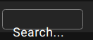
How can I change TextField height? I can't find it in the documentation. When I try to change it directly in CSS it works incorrectly (it looks like this - selected height on the screen 26px).

What should I do?

bflemi3
  • 6,698
  • 20
  • 88
  • 155
Andrey Radkevich
  • 3,012
  • 5
  • 25
  • 57

12 Answers12

53

You can try out adding the size="small" which is mentioned in the Textfield API

<TextField variant="outlined" size="small" / >
SAUMITRA KUMAR
  • 697
  • 6
  • 7
32

The other answer is useful but didn't work for me because if a label is used in an outlined component (as it is in the question) it leaves the label uncentered. If this is your usecase, read on.

The way the <label> component is styled is somewhat idiosyncratic, using position: absolute and transform. I believe it's done this way to make the animation work when you focus the field.

The following worked for me, with the latest material-ui v4 (it should work fine with v3 too).

// height of the TextField
const height = 44

// magic number which must be set appropriately for height
const labelOffset = -6

// get this from your form library, for instance in
// react-final-form it's fieldProps.meta.active
// or provide it yourself - see notes below
const focused = ???

---

<TextField
  label="Example"
  variant="outlined"

  /* styles the wrapper */
  style={{ height }}

  /* styles the label component */
  InputLabelProps={{
    style: {
      height,
      ...(!focused && { top: `${labelOffset}px` }),
    },
  }}

  /* styles the input component */
  inputProps={{
      style: {
        height,
        padding: '0 14px',
      },
  }}
/>

Notes

  • I just used inline styles rather than the withStyles HOC, as this approach just seems simpler to me
  • The focused variable is required for this solution - you get this with final-form, formik and probably other form libraries. If you're just using a raw TextField, or another form library that doesn't support this, you'll have to hook this up yourself.
  • The solution relies on a magic number labelOffset to center the label which is coupled to the static height you choose. If you want to edit height, you'll also have to edit labelOffset appropriately.
  • This solution does not support changing the label font size. You can change the input font size, only if you're fine with there being a mismatch between that and the label. The issue is that the size of the 'notch' that houses the label in the outlined border is calculated in javascript according to a magic number ratio that only works when the label font size is the default. If you set the label font size smaller, the notch will also be too small when the label shows in the border. There's no easy way to override this, short of repeating the entire calculation yourself and setting the width of the notch (the component is fieldset > legend) yourself via CSS. For me this wasn't worth it, as I'm fine with using the default font sizes with a height of 44px.
davnicwil
  • 28,487
  • 16
  • 107
  • 123
27

The component takes a multiline prop which is a boolean. Set this to true, and then set the component's rows prop to a number.

   <TextField
      multiline={true}
      rows={3}
      name="Description"
      label="Description"
      placeholder="Description"
      autoComplete="off"
      variant="outlined"
      value={description}
      onChange={e => setDescription(e.target.value)}
    />
Bruno Crosier
  • 654
  • 9
  • 14
11

You didn't show how you tried to specify the height, but the approach you used for font-size is the right approach. Here's an example showing two text fields with different heights:

import React from "react";
import ReactDOM from "react-dom";
import TextField from "@material-ui/core/TextField";
import { withStyles } from "@material-ui/core/styles";
const styles = {
  input1: {
    height: 50
  },
  input2: {
    height: 200,
    fontSize: "3em"
  }
};
function App(props) {
  return (
    <div className="App">
      <TextField
        variant="outlined"
        InputProps={{ classes: { input: props.classes.input1 } }}
      />
      <TextField
        variant="outlined"
        InputProps={{ classes: { input: props.classes.input2 } }}
      />
    </div>
  );
}
const StyledApp = withStyles(styles)(App);
const rootElement = document.getElementById("root");
ReactDOM.render(<StyledApp />, rootElement);

And here is a code sandbox with the same code so you can see it running.

Ryan Cogswell
  • 75,046
  • 9
  • 218
  • 198
  • So it is only possible to have differently sized TextFields if they also have different font sizes? That seems oddly restrictive to me. – pfincent Mar 25 '20 at 14:22
  • 1
    @pfincent No, there's no tie between the two. In fact, my example has two TextFields which both have heights that are different than the default, but only the second changes the font size. – Ryan Cogswell Mar 25 '20 at 14:31
  • oops ok, my bad. – pfincent Mar 25 '20 at 16:08
11

First of all, my heart goes out to any poor soul in this thread who has found themselves fighting against the awkward design of the MUI components. Second, if you're using themes AND the "filled" variant of TextField, this solution might work for you. Using the Chrome Dev Tools, I found success adjusting the height of the divs with the classes "MuiFormControl-root" and "MuiInputBase-root". This is what my code looks like (results may vary):

const theme = createMuiTheme({
  overrides: {
    MuiFormControl: {
      root: {
        height: '56px',
      },
    },
    MuiInputBase: {
      root: {
        height: '56px',
      },
    },
  },
})
John Miller
  • 388
  • 2
  • 8
  • 23
  • 3
    Sir you've likely saved my week. Amazing, thorough, simple solution. No idea why this isn't more out of the box and intuitive by MUI's dev team. – cr4z Jan 20 '23 at 17:13
11
  <TextField
    id="outlined-multiline-static"
    label="Multiline"
    multiline
    fullWidth
    defaultValue="Default Value"
    inputProps={{
      style: {
        height: "600px",
      },
    }}
  />
Chukwuemeka Maduekwe
  • 6,687
  • 5
  • 44
  • 67
7

To make it narrower, set a height, and add a "dense" margin prop on the TextField to keep the label aligned correctly:

<TextField margin="dense" style={{ height: 38 }} />
Anne
  • 230
  • 2
  • 6
6

With material-ui v4+, you have to adjust the input padding and the label position to get what you whant.

<TextField label="Label" variant="outlined" />

Suppose we want the above TextField to be 48px height (it's default size is 56px), we just have to do (56px - 48px) / 2 = 4px and in our css file:

.MuiTextField-root input {
  /* 14.5px = 18.5px - 4px (note: 18.5px is the input's default padding top and bottom) */
  padding-top: 14.5px;
  padding-bottom: 14.5px; 
}

.MuiTextField-root label {
  top: -4px;
}

.MuiTextField-root label[data-shrink='true'] {
  top: 0;
}

For styled-components users, all the above block of code can be defined as Sass mixins that can be re-used throughout the code base

import { css } from 'styled-components'

const muiTextFieldHeight = (height: number) => {
  const offset = (56 - height) / 2

  return css`
    input {
      padding-top: calc(18.5px - ${offset}px);
      padding-bottom: calc(18.5px - ${offset}px);
    }

    label {
      top: -${offset}px;
    }

    label[data-shrink='true'] {
      top: 0;
    }
  `
}

Then somewhere in your stylesheet

  .MuiTextField-root {
      ${muiTextFieldHeight(40)} /* set TextField height to 40px */
  }
Léon Logli
  • 439
  • 7
  • 7
5

Changing the height is simple, can be achieved using

InputProps={{style: { fontSize: '1.8rem', height: 70 },

But that isn't enough, because the label(placeholder in this case) will not be centered. Label can be centered using:

sx={{'.MuiFormLabel-root[data-shrink=false]': { top: <put desired value here>} }}
Sedat Polat
  • 1,631
  • 2
  • 18
  • 28
Luka ilic
  • 51
  • 1
  • 2
3

This works with material-ui v3,

<div className="container">
  <TextField
    label="Full name"
    margin="dense"
    variant="outlined"
    autoFocus
  />
</div>

.css

.container input {
  height: 36px;
  padding: 0px 14px;
}

.container label {
  height: 36px;
  top: -6px;
}

.container label[data-shrink="true"] {
  top: 0;
}

https://codesandbox.io/s/elated-kilby-9s3ge

Yoseph
  • 2,356
  • 1
  • 13
  • 18
1

With React and "@mui/material": "^5.2.2",

import * as React from 'react';
import TextField from '@mui/material/TextField';

export default function BasicTextFields() {
  return (
    <TextField
      label="Outlined"
      variant="outlined"
      InputLabelProps={{
        style: {
          fontSize: 14,
          backgroundColor: '#FFF',
          paddingLeft: 4,
          paddingRight: 4,
          color: '#383838',
        },
      }}
      inputProps={{
        style: {
          fontSize: 14,
          height: 40,
          width: 272,
          padding: '0 14px',
          fontWeight: 'bold'
        },
    }}
    />
  );
}

CSS

.MuiTextField-root{
  border: 1px solid $BORDER_COLOR_2;
  border-radius: 6px;
  height: 40px;
  box-shadow: 0px 2px 3px $BOX_SHADOW_1;
  color: $TEXT_COLOR_3;
  font-size: 14px;
  font-weight: bold;
}

.MuiTextField-root label {
  top: -6px;
}

.MuiTextField-root label[data-shrink='true'] {
  top: 0;
}
Ali
  • 31
  • 1
  • 3
0

If you are using a label and need it to be centered after adjusting the height, as I have had this frustrating issue, a remedy would be changing the transform css property. You can find the original transform property for the label when you inspect it with developer tools, and then adjust it to the appropriate value that centers it.

export const StyledTextField = withStyles({root: {
"& label.MuiInputLabel-outlined.MuiInputLabel-marginDense": {
  transform: "translate(14px, 18px) scale(1)",
},

"& label.MuiInputLabel-outlined.MuiInputLabel-shrink": {
  transform: "translate(14px, -5px) scale(0.8)",
},}})
osi_okorie
  • 73
  • 1
  • 4