IE seems to align items differently using justify-content when there is an overflow. it doesn't only happen with flex-end, you will face the same using center. Any value that will create a top overflow will not work as expected.
It will also happen in a row direction. Any property that will create a left overflow will not work.
Examples where the alignment is doing nothing:
.container {
  display:inline-flex;
  height:50px;
  width:50px;
  margin:50px;
  border:2px solid green;
}
.container span {
  flex-shrink:0;
  width:200%;
  background:red;
}

.alt {
  flex-direction:column;
}

.alt span {
  height:200%;
  width:auto;
}
<div class="container" style="justify-content:flex-end;">
  <span></span>
</div>

<div class="container" style="justify-content:center;">
  <span></span>
</div>

<div class="container alt" style="justify-content:flex-end;">
  <span></span>
</div>

<div class="container alt" style="justify-content:center;">
  <span></span>
</div>
I am surprised to say this, but it seems that IE is doing a good thing in those cases because it's preventing the unwanted overflow which may create issues like described in this question Centered flex-container grows beyond top and also this one Can't scroll to top of flex item that is overflowing container
Considering this, it's difficult to say if it's a bug. It's a probably by design and the IE team made the decision to avoid the bad overflow. 1
This said, here is a hack using some negative margin that will allow you to have the needed behavior on IE:
.flex-container {
  display: flex;
  flex-wrap: nowrap;
  background-color: DodgerBlue;
  flex-direction: column;
  flex-flow: column;
  justify-content: flex-end;
  height: 100px
}
.flex-container > div:first-child {
  margin-top:-100vh; /*put a very big margin here*/
}
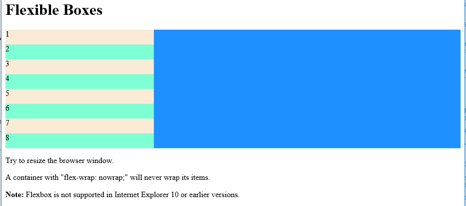
<h1>Flexible Boxes</h1>

<div class="flex-container">
  <div>1</div>
  <div>2</div>
  <div>3</div>
  <div>4</div>
  <div>5</div>
  <div>6</div>
  <div>7</div>
  <div>8</div>
</div>
Same hack applied to the previous examples:
.container {
  display:inline-flex;
  height:50px;
  width:50px;
  margin:50px;
  border:2px solid green;
}
.container span {
  flex-shrink:0;
  width:200%;
  background:red;
}

.alt {
  flex-direction:column;
}

.alt span {
  height:200%;
  width:auto;
}
<div class="container" style="justify-content:flex-end;">
  <span style="margin-left:-100%;"></span>
</div>

<div class="container" style="justify-content:center;">
  <span style="margin: 0 -100%;"></span>
</div>

<div class="container alt" style="justify-content:flex-end;">
  <span style="margin-top:-100%;"></span>
</div>

<div class="container alt" style="justify-content:center;">
  <span style="margin:-100% 0;"></span>
</div>
1: I don't have any official proof at the time being.