4

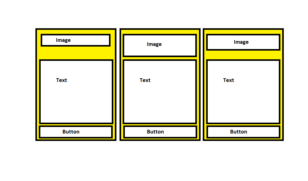
I have multiple items say cards. These cards need to stack horizontally and height needs to be the same. This is happening for me.

Each card has an image, text and a button. Image and text for each card should take what ever is the max height in any card, so that these align properly. This is not happening for me.

If the image and text align properly then the button will always be aligned in each card at the bottom.

I have been following this tutorial but I have multiple cards, putting three here only. Also the third card image height is being set via CSS.

.partner-cards * {
  box-sizing: border-box;
}

.partner-cards {
  display: flex;
  flex-wrap: wrap;
}

.partner-card {
  display: flex;
  flex: 1 0 20%;
  border-radius: 0;
  text-align: center;
  border: 3px solid blue;
  padding: 5px;/*3rem;*/
  margin-bottom: 3rem;
  max-width: 20%;
  margin: 5px;
}

.partner-card-content {
  display: flex;
  flex-direction: column;
}
/*
.card-content .image-container img {
  
  margin: 0;
  padding: 0;
}
*/
.partner-card-content .partner-image-container {
  border: 1px solid green;
  padding: 0;
  margin: 0;
  min-height: 11rem;
                display: flex;
                vertical-align: middle;
                align-items: center;
                justify-content: center;
                max-width: 100%;
}

.partner-card-content p /*, .card-content .image-container*/
{
  flex: 1 0 auto;
  border: 1px solid red;
}

.partner-card-content img.third-image {
  height: 5.5rem !important;
}
/*
p {
  font-size: 16px;
line-height: 26px;
font-family: Averta-Regular,Arial,Helvetica,sans-serif;
margin-bottom: 2.5rem;
margin-top: 0;
}*/
<div class="partner-cards">

  <div class="partner-card">
    <div class="partner-card-content">
      <div class="partner-image-container">
        <img src="https://via.placeholder.com/100x40" alt="">
      </div>
      <p>Lorem Ipsum is simply dummy text of the printing and typesetting industry. Lorem Ipsum has been the industry's standard dummy text ever since the 1500s.</p>
      <a class="primary-button" href="#">View XXX XXX XXX Offer</a>
    </div>
  </div>

  <div class="partner-card">
    <div class="partner-card-content">
      <div class="partner-image-container">
        <img src="https://via.placeholder.com/50x150" alt="">
      </div>
      <p>Lorem Ipsum is simply dummy text of the printing and typesetting industry. Lorem Ipsum has been the industry's standard dummy text ever since the 1500s. Lorem Ipsum is simply dummy text of the printing and typesetting industry. Lorem Ipsum has been
        the industry's standard dummy text ever since the 1500s.</p>
      <a class="primary-button" href="#">View YYY Offer</a>
    </div>
  </div>

  <div class="partner-card">
    <div class="partner-card-content">
      <div class="partner-image-container">
        <img src="https://via.placeholder.com/120x100" class="third-image" alt="">
      </div>
      <p>Lorem Ipsum is simply dummy text of the printing and typesetting industry. Lorem Ipsum has been the industry's standard dummy text ever since the 1500s. Lorem Ipsum is simply dummy text of the printing and typesetting industry. Lorem Ipsum has been
        the industry's standard dummy text ever since the 1500s. Lorem Ipsum is simply dummy text of the printing and typesetting industry. </p>
      <a class="primary-button" href="#">View ZZZ Offer</a>
    </div>
  </div>
  
  <div class="partner-card">
    <div class="partner-card-content">
      <div class="partner-image-container">
        <img src="https://via.placeholder.com/50x100" alt="">
      </div>
      <p>Lorem Ipsum is simply dummy text of the printing and typesetting industry. Lorem Ipsum has been the industry's standard dummy text ever since the 1500s. Lorem Ipsum is simply dummy text of the printing and typesetting industry. Lorem Ipsum has been
        the industry's standard dummy text ever since the 1500s. Lorem Ipsum is simply dummy text of the printing and typesetting industry. Lorem Ipsum has been the industry's standard dummy text ever since the 1500s</p>
      <a class="primary-button" href="#">View ABC Offer</a>
    </div>
  </div>
</div>

How it should show:

enter image description here

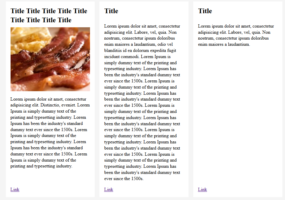
The tutorial image on code pen, properly aligns the h2, text and link:

enter image description here

Temani Afif
  • 245,468
  • 26
  • 309
  • 415
learning...
  • 3,104
  • 10
  • 58
  • 96
  • you *can't* align flex items in adjacent flexboxes... – kukkuz Mar 21 '19 at 02:36
  • @kukkuz plz take a look at this http://www.lottejackson.com/learning/an-equal-height-grid-using-flexbox. Each item has the link aligned towards the bottom as `flex: 1 0 auto` is being applied to the p. Here is the link to the tutorial on codepen https://codepen.io/lottejackson/embed/PwvjPj?height=268&theme-id=0&slug-hash=PwvjPj&default-tab=result&user=lottejackson&name=cp_embed_1#result-box. – learning... Mar 21 '19 at 02:39
  • try using different size images / long titles in that code and you'll see – kukkuz Mar 21 '19 at 02:54
  • @kukkuz I just checked codepen (tutorial) and placed extra text (different) inside item1 and item2 and the link properly got aligned at the bottom for all items. – learning... Mar 21 '19 at 03:04
  • the link aligns to the bottom always, but when you change the heights of the *title* `h2` elements, you can see they don't align – kukkuz Mar 21 '19 at 03:06
  • @kukkuz plz take a look at the image 2 i uploaded to the question. I just added extra text to H2, all items still align. i haven't change the height of the H2. – learning... Mar 21 '19 at 03:22
  • https://codepen.io/anon/pen/aMRQJB I just changed the header text... a 2-line text is working fine because of `p` element margins – kukkuz Mar 21 '19 at 03:23
  • Your change breaks the p alignment at the top but the link is still aligned at the bottom. In my example, my button isn't. – learning... Mar 21 '19 at 03:31
  • yeah, link is still fine.. so your issue is with the button? – kukkuz Mar 21 '19 at 03:32
  • im trying to understand your problem :) butwhen I run your code, each `card` comes one below the other – kukkuz Mar 21 '19 at 03:38
  • For me they are showing properly. 3 cards in a row. Its alignment inside the cards which is an issue. – learning... Mar 21 '19 at 03:42
  • put `flex-direction: row` on cards if you are setting it up at your end. It's a default value, see if this stack them properly for you. – learning... Mar 21 '19 at 03:48
  • Can you create a fiddle or a snippet? – kukkuz Mar 21 '19 at 04:02
  • I have created a fiddle with your code https://jsfiddle.net/t47q6g8s/ let me know what I am missing to replicate your issue – kukkuz Mar 21 '19 at 05:15
  • There is **NO *current*** CSS mechanism to align items that do not share a parent. CSS-Grid `subgrid` should allow this but, at present, no browser supports it. Current solutions *require* javascript. – Paulie_D Mar 21 '19 at 10:03
  • @kukkuz `max-width` is missing on the `.card`. Put some thing like 20% or so. – learning... Mar 21 '19 at 10:56
  • @kukkuz I have played around with your fiddle a bit, you can see it here https://jsfiddle.net/8jenc5fx/2/. – learning... Mar 21 '19 at 11:17
  • okay, actually Im a bit confused... so if you don't mind, now can you explain me based on the above fiddle the issue you are facing, so that things are clear for me... – kukkuz Mar 21 '19 at 11:26
  • In the fiddle, `p` area expands in height and button displays at the bottom. Its always aligned. In my case, `p` is retaining its original height per the content in it. – learning... Mar 21 '19 at 12:02
  • 1
    Rather than finding the collision, i changed the classes and now `p` tag become the same height. Now, getting into another issue, if one the anchors has text which is greater the width of the container, it will wrap to next row. In this case, `p` is not any more aligned. and the `a` start little higher than the rest. Plz take a look at the first box in the fiddle https://jsfiddle.net/learningjsfiddle/8jenc5fx/31/ – learning... Mar 21 '19 at 14:34
  • okay, so your issue is the *misalignment* occurs *only* when `a` *wraps* into multiple lines? – kukkuz Mar 21 '19 at 16:26
  • Don't think I am arguing but again I'm stressing the fact that *alignment of flexbox items in adjacent flexboxes is not possible* :) Anyway you *have* a `min-height` for the `partner-image-container`, so I guess you can have either a `min-height` set for the `a` or an *ellipsis* and keep it to a single line... – kukkuz Mar 21 '19 at 16:31
  • @kukkuz you are correct, keeping the button to single line text. IE 11 has some other Flexbox issues but that is a fight for another day. Please move your comment as an answer and i'll accept it. – learning... Mar 21 '19 at 22:47
  • have added an answer to explain the whole scenario of your layout, thanks :) – kukkuz Mar 22 '19 at 01:41

1 Answers1

1

TL;DR

Alignment of flexbox items in adjacent flexboxes is not possible in CSS. You really need sub-grids to solve this problem with dynamic sizes of the sections in your card.


Flexbox Scenario

Anyway given that you have a min-height for the partner-image-container, so I guess you can have either a min-height set for the a or an ellipsis to keep it to a single line. See below solution that adds an ellipsis:

.partner-cards * {
  box-sizing: border-box;
}

.partner-cards {
  display: flex;
  flex-wrap: wrap;
}

.partner-card {
  display: flex;
  flex: 1 0 20%;
  border-radius: 0;
  text-align: center;
  border: 3px solid blue;
  padding: 5px;/*3rem;*/
  margin-bottom: 3rem;
  max-width: 20%;
  margin: 5px;
}

.partner-card-content {
  display: flex;
  flex-direction: column;
  min-width: 0; /* ADDED */
}


/*
.card-content .image-container img {
  
  margin: 0;
  padding: 0;
}
*/

.partner-card-content .partner-image-container {
  border: 1px solid green;
  padding: 0;
  margin: 0;
  min-height: 11rem;
  display: flex;
  vertical-align: middle;
  align-items: center;
  justify-content: center;
  max-width: 100%;
}

.partner-card-content p/*, .card-content .image-container*/ {
  flex: 1 0 auto;
  border: 1px solid red;
}

.partner-card-content img.third-image {
  height: 5.5rem !important;
}


/*
p {
  font-size: 16px;
line-height: 26px;
font-family: Averta-Regular,Arial,Helvetica,sans-serif;
margin-bottom: 2.5rem;
margin-top: 0;
}*/

.primary-button { /* ADDED */
  text-overflow: ellipsis;
  overflow: hidden;
  white-space: nowrap;
}
<div class="partner-cards">

  <div class="partner-card">
    <div class="partner-card-content">
      <div class="partner-image-container">
        <img src="https://via.placeholder.com/100x40" alt="">
      </div>
      <p>Lorem Ipsum is simply dummy text of the printing and typesetting industry. Lorem Ipsum has been the industry's standard dummy text ever since the 1500s.</p>
      <a class="primary-button" href="#">View XXX XXX XXX Offer</a>
    </div>
  </div>

  <div class="partner-card">
    <div class="partner-card-content">
      <div class="partner-image-container">
        <img src="https://via.placeholder.com/50x150" alt="">
      </div>
      <p>Lorem Ipsum is simply dummy text of the printing and typesetting industry. Lorem Ipsum has been the industry's standard dummy text ever since the 1500s. Lorem Ipsum is simply dummy text of the printing and typesetting industry. Lorem Ipsum has been
        the industry's standard dummy text ever since the 1500s.</p>
      <a class="primary-button" href="#">View YYY Offer</a>
    </div>
  </div>

  <div class="partner-card">
    <div class="partner-card-content">
      <div class="partner-image-container">
        <img src="https://via.placeholder.com/120x100" class="third-image" alt="">
      </div>
      <p>Lorem Ipsum is simply dummy text of the printing and typesetting industry. Lorem Ipsum has been the industry's standard dummy text ever since the 1500s. Lorem Ipsum is simply dummy text of the printing and typesetting industry. Lorem Ipsum has been
        the industry's standard dummy text ever since the 1500s. Lorem Ipsum is simply dummy text of the printing and typesetting industry. </p>
      <a class="primary-button" href="#">View ZZZ Offer</a>
    </div>
  </div>

  <div class="partner-card">
    <div class="partner-card-content">
      <div class="partner-image-container">
        <img src="https://via.placeholder.com/50x100" alt="">
      </div>
      <p>Lorem Ipsum is simply dummy text of the printing and typesetting industry. Lorem Ipsum has been the industry's standard dummy text ever since the 1500s. Lorem Ipsum is simply dummy text of the printing and typesetting industry. Lorem Ipsum has been
        the industry's standard dummy text ever since the 1500s. Lorem Ipsum is simply dummy text of the printing and typesetting industry. Lorem Ipsum has been the industry's standard dummy text ever since the 1500s</p>
      <a class="primary-button" href="#">View ABC Offer</a>
    </div>
  </div>
</div>

Note that you'll have to add min-width: 0 to partner-card-content to override the default min-width: auto setting for a flexbox in the flex axis. You can see some examples of this behaviour below:


CSS Grid Scenario

You can do this in a different way using CSS Grid Layout - as an example consider 3 cards laid out in a row. This works for dynamic heights of each of your card sections - see demo below:

.partner-cards * {
  box-sizing: border-box;
}

.partner-cards {
  display: grid;
  grid-template-columns: 1fr 1fr 1fr;
  grid-template-rows: auto 1fr auto;
  grid-auto-flow: column;
  grid-column-gap: 10px;
}

.partner-card, .partner-card-content {
  display: contents;
}

.partner-card-content .partner-image-container {
  border: 1px solid green;
  display: flex;
  align-items: center;
  justify-content: center;
  max-width: 100%;
}

.partner-card-content p {
  border: 1px solid red;
  margin: 0;
}

.partner-card-content a {
  border: 1px solid;
}
<div class="partner-cards">
  <div class="partner-card">
    <div class="partner-card-content">
      <div class="partner-image-container">
        <img src="https://via.placeholder.com/100x40" alt="">
      </div>
      <p>Lorem Ipsum is simply dummy text of the printing and typesetting industry. Lorem Ipsum has been the industry's standard dummy text ever since the 1500s.</p>
      <a class="primary-button" href="#">View XXX XXX XXX Offer</a>
    </div>
  </div>
  <div class="partner-card">
    <div class="partner-card-content">
      <div class="partner-image-container">
        <img src="https://via.placeholder.com/50x150" alt="">
      </div>
      <p>Lorem Ipsum is simply dummy text of the printing and typesetting industry. Lorem Ipsum has been the industry's standard dummy text ever since the 1500s. Lorem Ipsum is simply dummy text of the printing and typesetting industry. Lorem Ipsum has been
        the industry's standard dummy text ever since the 1500s.</p>
      <a class="primary-button" href="#">View YYY Offer</a>
    </div>
  </div>

  <div class="partner-card">
    <div class="partner-card-content">
      <div class="partner-image-container">
        <img src="https://via.placeholder.com/120x100" class="third-image" alt="">
      </div>
      <p>Lorem Ipsum is simply dummy text of the printing and typesetting industry. Lorem Ipsum has been the industry's standard dummy text ever since the 1500s. Lorem Ipsum is simply dummy text of the printing and typesetting industry. Lorem Ipsum has been
        the industry's standard dummy text ever since the 1500s. Lorem Ipsum is simply dummy text of the printing and typesetting industry. </p>
      <a class="primary-button" href="#">View ZZZ Offer</a>
    </div>
  </div>
</div>

But again it has limitations because you are not able to control your layout - you don't have control over your cards but you are working on the contents of the cards here which is not very useful. Note that I have used display: contents for the partner-card and partner-card-content elements. When sub-grids are implemented, we will have a complete solution to layouts such as this - see the discussion below too:

kukkuz
  • 41,512
  • 6
  • 59
  • 95
  • 1
    Still going with Flexbox since i don't have control over that. Your suggestion helped with fixing the IE 11 issue as well. I have updated the jsfiddle https://jsfiddle.net/learningjsfiddle/2x4yc7v0/26/. Thanks for your time! – learning... Mar 22 '19 at 15:28