8

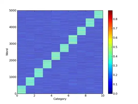
I have a very large matrix(10x55678) in "numpy" matrix format. the rows of this matrix correspond to some "topics" and the columns correspond to words(unique words from a text corpus). Each entry i,j in this matrix is a probability, meaning that word j belongs to topic i with probability x. since I am using ids rather than the real words and since the dimension of my matrix is really large I need to visualized it in a way.Which visualization do you suggest? a simple plot? or a more sophisticated and informative one?(i am asking these cause I am ignorant about the useful types of visualization). If possible can you give me an example that using a numpy matrix? thanks

the reason I asked this question is that I want to have a general view of the word-topic distributions in my corpus. any other methods are welcome

Benjamin
  • 11,560
  • 13
  • 70
  • 119
Hossein
  • 40,161
  • 57
  • 141
  • 175
  • 55678 word entries do not fit on a screen. You have to tell us what information is important for you. – eumiro Apr 05 '11 at 13:35
  • 1
    This question seems a bit like "I have 50000 telephone numbers. What is the best way of visualise those?" – Sven Marnach Apr 05 '11 at 13:37
  • @eumiro: is it possible to make it as compact as possible with the zoom ability? if not,this matrix is pretty sparse..many entries are zero which do not give me that much information, is this useful? – Hossein Apr 05 '11 at 13:38
  • @Sven Marnach: I just want get an overall picture of probability distributions in a visual way – Hossein Apr 05 '11 at 13:39
  • @Hossein: My point is that you have 55678 *completely unrelated* probability distributions. It does not seem to make much sense to try to plot them all at the same time – Sven Marnach Apr 05 '11 at 14:01
  • @Hossein, but how can you get an overall picture of the probability distribution across 50000 unique data points? Are you imagining peaks and valleys? That's only meaningful when the data points have a natural ordering. Perhaps you'd like to limit the visualization to, say, the 10 or 20 most common words? Or perhaps you would like to do clustering, which would require substantial statistical work. You do realize that most people know [fewer than 30000 words](http://iteslj.org/Articles/Cervatiuc-VocabularyAcquisition.html), right? – senderle Apr 05 '11 at 14:06
  • Who is the audience for this visualization? Just you? What decisions need to be made? Is it important to know which words have high/low probability? Is it important to know which words have common topics? Is it important to know word-word associativity via topic? Printing a list of word-topic pairs sorted and filtered by probability seems sufficient based on the assumptions I made reading your question. – Paul Apr 05 '11 at 14:10
  • @senderle: thanks. I think I am imagining peaks and valleys. and this large matrix is actually the result of some kind of clustering. so the clusters are the number of topics and each entry(probability) says how probable is that word x belongs to topic(cluster)Y. Most of this entries are zero or very very small. can you give me any suggestions? – Hossein Apr 05 '11 at 14:11

2 Answers2

17

You could certainly use matplotlib's imshowor pcolor method to display the data, but as comments have mentioned, it might be hard to interpret without zooming in on subsets of the data.

a = np.random.normal(0.0,0.5,size=(5000,10))**2
a = a/np.sum(a,axis=1)[:,None]  # Normalize

pcolor(a)

Unsorted random example

You could then sort the words by the probability that they belong to a cluster:

maxvi = np.argsort(a,axis=1)
ii = np.argsort(maxvi[:,-1])

pcolor(a[ii,:])

enter image description here

Here the word index on the y-axis no longer equals the original ordering since things have been sorted.

Another possibility is to use the networkx package to plot word clusters for each category, where the words with the highest probability are represented by nodes that are either larger or closer to the center of the graph and ignore those words that have no membership in the category. This might be easier since you have a large number of words and a small number of categories.

Hopefully one of these suggestions is useful.

JoshAdel
  • 66,734
  • 27
  • 141
  • 140
  • 2
    For word frequencies, try a log scale -- see [Zipf's law](http://en.wikipedia.org/wiki/Zipf's_law). – denis Apr 06 '11 at 16:39
2

The key thing to consider is whether you have important structure along both dimensions in the matrix. If you do then it's worth trying a colored matrix plot (e.g., imshow), but if your ten topics are basically independent, you're probably better off doing ten individual line or histogram plots. Both plots have advantages and disadvantages.

In particular, in full matrix plots, the z-axis color values are not very precise or quantitative, so its difficult to see, for example, small ripples on a trend, or quantitative assessments of rates of change, etc, so there's a significant cost to these. And they are also more difficult to pan and zoom since one can get lost and therefore not examine the entire plot, whereas panning along a 1D plot is trivial.

Also, of course, as others have mentioned, 50K points is too many to actually visualize, so you'll need to sort them, or something, to reduce the number of values that you'll actually need to visually assess.

In practice though, finding a good visualizing technique for a given data set is not always trivial, and for large and complex data sets, people try everything that has a chance of being helpful, and then choose what actually helps.

tom10
  • 67,082
  • 10
  • 127
  • 137