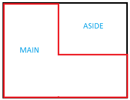
not really an answer but for the fun and to remenber & to show that the behavior of floatting elements can be used to fake such a shaped layout.
Float is not obsolete and can once be still usefull even if display has become very good.
so here is from my comment and an old pen an example looking close to your grid.
It is about https://developer.mozilla.org/en-US/docs/Web/Guide/CSS/Block_formatting_context
A block formatting context is a part of a visual CSS rendering of a Web page. It is the region in which the layout of block boxes occurs and in which floats interact with other elements.
demo below
/* my grid not flexible enough ...
.wrapper {
  display: grid;
  grid-template-columns: 1fr 300px;
  grid-template-areas: "main aside"
                       "main main";
}

.wrapper > aside {
 grid-area: aside;
}

.wrapper > main {
  grid-area: main;
}
*/
/* back to the past */
.wrapper {
overflow: hidden;/* to keep float inside */
}
.wrapper aside {
float: right;
width: 300px;
}
/*makup*/
.wrapper {
box-shadow: 0 0 0 3px inset red;
}
.wrapper aside {
padding: 1em;
border: solid;
box-shadow: 0 0 0 3px white, 0 0 0 6px red;
margin: 0 0 1.5em 1em;
}
main {
padding: 1em;
}
<section class="wrapper">
  <aside>Aside</aside>
  <main>MAIN</main>
</section>
to let content of main flow under aside, remember that you are dealing with float, do not reset display or oveflow to main to keep it this way , read about block formatting context.