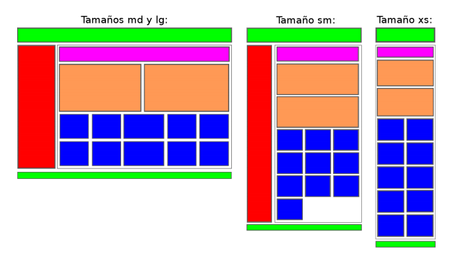
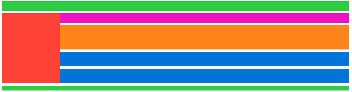
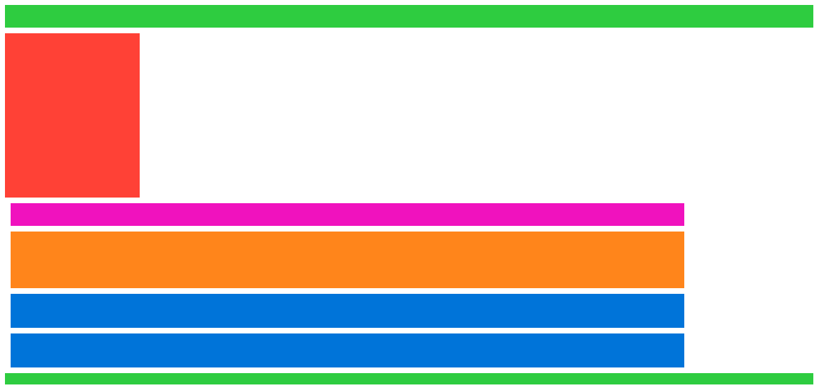
I'm starting to learn Bootstrap but for some reason I'm having this issue when trying to create a grid. I want it to look like this image, but it just breaks when I try to add a margin-left. I can add a margin-top no problem, but whenever I make it a bit larger horizontally, it all breaks, and it goes from this to, whenever I add, for example, "ml-2" to any element, this.
Here's my HTML:
<!DOCTYPE html>
<html lang="en" dir="ltr">
  <head>
    <meta charset="utf-8">
    <title>Tasca 21</title>
    <link rel="stylesheet" href="https://maxcdn.bootstrapcdn.com/bootstrap/4.0.0/css/bootstrap.min.css" integrity="sha384-Gn5384xqQ1aoWXA+058RXPxPg6fy4IWvTNh0E263XmFcJlSAwiGgFAW/dAiS6JXm" crossorigin="anonymous">
    <script src="https://code.jquery.com/jquery-3.2.1.slim.min.js" integrity="sha384-KJ3o2DKtIkvYIK3UENzmM7KCkRr/rE9/Qpg6aAZGJwFDMVNA/GpGFF93hXpG5KkN" crossorigin="anonymous"></script>
    <script src="https://cdnjs.cloudflare.com/ajax/libs/popper.js/1.12.9/umd/popper.min.js" integrity="sha384-ApNbgh9B+Y1QKtv3Rn7W3mgPxhU9K/ScQsAP7hUibX39j7fakFPskvXusvfa0b4Q" crossorigin="anonymous"></script>
    <script src="https://maxcdn.bootstrapcdn.com/bootstrap/4.0.0/js/bootstrap.min.js" integrity="sha384-JZR6Spejh4U02d8jOt6vLEHfe/JQGiRRSQQxSfFWpi1MquVdAyjUar5+76PVCmYl" crossorigin="anonymous"></script>
    <link rel="stylesheet" href="css/master.css">
    <meta name="viewport" content="width=device-width, initial-scale=1, shrink-to-fit=no">
  </head>
  <body>
    <div class="container">
      <div class="row">
        <div class="col" id="top"></div>
      </div>
      <div class="row">
        <div class="mt-2 col-lg-2 col-md-2 col-sm-3 xs-hidden" id="left"></div>
        <div class="col-10">
          <div class="row">
            <div class="mt-2 col" id="top2"></div>
          </div>
          <div class="row" id="mid">
            <div class="mt-2 col-lg-6 col-md-6 col-sm-12 col-xs-12"></div>
            <div class="mt-2 col-lg-6 col-md-6 col-sm-12 col-xs-12"></div>
          </div>
          <div class="row" id="cubes">
            <div class="mt-2 col-2"></div>
            <div class="mt-2 col-2"></div>
            <div class="mt-2 col-4"></div>
            <div class="mt-2 col-2"></div>
            <div class="mt-2 col-2"></div>
          </div>
          <div class="row" id="cubes">
            <div class="mt-2 col-2"></div>
            <div class="mt-2 col-2"></div>
            <div class="mt-2 col-4"></div>
            <div class="mt-2 col-2"></div>
            <div class="mt-2 col-2"></div>
          </div>
      </div>
    </div>
    <div class="row">
      <div class="col-12 mt-2" id="bottom"></div>
    </div>
  </div>
  </body>
</html>
And my CSS:
body {
  margin: 5em;
}
#top {
  background-color: #2ECC40;
  height: 2em;
}
#bottom {
  background-color: #2ECC40;
  height: 1em;
}
#left {
  background-color: #FF4136;
  height: 14.5em;
}
#top2 {
  background-color: #F012BE;
  height: 2em;
}
#mid div {
  background-color: #FF851B;
  height: 5em;
}
#cubes div {
  background-color: #0074D9;
  height: 3em;
}