10

I searched a lot of questions about heatmap throughout the site and packages, but I still have a problem.
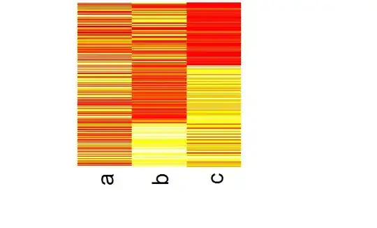
I have clustered data (kmeans/EM/DBscan..), and I want to create a heatmap by grouping the same cluster. I want the similar color patterns to be grouped in the heatmap, so generally, it looks like a block-diagonal.
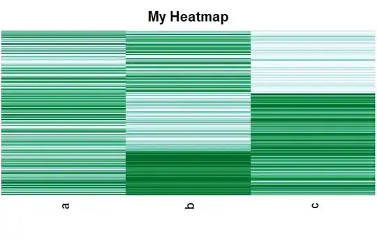
I tried to order the data by the cluster number and display it,

k = kmeans(data, 3)
d = data.frame(data)
d = data.frame(d, k$cluster)
d = d[order(d$k.cluster),]
heatmap(as.matrix(d))
but it is still not sorted and looks like this link:enter image description here
But, I want it to be sorted by its cluster number and looked like this:enter image description here
Can I do this in R?
I searched lots of packages and tried many ways, but I still have a problem.
Thanks a lot.
Andrie
  • 176,377
  • 47
  • 447
  • 496
question
  • 487
  • 3
  • 8
  • 13
  • 5
    Don't use a red-green colour scheme unless you want to make it impossible to red for the 5-10% of men who have red-green colour weakness. – hadley Apr 20 '11 at 00:42

2 Answers2

9

You can do this using reshape2 and ggplot2 as follows:

library(reshape2)
library(ggplot2)

# Create dummy data
set.seed(123)
df <- data.frame(
        a = sample(1:5, 1000, replace=TRUE),
        b = sample(1:5, 1000, replace=TRUE),
        c = sample(1:5, 1000, replace=TRUE)
)

# Perform clustering
k <- kmeans(df, 3)

# Append id and cluster
dfc <- cbind(df, id=seq(nrow(df)), cluster=k$cluster)

# Add idsort, the id number ordered by cluster 
dfc$idsort <- dfc$id[order(dfc$cluster)]
dfc$idsort <- order(dfc$idsort)

# use reshape2::melt to create data.frame in long format
dfm <- melt(dfc, id.vars=c("id", "idsort"))

ggplot(dfm, aes(x=variable, y=idsort)) + geom_tile(aes(fill=value))

enter image description here

Andrie
  • 176,377
  • 47
  • 447
  • 496
  • Wow, this is precisely what I am trying to do. I realize this question is a little old, but does anyone know how to display the y-axis labels (Probeset.ID) from the OP's question? Thanks. – drbunsen Dec 12 '11 at 22:39
  • How do we use kmeans for something like this df <- data.frame( a = sample(c("A","B","C","D","E"), 1000, replace=TRUE), b = sample(c("A","B","C","D","E"), 1000, replace=TRUE), c = sample(1:5, 1000, replace=TRUE) )? – blehman Jun 13 '13 at 22:04
  • I wish I could assign the green check to this one :-/ – Tyler Rinker Jul 30 '16 at 17:06
2

You should set Rowv and Colv to NA if you don't want the dendrograms and the subseuent ordering. BTW, You should also put of the scaling. Using the df of Andrie :

heatmap(as.matrix(df)[order(k$cluster),],Rowv=NA,Colv=NA,scale="none",labRow=NA)

enter image description here

In fact, this whole heatmap is based on image(). You can hack away using image to construct a plot exactly like you want. Heatmap is using layout() internally, so it will be diffucult to set the margins. With image you could do eg :

myHeatmap <- function(x,ord,xlab="",ylab="",main="My Heatmap",
                      col=heat.colors(5), ...){
    op <- par(mar=c(3,0,2,0)+0.1)
    on.exit(par(op))
    nc <- NCOL(x)
    nr <- NROW(x)
    labCol <- names(x)

    x <- t(x[ord,])
    image(1L:nc, 1L:nr, x, xlim = 0.5 + c(0, nc), ylim = 0.5 +
        c(0, nr), axes = FALSE, xlab=xlab, ylab=ylab, main=main,
        col=col,...)

    axis(1, 1L:nc, labels = labCol, las = 2, line = -0.5, tick = 0)
    axis(2, 1L:nr, labels = NA, las = 2, line = -0.5, tick = 0)
}

library(RColorBrewer)
myHeatmap(df,order(k$cluster),col=brewer.pal(5,"BuGn"))

To produce a plot that has less margins on the side. You can also manipulate axes, colors, ... You should definitely take a look at the RColorBrewerpackage

(This custom function is based on the internal plotting used by heatmap btw, simplified for the illustration and to get rid of all the dendrogram stuff)

enter image description here

Joris Meys
  • 106,551
  • 31
  • 221
  • 263