0

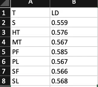
I have a data frame that looks like this.

enter image description here

enter image description here

I want to plot a dot chart for this data, but with my code, the labels are not printed. Also, I want to fill the dots with colours. Is this possible?

The code below shows what I have alredy tried:

  lexical_density=read.csv("~/lexical_density_lit_job10.csv", sep=";")
  dat=lexical_density

dotchart(dat$Lexical.Density,labels=row.names(dat$TEXTS),
         main="Literature Domain", 
         xlab="Lexical Density")

I want to plot a chart like this
Natalia Resende
  • 185
  • 1
  • 1
  • 15
  • Hi, you need to make your question [reproducible](https://stackoverflow.com/a/5963610/6574038) for Stack Overflow, cheers. – jay.sf Jul 14 '19 at 10:35
  • @jay.sf, why it is not reproducible? It is just a question about plot. – Natalia Resende Jul 14 '19 at 10:44
  • Try your code in a fresh R session and you'll see why we can't reproduce this. But it's necessary because it's related to your data. – jay.sf Jul 14 '19 at 10:46

1 Answers1

1

Is this what you are after?

df <- data.frame(T = c('S', 'HT',' MT',' PF', 'PL', 'SF', 'SL'), 
                 LD = c(0.559, 0.576, 0.567, 0.585, 0.567, 0.566, 0.568), stringsAsFactors = FALSE)

dotchart(df$LD, labels = df$T,  bg = 'red')
Tony Ladson
  • 3,539
  • 1
  • 23
  • 30