So after some research and work I created this solution which I decided to share it with you.
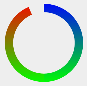
It is based on the prozorov's solution. His circle wasn't 360deg and lacked the needed animation part. It isn't true gradient going with the stroke around the edge of the circle (which is not easy to do with SVG) but rather two linear gradients put together, but for most cases that trick does it.
And here's the complete solution:
.animated {
  animation: dash 5s infinite;
}

@keyframes dash {
  0% {
    stroke-dashoffset: 0;
  }
  50% {
    stroke-dashoffset: 1570;
  }
  100% {
    stroke-dashoffset: 0;
  }


}
<svg xmlns="http://www.w3.org/2000/svg" version="1.1" height="800" width="800">
  <defs>
  <linearGradient id="Gradient1" gradientTransform="rotate(90)">
      <stop offset="0%" stop-color="#ff0000"/>
      <stop offset="100%" stop-color="#00ff00"/>
    </linearGradient>
     <linearGradient id="Gradient2" gradientTransform="rotate(90)">
      <stop offset="0%" stop-color="#0000ff"/>
      <stop offset="100%" stop-color="#00ff00"/>
    </linearGradient>
    <pattern id="Pattern" x="0" y="0" width="600" height="600" patternUnits="userSpaceOnUse">
    <g transform="rotate(0, 300, 300)">
   <rect shape-rendering="crispEdges" x="0" y="0" width="300" height="600" fill="url(#Gradient1)"/>
   <rect shape-rendering="crispEdges"  x="300" y="0" width="300" height="600" fill="url(#Gradient2)"/>
   </g>
  </pattern>
  </defs>

  <path id='arc5' class="animated"
      style="stroke: url(#Pattern);" fill='transparent'
        stroke-dasharray="1570 1570"
        stroke-dashoffset="0"
        stroke-width='60'
        d='M 300 58 A 250 250 0 1 1 299.99 58'/>

</svg
And link to JS Fiddle