0

I have been searching for a simple and efficient way to apply a single gradient to moving particles from the particles.js library. Ideally, I would like something using CSS only, but I am pretty sure now that it's not possible even if I have read interesting things about clip-path like there explanations on clipping and masking using CSS.

My goal is to make something dynamic like this (I have no real edition software other than Asesprite, please don't blame me, if you know a good vector tool for linux, tell me):enter image description here

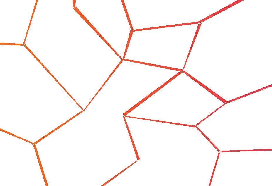
To have a look to an implementation of the library, have a look at the demo on CodePen.

I do not use a server with particles.js (also available there (GitHub) so I would like a solution I can implement on the app.js file linked to my .html one:

/* ---- particles.js config ---- */
// default shape: circles

particlesJS("particles-js", {
    "particles": {
      "number": {
        "value": 80,
        "density": {
          "enable": true,
          "value_area": 800
        }
      },
      "color": {
        "value": "#ffffff"
      },
      "shape": {
        "type": "stroke",
        "stroke": {
          "width": 0,
          "color": "#000000"
        },
        "polygon": {
          "nb_sides": 5
        },
        "image": {
          "src": "../img/particle.png",
          "width": 100,
          "height": 100
        }
      },
      "opacity": {
        "value": 0.5,
        "random": true,
        "anim": {
          "enable": true,
          "speed": 1,
          "opacity_min": 0.1,
          "sync": false
        }
      },
      "size": {
        "value": 3,
        "random": true,
        "anim": {
          "enable": false,
          "speed": 40,
          "size_min": 0.1,
          "sync": false
        }
      },
      "line_linked": {
        "enable": true,
        "distance": 180,
        "color": "#ffffff",
        "opacity": 0.8,
        "width": 2
      },
      "move": {
        "enable": true,
        "speed": 6,
        "direction": "none",
        "random": false,
        "straight": false,
        "out_mode": "out",
        "bounce": false,
        "attract": {
          "enable": false,
          "rotateX": 600,
          "rotateY": 1200
        }
      }
    },
    "interactivity": {
      "detect_on": "canvas",
      "events": {
        "onhover": {
          "enable": true,
          "mode": "repulse"
        },
        "onclick": {
          "enable": false,
          "mode": "bubble"
        },
        "resize": true
      },
      "modes": {
        "grab": {
          "distance": 140,
          "line_linked": {
            "opacity": 1
          }
        },
        "bubble": {
          "distance": 400,
          "size": 40,
          "duration": 2,
          "opacity": 8,
          "speed": 3
        },
        "repulse": {
          "distance": 90,
          "duration": 0.4
        },
        "push": {
          "particles_nb": 4
        },
        "remove": {
          "particles_nb": 2
        }
      }
    },
    "retina_detect": true
  });

I know there are similar questions, but I don't understand how I could manage to make the particules behave as a filter for a behind fixed gradient: a similar case, another one.

Onyr
  • 769
  • 5
  • 21

1 Answers1

1

It might be possible to do this through CSS with mix-blend-mode, but this will also affect the underlying elements (here the red background), so you would have to play with filters too and at the end you will have such complex image processing that you'll find doing it yourself over the initial canvas is probably just easier and faster (in terms of perfs), with a simple composite operation:

particlesJS("particles-js", {
  "particles": {
    "number": {
      "value": 380,
      "density": {
        "enable": true,
        "value_area": 800
      }
    },
    "color": {
      "value": "#ffffff"
    },
    "shape": {
      "type": "circle",
      "stroke": {
        "width": 0,
        "color": "#000000"
      },
      "polygon": {
        "nb_sides": 5
      },
      "image": {
        "src": "img/github.svg",
        "width": 100,
        "height": 100
      }
    },
    "opacity": {
      "value": 0.5,
      "random": false,
      "anim": {
        "enable": false,
        "speed": 1,
        "opacity_min": 0.1,
        "sync": false
      }
    },
    "size": {
      "value": 3,
      "random": true,
      "anim": {
        "enable": false,
        "speed": 40,
        "size_min": 0.1,
        "sync": false
      }
    },
    "line_linked": {
      "enable": true,
      "distance": 150,
      "color": "#ffffff",
      "opacity": 0.4,
      "width": 1
    },
    "move": {
      "enable": true,
      "speed": 6,
      "direction": "none",
      "random": false,
      "straight": false,
      "out_mode": "out",
      "bounce": false,
      "attract": {
        "enable": false,
        "rotateX": 600,
        "rotateY": 1200
      }
    }
  },
  "interactivity": {
    "detect_on": "canvas",
    "events": {
      "onhover": {
        "enable": true,
        "mode": "grab"
      },
      "onclick": {
        "enable": true,
        "mode": "push"
      },
      "resize": true
    },
    "modes": {
      "grab": {
        "distance": 140,
        "line_linked": {
          "opacity": 1
        }
      },
      "bubble": {
        "distance": 400,
        "size": 40,
        "duration": 2,
        "opacity": 8,
        "speed": 3
      },
      "repulse": {
        "distance": 200,
        "duration": 0.4
      },
      "push": {
        "particles_nb": 4
      },
      "remove": {
        "particles_nb": 2
      }
    }
  },
  "retina_detect": true
});


// setup over-drawing
const ctx = document.querySelector('#particles-js > canvas').getContext('2d');
let grad;
onresize();
addEventListener('resize', onresize);

function onresize() {
  grad= ctx.createLinearGradient(0,0,ctx.canvas.width,0);
  grad.addColorStop(0,'yellow');
  grad.addColorStop(1,'green');
}

// must be ran after Particles.js' own anim loop has began
// se we are always pushed after their drawings
requestAnimationFrame( anim );
function anim() {
  ctx.fillStyle = grad;
  ctx.globalCompositeOperation = "source-atop";
ctx.fillRect(0,0,ctx.canvas.width,ctx.canvas.height);
  ctx.globalCompositeOperation = "source-over";
  requestAnimationFrame( anim );
}
/* ---- reset ---- */

body {
  margin: 0;
  font:normal 75% Arial, Helvetica, sans-serif;
}

canvas {
  display: block;
  vertical-align: bottom;
}

/* ---- particles.js container ---- */

#particles-js {
  position: absolute;
  width: 100%;
  height: 100%;
  background-color: #b61924;
  background-image: url("");
  background-repeat: no-repeat;
  background-size: cover;
  background-position: 50% 50%;
}
<script src="https://cdn.jsdelivr.net/particles.js/2.0.0/particles.min.js"></script>
<div id="particles-js"></div>
Kaiido
  • 123,334
  • 13
  • 219
  • 285
  • Ok, it works perfectly fine, you are a hero, have a great day. Just to conclude, [here](https://developer.mozilla.org/en-US/docs/Web/API/CanvasRenderingContext2D/globalCompositeOperation) we can find more info on linear gradients and how to use them. Have a great day ;) – Onyr Dec 11 '19 at 14:41