0

Trying to display "Grades" over inspection year, and the count is just the observations in the data frame.

Creating a quick table:

table(mydata1$Grade,mydata1$Inspection.Year)

Creating a quick barchart:

ggplot(mydata1, aes(fill=Grade , x=Inspection.Year)) +
  geom_bar()

I want to do the same thing with a line graph, but no luck with

ggplot(mydata1, aes(fill=Grade , x=Inspection.Year)) +
  geom_line()

any thoughts?

Thanks!
markus
  • 25,843
  • 5
  • 39
  • 58
dlopez
  • 13
  • 2
  • geom_line needs a y parameter. Try changing fill for y in the line graph. You may have to mutate the dataframe and include another column with the y axis you want. – Arthur Netto Jan 20 '20 at 17:30

1 Answers1

0

Suppose your data looks something like this:

mydata1 = data.frame(
Inspection.Year=sample(2000:2005,100,replace=TRUE),
Grade=sample(LETTERS[1:3],10,replace=TRUE))

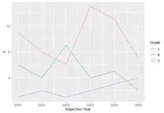
You need to tally your counts and plot them on the y-axis, so something like below:

library(dplyr)

mydata1 %>% count(Inspection.Year,Grade)
# A tibble: 17 x 3
   Inspection.Year Grade     n
             <int> <fct> <int>
 1            2000 A        11
 2            2000 B         6
 3            2000 C         1
 4            2001 A         8

And to plot this:

mydata1 %>% count(Inspection.Year,Grade) %>%
ggplot()+geom_line(aes(x=Inspection.Year,y=n,col=Grade))

Or something similar to the "fill" in geom_bar, you set y=1, and use stat_summary to sum up the 1s per Grade / Year, which will give you n:

ggplot(mydata1, aes(col=Grade , x=Inspection.Year,y=1))+ stat_summary(geom="line",fun.y=sum)

Both give the plot below:

enter image description here

StupidWolf
  • 45,075
  • 17
  • 40
  • 72