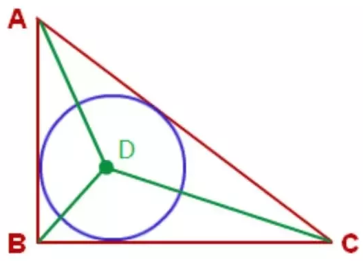
Is it possible to draw a circle inside a right angled triangle in an HTML page using CSS. Is it also possible to put some text inside it?
The output should be something like
Here's a minimal example that can hopefully get you started: https://jsfiddle.net/8mfx9qhj
I always end up back at https://css-tricks.com/the-shapes-of-css/ when trying to do things like this with CSS. If you're looking to draw a more complex diagram like the image above, I'd recommend doing it with SVG and some drawing library (e.g. http://snapsvg.io/) instead, which will make the job a lot easier.
Code from linked jsfiddle:
<div id="triangle">
  <div id="circle">
    hello world
  </div>
</div>
#triangle {
  position: relative;

  width: 0;
  height: 0;

  border-bottom: 100px solid blue;
  border-right: 150px solid transparent;
}

#circle {
  position: absolute;
  top: 30px;

  width: 38px;
  height: 38px;
  padding: 16px;

  border-radius: 50%;

  background: red;
  color: white;
}
Output:

As you can see lots of css and nested html is needed to create the shape. As @evnp said SVG would make your life easier.
#right-triangle-red {
  width: 0;
  height: 0;
  border-bottom: 300px solid red;
  border-right: 500px solid transparent;
  position: relative;
}

#right-trianlg-white {
  width: 0;
  height: 0;
  border-bottom: 276px solid white;
  border-right: 461px solid transparent;
  position: relative;
  z-index: 10;
  top: 16px;
  left: 10px;
}

.triangles {
  position: relative;
}

#circle-purple {
  width: 200px;
  height: 200px;
  background: purple;
  border-radius: 50%;
  position: relative;
}

#circle-white {
  width: 190px;
  height: 190px;
  background: white;
  border-radius: 50%;
  position: relative;
  z-index: 20;
  top: 5px;
  left: 5px;
}

#circle-green {
  width: 15px;
  height: 15px;
  background: green;
  border-radius: 50%;
  position: absolute;
  z-index: 40;
  top: 86px;
  left: 86px;
}

.circles {
  position: relative;
  z-index: 20;
  top: -207px;
  left: 10px;
}

.label {
  font-size: 30px;
  color: red;
  z-index: 30;
  position: relative;
}

.label-b {
  top: -219px;
  left: 510px;
}

.label-c {
  top: -205px;
  left: -31px;
}

.label-d {
  color: green;
  top: -341px;
  left: 64px;
}

.shape-container {
  position: relative;
}
<span class="label label-a">
A
</span>
<div class="shape-container">
<div class="triangles">
<div id="right-triangle-red">
<div id="right-trianlg-white">
</div>
</div>
</div>
<div class="circles">
<div id="circle-purple">
<div id="circle-white">
<div id="circle-green">
</div>
</div>
</div>
</div>
</div>
<span class="label label-b">
B
</span>
<span class="label label-c">
C
</span>
<span class="label label-d">
D
</span>
I will consider this previous answer to draw the triangle and will add another gradient for the circle
.triangle {
  --t:10;    /* Thickness */
  --c:black; /* Color */
  --r:25px;  /* Radius*/

  width:100px;
  height:100px;
  display:inline-block;
  border:calc(var(--t)*1px) solid transparent;
  border-image:
    linear-gradient(to bottom left,
      transparent 49.5%,var(--c) 50%) var(--t);
  background:
    /* Left side */
    linear-gradient(to bottom left,
      transparent 49.5%,var(--c) 50% calc(50% + var(--t)*1px),
      transparent calc(50% + var(--t)*1px + 1px)),
    /* circle */
    radial-gradient(circle var(--r) at var(--r) calc(100% - var(--r)),
      transparent calc(100% - 5px), yellow calc(100% - 4px) 99%,transparent 100%);
  background-origin:border-box,padding-box;
  background-repeat:no-repeat;
}

body {
 background:pink;
}
<div class="triangle"></div>
<div class="triangle" style="--t:5;--c:blue;width:150px;--r:33px;"></div>
<div class="triangle" style="--t:8;--c:red;height:150px;--r:31px;"></div>
<div class="triangle" style="--t:15;--c:green;width:80px;--r:20px"></div>You simply need some math to calculate the radius. Related: https://math.stackexchange.com/q/2247599/695610
As you can see, it's a simple div at the end so you can write your content inside it and align it like you want