None of the above solutions worked for me as the GeometryReader returns different values once placed in a Navigation View that throws off the positioning of the active indicator in the background. I found alternate solutions, but they only worked with fixed length menu strings. Perhaps there is a simple modification to make the above code contributions work, and if so, I would be eager to read it. If you're having the same issues I was, then this may work for you instead.
Thanks to inspiration from a Reddit user "End3r117" and this SwiftWithMajid article, https://swiftwithmajid.com/2020/01/15/the-magic-of-view-preferences-in-swiftui/, I was able to craft a solution. This works either inside or outside of a NavigationView and accepts menu items of various lengths.
struct SegmentMenuPicker: View {
var titles: [String]
var color: Color
@State private var selectedIndex = 0
@State private var frames = Array<CGRect>(repeating: .zero, count: 5)
var body: some View {
VStack {
ZStack {
HStack(spacing: 10) {
ForEach(self.titles.indices, id: \.self) { index in
Button(action: {
print("button\(index) pressed")
self.selectedIndex = index
}) {
Text(self.titles[index])
.foregroundColor(color)
.font(.footnote)
.fontWeight(.semibold)
}
.padding(EdgeInsets(top: 0, leading: 5, bottom: 0, trailing: 5))
.modifier(FrameModifier())
.onPreferenceChange(FramePreferenceKey.self) { self.frames[index] = $0 }
}
}
.background(
Rectangle()
.fill(self.color.opacity(0.4))
.frame(
width: self.frames[self.selectedIndex].width,
height: 2,
alignment: .topLeading)
.offset(x: self.frames[self.selectedIndex].minX - self.frames[0].minX, y: self.frames[self.selectedIndex].height)
, alignment: .leading
)
}
.padding(.bottom, 15)
.animation(.easeIn(duration: 0.2))
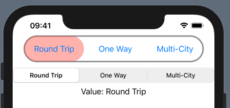
Text("Value: \(self.titles[self.selectedIndex])")
Spacer()
}
}
}
struct FramePreferenceKey: PreferenceKey {
static var defaultValue: CGRect = .zero
static func reduce(value: inout CGRect, nextValue: () -> CGRect) {
value = nextValue()
}
}
struct FrameModifier: ViewModifier {
private var sizeView: some View {
GeometryReader { geometry in
Color.clear.preference(key: FramePreferenceKey.self, value: geometry.frame(in: .global))
}
}
func body(content: Content) -> some View {
content.background(sizeView)
}
}
struct NewPicker_Previews: PreviewProvider {
static var previews: some View {
VStack {
SegmentMenuPicker(titles: ["SuperLongValue", "1", "2", "Medium", "AnotherSuper"], color: Color.blue)
NavigationView {
SegmentMenuPicker(titles: ["SuperLongValue", "1", "2", "Medium", "AnotherSuper"], color: Color.red)
}
}
}
}


